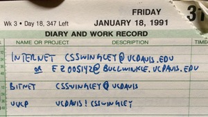
1991 contacts
Yesterday I was going through my journal books from the early 90s to see if I could get a sense of how much bicycling I did when I lived in Davis California. I came across the list of my network contacts from January 1991 shown in the photo. I had an email, bitnet and uucp address on the UC Davis computer system. I don’t have any record of actually using these, but I do remember the old email clients that required lines be less than 80 characters, but which were unable to edit lines already entered.
I found the statistics for 109 of my bike rides between April 1991 and June 1992, and I think that probably represents most of them from that period. I moved to Davis in the fall of 1990 and left in August 1993, however, and am a little surprised I didn’t find any rides from those first six months or my last year in California.
I rode 2,671 miles in those fifteen months, topping out at 418 miles in June 1991. There were long gaps in the record where I didn’t ride at all, but when I rode, my average weekly mileage was 58 miles and maxed out at 186 miles.
To put that in perspective, in the last seven years of commuting to work and riding recreationally, my highest monthly mileage was 268 miles (last month!), my average weekly mileage was 38 miles, and the farthest I’ve gone in a week was 81 miles.
The road biking season is getting near to the end here in Fairbanks as the chances of significant snowfall on the roads rises dramatically, but I hope that next season I can push my legs (and hip) harder and approach some of the mileage totals I reached more than twenty years ago.
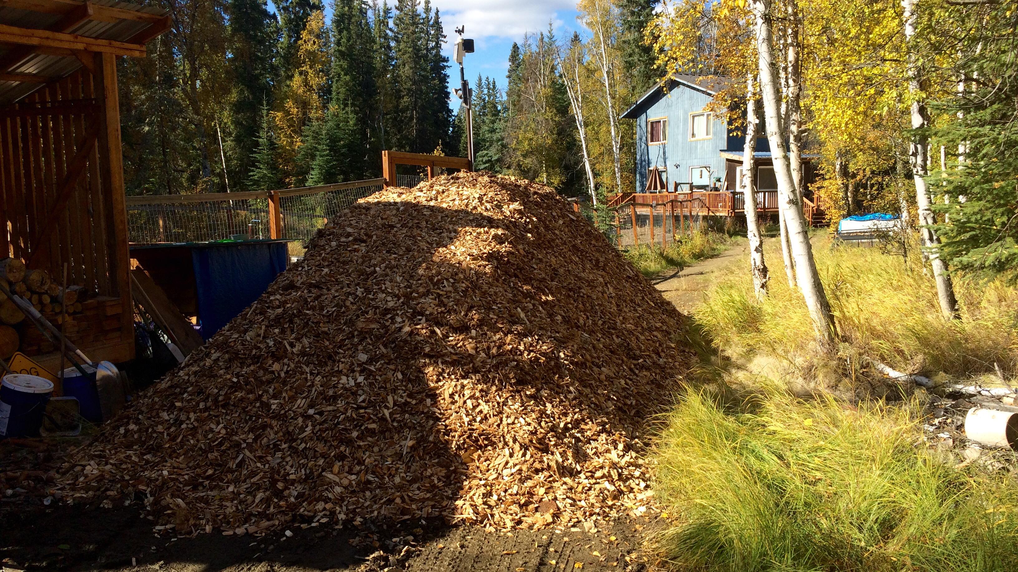
Thirty yards of wood chips
Every couple years we cover our dog yard with a fresh layer of wood chips from the local sawmill, Northland Wood. This year I decided to keep closer track of how much effort it takes to move all 30 yards of wood chips by counting each wheelbarrow load, recording how much time I spent, and by using a heart rate monitor to keep track of effort.
The image below show the tally board. Tick marks indicate wheelbarrow-loads, the numbers under each set of five were the number of minutes since the start of each bout of work, and the numbers on the right are total loads and total minutes. I didn’t keep track of time, or heart rate, for the first set of 36 loads.

It’s not on the chalkboard, but my heart rate averaged 96 beats per minute for the first effort on Saturday morning, and 104, 96, 103, and 103 bpm for the rest. That averages out to 100.9 beats per minute.
For the loads where I was keeping track of time, I averaged 3 minutes and 12 seconds per load. Using that average for the 36 loads on Friday afternoon, that means I spent around 795 minutes, or 13 hours and 15 minutes moving and spreading 248 wheelbarrow-loads of chips.
Using a formula found in [Keytel LR, et al. 2005. Prediction of energy expenditure from heart rate monitoring during submaximal exercise. J Sports Sci. 23(3):289-97], I calculate that I burned 4,903 calories above the amount I would have if I’d been sitting around all weekend. To put that in perspective, I burned 3,935 calories running the Equinox Marathon in September, 2013.
As I was loading the wheelbarrow, I was mentally keeping track of how many pitchfork-loads it took to fill the wheelbarrow, and the number hovered right around 17. That means there are about 4,216 pitchfork loads in 30 yards of wood chips.
To summarize: 30 yards of wood chips is equivalent to 248 wheelbarrow loads. Each wheelbarrow-load is 0.1209 yards, or 3.26 cubic feet. Thirty yards of wood chips is also equivalent to 4,216 pitchfork loads, each of which is 0.19 cubic feet. It took me 13.25 hours to move and spread it all, or 3.2 minutes per wheelbarrow-load, or 11 seconds per pitchfork-load.
One final note: this amount completely covered all but a few square feet of the dog yard. In some places the chips were at least six inches deep, and in others there’s just a light covering of new over old. I don’t have a good measure of the yard, but if I did, I’d be able to calculate the average depth of the chips. My guess is that it is around 2,500 square feet, which is what 30 yards would cover to an average depth of 4 inches.
Introduction
Often when I’m watching Major League Baseball games a player will come up to bat or pitch and I’ll comment “former Oakland Athletic” and the player’s name. It seems like there’s always one or two players on the roster of every team that used to be an Athletic.
Let’s find out. We’ll use the Retrosheet database again, this time using the roster lists from 1990 through 2014 and comparing it against the 40-man rosters of current teams. That data will have to be scraped off the web, since Retrosheet data doesn’t exist for the current season and rosters change frequently during the season.
Methods
As usual, I’ll use R for the analysis, and rmarkdown to produce this post.
library(plyr)
library(dplyr)
library(rvest)
options(stringsAsFactors=FALSE)
We’re using plyr and dplyr for most of the data manipulation and rvest to grab the 40-man rosters for each team from the MLB website. Setting stringsAsFactors to false prevents various base R packages from converting everything to factors. We're not doing any statistics with this data, so factors aren't necessary and make comparisons and joins between data frames more difficult.
Players by team for previous years
Load the roster data:
retrosheet_db <- src_postgres(host="localhost", port=5438,
                              dbname="retrosheet", user="cswingley")

rosters <- tbl(retrosheet_db, "rosters")

all_recent_players <-
     rosters %>%
     filter(year>1989) %>%
     collect() %>%
     mutate(player=paste(first_name, last_name),
            team=team_id) %>%
     select(player, team, year)

save(all_recent_players, file="all_recent_players.rdata", compress="gzip")
The Retrosheet database lives in PostgreSQL on my computer, but one of the advantages of using dplyr for retrieval is it would be easy to change the source statement to connect to another sort of database (SQLite, MySQL, etc.) and the rest of the commands would be the same.
We only grab data since 1990 and we combine the first and last names into a single field because that’s how player names are listed on the 40-man roster pages on the web.
Now we filter the list down to Oakland Athletic players, combine the rows for each Oakland player, summarizing the years they played for the A’s into a single column.
oakland_players <- all_recent_players %>%
    filter(team=='OAK') %>%
    group_by(player) %>%
    summarise(years=paste(year, collapse=', '))
Here’s what that looks like:
kable(head(oakland_players))
| player | years |
|---|---|
| A.J. Griffin | 2012, 2013 |
| A.J. Hinch | 1998, 1999, 2000 |
| Aaron Cunningham | 2008, 2009 |
| Aaron Harang | 2002, 2003 |
| Aaron Small | 1996, 1997, 1998 |
| Adam Dunn | 2014 |
| ... | ... |
Current 40-man rosters
Major League Baseball has the 40-man rosters for each team on their site. In order to extract them, we create a list of the team identifiers (oak, sf, etc.), then loop over this list, grabbing the team name and all the player names. We also set up lists for the team names (“Athletics”, “Giants”, etc.) so we can replace the short identifiers with real names later.
teams=c("ana", "ari", "atl", "bal", "bos", "cws", "chc", "cin", "cle", "col",
        "det", "mia", "hou", "kc", "la", "mil", "min", "nyy", "nym", "oak",
        "phi", "pit", "sd", "sea", "sf", "stl", "tb", "tex", "tor", "was")

team_names = c("Angels", "Diamondbacks", "Braves", "Orioles", "Red Sox",
               "White Sox", "Cubs", "Reds", "Indians", "Rockies", "Tigers",
               "Marlins", "Astros", "Royals", "Dodgers", "Brewers", "Twins",
               "Yankees", "Mets", "Athletics", "Phillies", "Pirates",
               "Padres", "Mariners", "Giants", "Cardinals", "Rays", "Rangers",
               "Blue Jays", "Nationals")

get_players <- function(team) {
    # reads the 40-man roster data for a team, returns a data frame

    roster_html <- html(paste("http://www.mlb.com/team/roster_40man.jsp?c_id=",
                              team,
                              sep=''))

    players <- roster_html %>%
        html_nodes("#roster_40_man a") %>%
        html_text()

    data.frame(team=team, player=players)
}

current_rosters <- ldply(teams, get_players)

save(current_rosters, file="current_rosters.rdata", compress="gzip")
Here’s what that data looks like:
kable(head(current_rosters))
| team | player |
|---|---|
| ana | Jose Alvarez |
| ana | Cam Bedrosian |
| ana | Andrew Heaney |
| ana | Jeremy McBryde |
| ana | Mike Morin |
| ana | Vinnie Pestano |
| ... | ... |
Combine the data
To find out how many players on each Major League team used to play for the A’s we combine the former A’s players with the current rosters using player name. This may not be perfect due to differences in spelling (accented characters being the most likely issue), but the results look pretty good.
roster_with_oakland_time <- current_rosters %>%
    left_join(oakland_players, by="player") %>%
    filter(!is.na(years))

kable(head(roster_with_oakland_time))
| team | player | years |
|---|---|---|
| ana | Huston Street | 2005, 2006, 2007, 2008 |
| ana | Grant Green | 2013 |
| ana | Collin Cowgill | 2012 |
| ari | Brad Ziegler | 2008, 2009, 2010, 2011 |
| ari | Cliff Pennington | 2008, 2009, 2010, 2011, 2012 |
| atl | Trevor Cahill | 2009, 2010, 2011 |
| ... | ... | ... |
You can see from this table (just the first six rows of the results) that the Angels have three players that were Athletics.
Let’s do the math and find out how many former A’s are on each team’s roster.
n_former_players_by_team <-
    roster_with_oakland_time %>%
        group_by(team) %>%
        arrange(player) %>%
        summarise(number_of_players=n(),
                  players=paste(player, collapse=", ")) %>%
        arrange(desc(number_of_players)) %>%
        inner_join(data.frame(team=teams, team_name=team_names),
                   by="team") %>%
        select(team_name, number_of_players, players)

names(n_former_players_by_team) <- c('Team', 'Number',
                                     'Former Oakland Athletics')
kable(n_former_players_by_team,
      align=c('l', 'r', 'r'))
| Team | Number | Former Oakland Athletics |
|---|---|---|
| Athletics | 22 | A.J. Griffin, Andy Parrino, Billy Burns, Coco Crisp, Craig Gentry, Dan Otero, Drew Pomeranz, Eric O'Flaherty, Eric Sogard, Evan Scribner, Fernando Abad, Fernando Rodriguez, Jarrod Parker, Jesse Chavez, Josh Reddick, Nate Freiman, Ryan Cook, Sam Fuld, Scott Kazmir, Sean Doolittle, Sonny Gray, Stephen Vogt |
| Astros | 5 | Chris Carter, Dan Straily, Jed Lowrie, Luke Gregerson, Pat Neshek |
| Braves | 4 | Jim Johnson, Jonny Gomes, Josh Outman, Trevor Cahill |
| Rangers | 4 | Adam Rosales, Colby Lewis, Kyle Blanks, Michael Choice |
| Angels | 3 | Collin Cowgill, Grant Green, Huston Street |
| Cubs | 3 | Chris Denorfia, Jason Hammel, Jon Lester |
| Dodgers | 3 | Alberto Callaspo, Brandon McCarthy, Brett Anderson |
| Mets | 3 | Anthony Recker, Bartolo Colon, Jerry Blevins |
| Yankees | 3 | Chris Young, Gregorio Petit, Stephen Drew |
| Rays | 3 | David DeJesus, Erasmo Ramirez, John Jaso |
| Diamondbacks | 2 | Brad Ziegler, Cliff Pennington |
| Indians | 2 | Brandon Moss, Nick Swisher |
| White Sox | 2 | Geovany Soto, Jeff Samardzija |
| Tigers | 2 | Rajai Davis, Yoenis Cespedes |
| Royals | 2 | Chris Young, Joe Blanton |
| Marlins | 2 | Dan Haren, Vin Mazzaro |
| Padres | 2 | Derek Norris, Tyson Ross |
| Giants | 2 | Santiago Casilla, Tim Hudson |
| Nationals | 2 | Gio Gonzalez, Michael Taylor |
| Red Sox | 1 | Craig Breslow |
| Rockies | 1 | Carlos Gonzalez |
| Brewers | 1 | Shane Peterson |
| Twins | 1 | Kurt Suzuki |
| Phillies | 1 | Aaron Harang |
| Mariners | 1 | Seth Smith |
| Cardinals | 1 | Matt Holliday |
| Blue Jays | 1 | Josh Donaldson |
Pretty cool. I do notice one problem: there are actually two Chris Young’s playing in baseball today. Chris Young the outfielder played for the A’s in 2013 and now plays for the Yankees. There’s also a pitcher named Chris Young who shows up on our list as a former A’s player who now plays for the Royals. This Chris Young never actually played for the A’s. The Retrosheet roster data includes which hand (left and/or right) a player bats and throws with, and it’s possible this could be used with the MLB 40-man roster data to eliminate incorrect joins like this, but even with that enhancement, we still have the problem that we’re joining on things that aren’t guaranteed to uniquely identify a player. That’s the nature of attempting to combine data from different sources.
One other interesting thing. I kept the A’s in the list because the number of former A’s currently playing for the A’s is a measure of how much turnover there is within an organization. Of the 40 players on the current A’s roster, only 22 of them have ever played for the A’s. That means that 18 came from other teams or are promotions from the minors that haven’t played for any Major League teams yet.
All teams
Teams with players on other teams
Now that we’ve looked at how many A’s players have played for other teams, let’s see how the number of players playing for other teams is related to team. My gut feeling is that the A’s will be at the top of this list as a small market, low budget team who is forced to turn players over regularly in order to try and stay competitive.
We already have the data for this, but need to manipulate it in a different way to get the result.
teams <- c("ANA", "ARI", "ATL", "BAL", "BOS", "CAL", "CHA", "CHN", "CIN",
           "CLE", "COL", "DET", "FLO", "HOU", "KCA", "LAN", "MIA", "MIL",
           "MIN", "MON", "NYA", "NYN", "OAK", "PHI", "PIT", "SDN", "SEA",
           "SFN", "SLN", "TBA", "TEX", "TOR", "WAS")

team_names <- c("Angels", "Diamondbacks", "Braves", "Orioles", "Red Sox",
                "Angels", "White Sox", "Cubs", "Reds", "Indians", "Rockies",
                "Tigers", "Marlins", "Astros", "Royals", "Dodgers", "Marlins",
                "Brewers", "Twins", "Expos", "Yankees", "Mets", "Athletics",
                "Phillies", "Pirates", "Padres", "Mariners", "Giants",
                "Cardinals", "Rays", "Rangers", "Blue Jays", "Nationals")

players_on_other_teams <- all_recent_players %>%
    group_by(player, team) %>%
    summarise(years=paste(year, collapse=", ")) %>%
    inner_join(current_rosters, by="player") %>%
    mutate(current_team=team.y, former_team=team.x) %>%
    select(player, current_team, former_team, years) %>%
    inner_join(data.frame(former_team=teams, former_team_name=team_names),
                by="former_team") %>%
    group_by(former_team_name, current_team) %>%
    summarise(n=n()) %>%
    group_by(former_team_name) %>%
    arrange(desc(n)) %>%
    mutate(rank=row_number()) %>%
    filter(rank!=1) %>%
    summarise(n=sum(n)) %>%
    arrange(desc(n))
This is a pretty complicated set of operations. The main trick (and possible flaw in the analysis) is to get a list similar to the one we got for the A’s earlier, and eliminate the first row (the number of players on a team who played for that same team in the past) before counting the total players who have played for other teams. It would probably be better to eliminate that case using team name, but the team codes vary between Retrosheet and the MLB roster data.
Here are the results:
names(players_on_other_teams) <- c('Former Team', 'Number of players')

kable(players_on_other_teams)
| Former Team | Number of players |
|---|---|
| Athletics | 57 |
| Padres | 57 |
| Marlins | 56 |
| Rangers | 55 |
| Diamondbacks | 51 |
| Braves | 50 |
| Yankees | 50 |
| Angels | 49 |
| Red Sox | 47 |
| Pirates | 46 |
| Royals | 44 |
| Dodgers | 43 |
| Mariners | 42 |
| Rockies | 42 |
| Cubs | 40 |
| Tigers | 40 |
| Astros | 38 |
| Blue Jays | 38 |
| Rays | 38 |
| White Sox | 38 |
| Indians | 35 |
| Mets | 35 |
| Twins | 33 |
| Cardinals | 31 |
| Nationals | 31 |
| Orioles | 31 |
| Reds | 28 |
| Brewers | 26 |
| Phillies | 25 |
| Giants | 24 |
| Expos | 4 |
The A’s are indeed on the top of the list, but surprisingly, the Padres are also at the top. I had no idea the Padres had so much turnover. At the bottom of the list are teams like the Giants and Phillies that have been on recent winning streaks and aren’t trading their players to other teams.
Current players on the same team
We can look at the reverse situation: how many players on the current roster played for that same team in past years. Instead of removing the current × former team combination with the highest number, we include only that combination, which is almost certainly the combination where the former and current team is the same.
players_on_same_team <- all_recent_players %>%
    group_by(player, team) %>%
    summarise(years=paste(year, collapse=", ")) %>%
    inner_join(current_rosters, by="player") %>%
    mutate(current_team=team.y, former_team=team.x) %>%
    select(player, current_team, former_team, years) %>%
    inner_join(data.frame(former_team=teams, former_team_name=team_names),
                by="former_team") %>%
    group_by(former_team_name, current_team) %>%
    summarise(n=n()) %>%
    group_by(former_team_name) %>%
    arrange(desc(n)) %>%
    mutate(rank=row_number()) %>%
    filter(rank==1,
           former_team_name!="Expos") %>%
    summarise(n=sum(n)) %>%
    arrange(desc(n))

names(players_on_same_team) <- c('Team', 'Number of players')

kable(players_on_same_team)
| Team | Number of players |
|---|---|
| Rangers | 31 |
| Rockies | 31 |
| Twins | 30 |
| Giants | 29 |
| Indians | 29 |
| Cardinals | 28 |
| Mets | 28 |
| Orioles | 28 |
| Tigers | 28 |
| Brewers | 27 |
| Diamondbacks | 27 |
| Mariners | 27 |
| Phillies | 27 |
| Reds | 26 |
| Royals | 26 |
| Angels | 25 |
| Astros | 25 |
| Cubs | 25 |
| Nationals | 25 |
| Pirates | 25 |
| Rays | 25 |
| Red Sox | 24 |
| Blue Jays | 23 |
| Athletics | 22 |
| Marlins | 22 |
| Padres | 22 |
| Yankees | 22 |
| Dodgers | 21 |
| White Sox | 20 |
| Braves | 13 |
The A’s are near the bottom of this list, along with other teams that have been retooling because of a lack of recent success such as the Yankees and Dodgers. You would think there would be an inverse relationship between this table and the previous one (if a lot of your former players are currently playing on other teams they’re not playing on your team), but this isn’t always the case. The White Sox, for example, only have 20 players on their roster that were Sox in the past, and there aren’t very many of them playing on other teams either. Their current roster must have been developed from their own farm system or international signings, rather than by exchanging players with other teams.
Yesterday I saw something I’ve never seen in a baseball game before: a runner getting hit by a batted ball, which according to Rule 7.08(f) means the runner is out and the ball is dead. It turns out that this isn’t as unusual an event as I’d thought (see below), but what was unusal is that this ended the game between the Angels and Giants. Even stranger, this is also how the game between the Diamondbacks and Dodgers ended.
Let’s use Retrosheet data to see how often this happens. Retrosheet data is organized into game data, roster data and event data. Event files contain a record of every event in a game and include the code BR for when a runner is hit by a batted ball. Here’s a SQL query to find all the matching events, who got hit and whether it was the last out in the game.
SELECT sub.game_id, teams, date, inn_ct, outs_ct, bat_team, event_tx,
   first_name || ' ' || last_name AS runner,
   CASE WHEN event_id = max_event_id THEN 'last out' ELSE '' END AS last_out
FROM (
   SELECT year, game_id, away_team_id || ' @ ' || home_team_id AS teams,
      date, inn_ct,
      CASE WHEN bat_home_id = 1
            THEN home_team_id
            ELSE away_team_id END AS bat_team, outs_ct, event_tx,
      CASE regexp_replace(event_tx, '.*([1-3])X[1-3H].*', E'\\1')
            WHEN '1' THEN base1_run_id
            WHEN '2' THEN base2_run_id
            WHEN '3' THEN base3_run_id END AS runner_id,
      event_id
   FROM events
   WHERE event_tx ~ 'BR'
) AS sub
   INNER JOIN rosters
      ON sub.year=rosters.year
            AND runner_id=player_id
            AND rosters.team_id = bat_team
   INNER JOIN (
      SELECT game_id, max(event_id) AS max_event_id
      FROM events
      GROUP BY game_id
   ) AS max_events
   ON sub.game_id = max_events.game_id
ORDER BY date;
Here's what the query does. The first sub-query sub finds all the events with the BR code, determines which team was batting and finds the id for the player who was running. This is joined with the roster table so we can assign a name to the runner. Finally, it’s joined with a subquery, max_events, which finds the last event in each game. Once we’ve got all that, the SELECT statement at the very top retrieves the columns of interest, and records whether the event was the last out of the game.
Retrosheet has event data going back to 1922, but the event files don’t include every game played in a season until the mid-50s. Starting in 1955 a runner being hit by a batted ball has a game twelve times, most recently in 2010. On average, runners get hit (and are called out) about fourteen times a season.
Here are the twelve times a runner got hit to end the game, since 1955. Until yesterday, when it happened twice in one day:
| Date | Teams | Batting | Event | Runner |
|---|---|---|---|---|
| 1956-09-30 | NY1 @ PHI | PHI | S4/BR.1X2(4)# | Granny Hamner |
| 1961-09-16 | PHI @ CIN | PHI | S/BR/G4.1X2(4) | Clarence Coleman |
| 1971-08-07 | SDN @ HOU | SDN | S/BR.1X2(3) | Ed Spiezio |
| 1979-04-07 | CAL @ SEA | SEA | S/BR.1X2(4) | Larry Milbourne |
| 1979-08-15 | TOR @ OAK | TOR | S/BR.3-3;2X3(4)# | Alfredo Griffin |
| 1980-09-22 | CLE @ NYA | CLE | S/BR.3XH(5) | Toby Harrah |
| 1984-04-06 | MIL @ SEA | MIL | S/BR.1X2(4) | Robin Yount |
| 1987-06-25 | ATL @ LAN | ATL | S/L3/BR.1X2(3) | Glenn Hubbard |
| 1994-06-13 | HOU @ SFN | HOU | S/BR.1X2(4) | James Mouton |
| 2001-08-04 | NYN @ ARI | ARI | S/BR.2X3(6) | David Dellucci |
| 2003-04-09 | KCA @ DET | DET | S/BR.1X2(4) | Bobby Higginson |
| 2010-06-27 | PIT @ OAK | PIT | S/BR/G.1X2(3) | Pedro Alvarez |
And all runners hit last season:
| Date | Teams | Batting | Event | Runner |
|---|---|---|---|---|
| 2014-05-07 | SEA @ OAK | OAK | S/BR/G.1X2(3) | Derek Norris |
| 2014-05-11 | MIN @ DET | DET | S/BR/G.3-3;2X3(6);1-2 | Austin Jackson |
| 2014-05-23 | CLE @ BAL | BAL | S/BR/G.2X3(6);1-2 | Chris Davis |
| 2014-05-27 | NYA @ SLN | SLN | S/BR/G.1X2(3) | Matt Holliday |
| 2014-06-14 | CHN @ PHI | CHN | S/BR/G.1X2(4) | Justin Ruggiano |
| 2014-07-13 | OAK @ SEA | SEA | S/BR/G.1X2(4) | Kyle Seager |
| 2014-07-18 | PHI @ ATL | PHI | S/BR/G.1X2(4) | Grady Sizemore |
| 2014-07-25 | BAL @ SEA | SEA | S/BR/G.1X2(4) | Brad Miller |
| 2014-08-05 | NYN @ WAS | WAS | S/BR/G.2X3(6);3-3 | Asdrubal Cabrera |
| 2014-09-04 | SLN @ MIL | SLN | S/BR/G.2X3(6);1-2 | Matt Carpenter |
| 2014-09-09 | SDN @ LAN | LAN | S/BR/G.2X3(6) | Matt Kemp |
| 2014-09-18 | BOS @ PIT | BOS | S/BR/G.3XH(5);1-2;B-1 | Jemile Weeks |
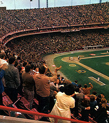
Memorial Stadium, 1971
photo by Tom Vivian
Yesterday, the Baltimore Orioles and Chicago White Sox played a game at Camden Yards in downtown Baltimore. The game was “closed to fans” due to the riots that broke out in the city after the funeral for a man who died in police custody. It’s the first time a Major League Baseball game has been played without any fans in the stands, but unfortunately it’s not the first time there have been riots in Baltimore.
After Martin Luther King, Jr. was murdered in April 1968, Baltimore rioted for six days, with local police, and more than eleven thousand National Guard, Army troops, and Marines brought in to restore order. According to wikipedia six people died, more than 700 were injured, 1,000 businesses were damaged and close to six thousand people were arrested.
At that time, the Orioles played in Memorial Stadium, about 4 miles north-northwest of where they play now. I don’t know much about that area of Baltimore, but I was curious to know whether the Orioles played any baseball games during those riots.
Retrosheet has one game, on April 10, 1968, with a reported attendance of 22,050. The Orioles defeated the Oakland Athletics by a score of 3–1. Thomas Phoebus got the win over future Hall of Famer Catfish Hunter. Other popular players in the game included Reggie Jackson, Sal Bando, Rick Mondy and Bert Campaneris for the A’s and Brooks Robinson, Frank Robinson, Davey Johnson, and Boog Powell for the Orioles.
The box score and play-by-play can be viewed here.