I re-ran the analysis of my ski speeds discussed in an earlier post. The model looks like this:
lm(formula = mph ~ season_days + temp, data = ski)

Residuals:
     Min       1Q   Median       3Q      Max
-1.76466 -0.20838  0.02245  0.15600  0.90117

Coefficients:
            Estimate Std. Error t value Pr(>|t|)
(Intercept) 4.414677   0.199258  22.156  < 2e-16 ***
season_days 0.008510   0.001723   4.938 5.66e-06 ***
temp        0.027334   0.003571   7.655 1.10e-10 ***
---
Signif. codes:  0 ‘***’ 0.001 ‘**’ 0.01 ‘*’ 0.05 ‘.’ 0.1 ‘ ’ 1

Residual standard error: 0.428 on 66 degrees of freedom
Multiple R-squared: 0.5321, Adjusted R-squared: 0.5179
F-statistic: 37.52 on 2 and 66 DF,  p-value: 1.307e-11
What this is saying is that about half the variation in my ski speeds can be explained by the temperature when I start skiing and how far along in the season we are (season_days). Temperature certainly makes sense—I was reminded of how little glide you get at cold temperatures skiing to work this week at -25°F. And it’s gratifying that my speeds are increasing as the season goes on. It’s not my imagination that my legs are getting stronger and my technique better.
The following figure shows the relationship of each of these two variables (season_days and temp) to the average speed of the trip. I used the melt function from the reshape package to make the plot:
melted <- melt(data = ski,
               measure.vars = c('season_days', 'temp'),
               id.vars = 'mph')
q <- ggplot(data = melted, aes(x = value, y = mph))
q + geom_point()
  + facet_wrap(~ variable, scales = 'free_x')
  + stat_smooth(method = 'lm')
  + theme_bw()
Last week I replaced by eighteen-year-old ski boots with a new pair, and they’re hurting my ankles a little. Worse, the first four trips with my new boots were so slow and frustrating that I thought maybe I’d made a mistake in the pair I’d bought. My trip home on Friday afternoon was another frustrating ski until I stopped and applied warmer kick wax and had a much more enjoyable mile and a half home. There are a lot of other unmeasured factors including the sort of snow on the ground (fresh snow vs. smooth trail vs. a trail ripped up by snowmachines), whether I applied the proper kick wax or not, whether my boots are hurting me, how many times I stopped to let dog teams by, and many other things I can’t think of. Explaining half of the variation in speed is pretty impressive.
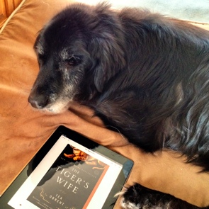
Nika, The Tiger’s Wife
I finished the last of the sixteen Tournament of Books contestants (well, except that I couldn’t actually finish The Stranger’s Child). I haven’t commented on the last four, but I read and enjoyed The Last Brother, Salvage the Bones, The Cat’s Table, and The Tiger’s Wife.
Of the four, I enjoyed The Tiger’s Wife and The Cat’s Table the most. Both require some patience, and I didn’t get into them to the extent that I was thinking about them when I wasn’t reading them, but they are worth the effort. The Tiger’s Wife easily beats The Stranger’s Child in the first round, as does The Cat’s Table over Swamplandia! I enjoyed Swamplandia! but it feels like it has been years since I read it, and the story didn’t stick with me like a great book does.
The dog in the photo is our oldest, Nika, who turned fifteen last September. She is having trouble with her hind legs, and often has no appetite, but when we go for walks on the Creek or trails, she’s still as excited and animated as she was when she was a puppy. I’m listening to the A’s vs. Cubs game now, but I think I’ll take her out for a little walk later. The A’s introduced Cuban sensation Yoenis Cespedes earlier today, but he isn’t in the starting lineup. I will be very interested to see how he handles major league pitching, but that probably won’t happen for a few days.
Recently read iBooks
The Morning News Tournament of Books starts next week, and I’m about a third of the way through the only unread volume in this year’s contest, Téa Obreht’s The Tiger’s Wife. In preparation for my posts on the tournament, I wanted to generate a tournament bracket, filled with my choices. I could have fired up Inkscape or my favorite old drawing program, xfig, but drawing something that has such an obvious pattern built into it would be much easier using a programming language rather than moving a mouse pointer around over and over again.
I debated refreshing my Metapost skills, the tool I used to generate my best baseball scorecards, and even wrote a simple Pic (a language written in 1982 by Brian Kernighan, of K&R and awk fame) macro to do it. But I wanted something that would work on the web, and for figures on the Internet, SVG is really the best format (well, unless you’re stuck on Internet Explorer…). Metapost and Pic produce PostScript and PDF, and I wasn’t happy with the way the available PS to SVG image converters mangled the Pic PostScript.
I settled on Python (of course!) and the svgwrite library. Generating an SVG file programatically is pretty easy with svgwrite. You start the drawing with:
svg = svgwrite.Drawing(output_filename, size = ("700px", "650px"))
and then draw stuff onto the page with commands like those found in my draw_bracket function. The all-caps variables are global parameters set at the top of the code to control the size of various elements across the entire figure. I also created a Point class for handling x / y coordinates in the diagram. That’s what start is defined as below (and how I can access x and y via start.x and start.y.
def draw_bracket(svg, start, width, height, names):
    """ Draw a bracket from (start.x, start.y) right width, down height,
        to (start.x, start.y + height), placing the names above the
        horizonal lines. """

    lines = svg.add(svg.g(stroke_width = 2, stroke = "red"))
    lines.add(svg.line((start.x, start.y), (start.x + width, start.y)))
    lines.add(svg.line((start.x + width, start.y),
                       (start.x + width, start.y + height)))
    lines.add(svg.line((start.x + width, start.y + height),
                       (start.x, start.y + height)))
    texts = svg.add(svg.g(font_size = TEXT_SIZE))
    texts.add(svg.text(names[0],
                       (start.x + TEXT_RIGHT, start.y - TEXT_UP)))
    texts.add(svg.text(names[1],
                       (start.x + TEXT_RIGHT, start.y + height - TEXT_UP)))
With this function, all that’s left is to design the data structures that hold the data in each column of the diagram, and write the loops to draw the brackets. Here’s the first loop:
# ROUND 1
current_start = Point(MARGIN, MARGIN)
for bracket in first_brackets:
    print(current_start)
    draw_bracket(svg, current_start, INIT_BRACKET_WIDTH,
            FIRST_BRACKET_HEIGHT, bracket)
    current_start = current_start + \
                    Point(0, FIRST_BRACKET_HEIGHT + FIRST_BRACKET_SKIP)
first_brackets is a tuple of paired tuples, so each bracket above contains the two book titles that should appear on each leg of that bracket.
first_brackets = (
        ("Sense of an Ending", "The Devil All the Time"),
        ("Lightning Rods", "Salvage the Bones"),
        ...
    )
The full code can be downloaded at make_bracket.py. The result:
I’ll comment more on my picks after I’ve finished The Tiger’s Wife, and as the tournament starts next week. There were a lot of great books in the tournament, and I wouldn’t be disappointed if some of the later bracket winners in my diagram wound up winning. For me, the most interesting first round bracket is Wil Weaton’s tough choice between Ann Pachett’s State of Wonder and The Sisters Brothers by Patrick deWitt. I chose Sisters, but it was a tough choice, and even though it doesn’t make it past round one on my diagram, I’d be happy to see Wonder win it all.
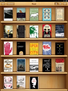
One other note on the screenshot from my iPad at the top of the post. There are several excellent, non-Tournament books pictured. I highly recommend The Last Werewolf, by Glen Duncan, Neal Stephenson’s Reamde, 11/22/63 (Stephen King), and Eleanor Henderson’s Ten Thousand Saints. These four are easily better than the worst of this year’s Tournament (Hollinghurst, DeWitt and Zambreno).

Snowmachine trespass
It's great living where we do: in the middle of nowhere, and yet, only a few miles from town. I can ski to work in the winter on the multi-use commuter trail across the street from our driveway and ride my bike on the road in the summer.
If there is a down side to living where we do it's that it feels like the middle of nowhere to those who think it's their right to drive their gasoline-powered vehicles wherever they want. Several years ago I put up a pair of signs on one of our trails after a four wheeler damaged the vegetation around the trail. And miraculously, that seems to have worked.
Now we've got snowmachines (snowmobiles) riding down the road, which is illegal, then crossing onto the powerline, which is private property. Golden Valley Electric Association has a right of way easement, but it is still my property. In a different time and place it's the sort of thing that might be solved by shooting the offenders with a rock salt-loaded shotgun.
I took a more measured approach and stuck a pair of poles in the snow where they blew across the driveway in attempt to indicate that this isn't an acceptable place to drive their machines. Today they made a new track next to the poles, and knocked one of them over for good measure (the photo above).
And, keep in mind, there's a snowmachine-friendly trail across the street!
I know this is a fight I can't win, so I should just ignore it. And that's what I'll do after making this plea: if any of you ride snowmachines or know others that do, please encourage them to respect private property, including powerlines. Asshats like those riding roughshod all over my property give considerate riders a bad name.
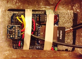
Today was the first day where I got some good data skiing to and from work using my data logger. There’s a photo of it in it’s protective box on the right. The Arduino and data logging shield (with the sensors soldered to it) is sitting on top of a battery pack holding six AA batteries. The accelerometer is the little square board that is sticking up on the left side of the logger, and you can see the SD card on the right side. The cord under the rubber bands leads to the external temperature sensor.
This morning it took about four minutes for the sensor to go from room temperature to outside temperature (-12°F), which means I need to pre-acclimate it before going out for a ski. A thermocouple would respond faster (much less mass), but they’re not as accurate because they have such a wide response range (-200°C to 1,350°C). A thermistor might be a good compromise, but I haven’t fiddled with those yet.
Here’s the temperature data from my ski home:
When I left work, the temperature at our house was 12°F, and I figured it would be warmer almost everywhere else, so I used “extra green” kick wax, which has a range of 12 to 21°F. I’ve highlighted this range on the plot with a transparent green box. In general, if you’ve chosen wax that’s too warm for the conditions, you won’t get much glide, and if the wax is rated too cold, you won’t have much kick. The plot shows that as I got near the end of the route and the temperature dropped below the lower range of the wax, I should have lost some glide, which is pretty much exactly what happened. Normally this isn’t a big issue on the Goldstream Valley Trail because it’s often very smooth, which means that a warmer wax is needed to get a grip, but this afternoon’s trail had seen a lot of snowmachine traffic, it wasn’t very smooth, and I didn’t get as much glide as earlier in the ski.
The other interesting thing is the dramatic dip marked “Goldstream Creek” on the plot. This is where the trail crosses the Creek on a small bridge designed for light recreational traffic (nothing bigger than a snowmachine or four-wheeler). It’s probably the lowest place in the trail. Our house is also on the Creek, so the two coldest spots on the trail are exactly where I’d expect them to be, right on the Creek.