Introduction
For the past two years I’ve played Yahoo fantasy baseball with a group of friends. It’s a fun addition to watching games because it requires you to pay attention to more than just the players on the teams you root for (especially important if your favorite “team” is the Athletics).
Last year we had a draft party and it was interesting to see how different people approached the draft. Some of us chose players for emotional reasons like whether they played for the team they rooted for or what country the player was from, and some used a very analytical approach. The last two years I’ve tended to be more on the emotional side, choosing preferrentialy for former Oakland Athletcs players in the first year, and current Phillies last year. Some brought computers to track choices and rankings, and some didn’t bring anything at all except their phones and minds.
I’ve been working on my draft strategy for next year, and plan to use a more analytical approach to the draft. I’m working on an app that will have all the players in draft ranked, and allow me to easily mark off who has been selected, and who I’ve added to my team in real time as the draft is underway.
One of the important considerations for choosing any player is what positions they can play. Not only do you need to field a complete team with pitchers, catchers, infielders, and outfielders, but some players are capable of playing multiple positions, and those players can be more valuable to a fantasy manager than their pure numbers would suggest because you can plug them into different positions on any given day. Last year I had Alec Bohm on my team, which allowed me to fill either first base (typically manned by Vladimir Gurerro Jr) or third, depending on what teams were playing or who might be injured or getting a day off. I used Brandon Drury to great effect two years ago because he was eligible for three infield positions.
Positional eligibility for Yahoo fantasy follows these rules:
- Position eligibility – 5 starts or 10 total appearances in a position.
- Pitcher eligibility – 3 starts to be a starter, or 5 relief appearances to qualify as a reliever.
In this post I will use Retrosheet event data to determine the positional eligibility for all the players who played in the majors last year. In cases where a player in the draft hasn’t played in the majors but is likely to reach Major League Baseball in 2024, I’ll just use whatever position the projections have him in.
Methods
I’m going to use the retrosheet R package to load the event files for 2023, then determine how many games each player started and substituted at each position, and apply Yahoo’s rules to determine eligibility.
We’ll load some libraries, get the team IDs, and map Retrosheet position IDs to the usual position abbreviations.
library(tidyr)
library(dplyr)
library(purrr)
library(retrosheet)
library(glue)

YEAR <- 2023

team_ids <- getTeamIDs(YEAR)

positions <- tribble(
   ~fieldPos, ~pos,
   "1", "P",
   "2", "C",
   "3", "1B",
   "4", "2B",
   "5", "3B",
   "6", "SS",
   "7", "LF",
   "8", "CF",
   "9", "RF",
   "10", "DH",
   "11", "PH",
   "12", "PR"
)
Next, we write a function to retrieve the data for a single team’s home games, and extract the starting and subtitution information, which are stored as $start and $sub matrices in the Retrosheet event files. Then loop over this function for every team, and convert position ID to the position abbreviations.
get_pbp <- function(team_id) {
   print(glue("loading {team_id}"))

   pbp <- getRetrosheet("play", YEAR, team_id)

   starters <- map(
      seq(1, length(pbp)),
      function(game) {
      pbp[[game]]$start |>
         as_tibble()
      }
   ) |>
      list_rbind() |>
      mutate(start_sub = "start")

   subs <- map(
      seq(1, length(pbp)),
      function(game) {
      pbp[[game]]$sub |>
         as_tibble()
      }
   ) |>
      list_rbind() |>
      mutate(start_sub = "sub")

   bind_rows(starters, subs)
}

pbp_start_sub <- map(
   team_ids,
   get_pbp
) |>
   list_rbind() |>
   inner_join(positions, by = "fieldPos")
That data frame looks like this, with one row for every player that played in any game during the 2023 regular season:
# A tibble: 76,043 × 7
   retroID  name                  team  batPos fieldPos start_sub pos
   <chr>    <chr>                 <chr> <chr>  <chr>    <chr>     <chr>
   1 sprig001 George Springer       0     1      9        start     RF
   2 bichb001 Bo Bichette           0     2      6        start     SS
   3 guerv002 Vladimir Guerrero Jr. 0     3      3        start     1B
   4 chapm001 Matt Chapman          0     4      5        start     3B
   5 merrw001 Whit Merrifield       0     5      7        start     LF
   6 kirka001 Alejandro Kirk        0     6      2        start     C
   7 espis001 Santiago Espinal      0     7      4        start     2B
   8 luplj001 Jordan Luplow         0     8      10       start     DH
   9 kierk001 Kevin Kiermaier       0     9      8        start     CF
  10 bassc001 Chris Bassitt         0     0      1        start     P
# ℹ 76,033 more rows
Next, we convert that into appearances by grouping the data by player, whether they were a starter or substitute, and by their position. Since each row in the original data frame is per game, we can use n() to count the games each player started and subbed for each position.
appearances <- pbp_start_sub |>
   group_by(retroID, name, start_sub, pos) |>
   summarize(games = n(), .groups = "drop") |>
   pivot_wider(names_from = start_sub, values_from = games)
That looks like this:
# A tibble: 3,479 × 5
   retroID  name          pos     sub start
   <chr>    <chr>         <chr> <int> <int>
   1 abadf001 Fernando Abad P         6    NA
   2 abboa001 Andrew Abbott P        NA    21
   3 abboc001 Cory Abbott   P        22    NA
   4 abrac001 CJ Abrams     SS        3   148
   5 abrac001 CJ Abrams     PH        2    NA
   6 abrac001 CJ Abrams     PR        1    NA
   7 abrea001 Albert Abreu  P        45    NA
   8 abreb002 Bryan Abreu   P        72    NA
   9 abrej003 Jose Abreu    1B       NA   134
  10 abrej003 Jose Abreu    DH       NA     7
# ℹ 3,469 more rows
Finally, we group by the player and position, calculate eligibility, then group by player and combine all the positions they are eligible for into a single string. There’s a little funny business at the end to remove pitching eligibility from position players who are called into action as pitchers in blow out games, and player suffixes, which may or may not be necessary for matching against your projection ranks.
eligibility <- appearances |>
   filter(pos != "PH", pos != "PR") |>
   mutate(
      sub = if_else(is.na(sub), 0, sub),
      start = if_else(is.na(start), 0, start),
      total = sub + start,
      eligible = case_when(
      pos == "P" & start >= 3 & sub >= 5 ~ "SP,RP",
      pos == "P" & start >= 3 ~ "SP",
      pos == "P" & sub >= 5 ~ "RP",
      pos == "P" ~ "P",
      start >= 5 | total >= 10 ~ pos,
      TRUE ~ NA
      )
   ) |>
   filter(!is.na(eligible)) |>
   arrange(retroID, name, desc(total)) |>
   group_by(retroID, name) |>
   summarize(
      eligible = paste(eligible, collapse = ","),
      eligible = gsub(",P$", "", eligible),
      .groups = "drop"
   ) |>
   mutate(
      name = gsub(" (Jr.|II|IV)", "", name)
   )
Here’s a look at the final results. You can download the full data as a CSV file below.
# A tibble: 1,402 × 3
   retroID  name            eligible
   <chr>    <chr>           <chr>
   1 abadf001 Fernando Abad   RP
   2 abboa001 Andrew Abbott   SP
   3 abboc001 Cory Abbott     RP
   4 abrac001 CJ Abrams       SS
   5 abrea001 Albert Abreu    RP
   6 abreb002 Bryan Abreu     RP
   7 abrej003 Jose Abreu      1B,DH
   8 abrew002 Wilyer Abreu    CF,LF
   9 acevd001 Domingo Acevedo RP
  10 actog001 Garrett Acton   RP
# ℹ 1,392 more rows
Who is eligible for the most positions? Here's the top 20:
   retroID  name              eligible
   <chr>    <chr>             <chr>
 1 herne001 Enrique Hernandez SS,2B,CF,3B,LF,1B
 2 diaza003 Aledmys Diaz      3B,SS,LF,2B,1B,DH
 3 hampg001 Garrett Hampson   SS,CF,RF,2B,LF
 4 mckiz001 Zach McKinstry    3B,2B,RF,LF,SS
 5 ariag002 Gabriel Arias     SS,1B,RF,3B
 6 bertj001 Jon Berti         SS,3B,LF,2B
 7 biggc002 Cavan Biggio      2B,RF,1B,3B
 8 cabro002 Oswaldo Cabrera   LF,RF,3B,SS
 9 castw003 Willi Castro      LF,CF,3B,2B
10 dubom001 Mauricio Dubon    2B,CF,LF,SS
11 edmat001 Tommy Edman       2B,SS,CF,RF
12 gallj002 Joey Gallo        1B,LF,CF,RF
13 ibana001 Andy Ibanez       2B,3B,LF,RF
14 newmk001 Kevin Newman      3B,SS,2B,1B,DH
15 rengl001 Luis Rengifo      2B,SS,3B,RF
16 senzn001 Nick Senzel       3B,LF,CF,RF
17 shorz001 Zack Short        2B,SS,3B,RP
18 stees001 Spencer Steer     1B,3B,LF,2B,DH
19 vargi001 Ildemaro Vargas   3B,2B,SS,LF
20 vierm001 Matt Vierling     RF,LF,3B,CF
References and Acknowledgements
The information used here was obtained free of charge from and is copyrighted by Retrosheet. Interested parties may contact Retrosheet at “www.retrosheet.org”.
Introduction
Yesterday Richard James posted about “hythergraphs”, which he’d seen on Toolik Field Station’s web site.
Hythergraphs show monthly weather parameters for an entire year, plotting temperature against precipitation (or other paired climate variables) against each other for each month of the year, drawing a line from month to month. When contrasting one climate record against another (historic vs. contemporary, one station against another), the differences stand out.
I was curious to see how easy it would be to produce one with R and ggplot.
Data
I’ll produce hythergraphs, one that compares Fairbanks Airport data against the data collected at our station on Goldstream Creek for the period of record for our station (2011‒2022) and one that compares the Fairbanks Airport station data from 1951‒2000 against data from 2001‒2022 (similar to what Richard did).
I’m using the following R packages:
library(tidyverse)
library(RPostgres)
library(lubridate)
library(scales)
I’ll skip the part where I pull the data from the GHCND database. What we need is a table of observations that look like this. We’ve got a categorical column (station_name), a date column, and the two climate variables we’re going to plot:
# A tibble: 30,072 × 4
   station_name     dte         PRCP   TAVG
   <chr>            <date>     <dbl>  <dbl>
   1 GOLDSTREAM CREEK 2011-04-01   0   -17.5
   2 GOLDSTREAM CREEK 2011-04-02   0   -15.6
   3 GOLDSTREAM CREEK 2011-04-03   0    -8.1
   4 GOLDSTREAM CREEK 2011-04-04   0    -5
   5 GOLDSTREAM CREEK 2011-04-05   0    -5
   6 GOLDSTREAM CREEK 2011-04-06   0.5  -3.9
   7 GOLDSTREAM CREEK 2011-04-07   0    -8.3
   8 GOLDSTREAM CREEK 2011-04-08   2    -5.85
   9 GOLDSTREAM CREEK 2011-04-09   0.5  -1.65
  10 GOLDSTREAM CREEK 2011-04-10   0    -4.45
# ℹ 30,062 more rows
From that raw data, we’ll aggregate to year and month, calculating the montly precipitation sum and mean average temperature, then aggregate to station and month, calculating the mean monthly precipitation and temperature.
The final step adds the necessary aesthetics to produce the plot using ggplot. We’ll draw the monthly scatterplot values using the first letter of the month, calculated using month_label = substring(month.name[month], 1, 1) below. To draw the lines from one month to the next we use geom_segement and calculate the ends of each segment by setting xend and yend to the next row’s value from the table.
One flaw in this approach is that there’s no line between December and January because there is no “next” value in the data frame. This could be fixed by seperately finding the January positions, then passing those to lead() as the default value (which is normally NA).
airport_goldstream <- pivot |>
   filter(dte >= "2010-04-01") |>
   # get monthly precip total, mean temp
   mutate(
      year = year(dte),
      month = month(dte)
   ) |>
   group_by(station_name, year, month) |>
   summarize(
      sum_prcp_in = sum(PRCP, na.rm = TRUE) / 25.4,
      mean_tavg_f = mean(TAVG, na.rm = TRUE) * 9 / 5.0 + 32,
      .groups = "drop"
   ) |>
   # get monthy means for each station
   group_by(station_name, month) |>
   summarize(
      mean_prcp_in = mean(sum_prcp_in),
      mean_tavg_f = mean(mean_tavg_f),
      .groups = "drop"
   ) |>
   # add month label, line segment ends
   arrange(station_name, month) |>
   group_by(station_name) |>
   mutate(
      month_label = substring(month.name[month], 1, 1),
      xend = lead(mean_prcp_in),
      yend = lead(mean_tavg_f)
   )
Here’s what that data frame looks like:
# A tibble: 24 × 7
# Groups:   station_name [2]
   station_name      month mean_prcp_in mean_tavg_f month_label  xend   yend
   <chr>             <dbl>        <dbl>       <dbl> <chr>       <dbl>  <dbl>
   1 FAIRBANKS INTL AP     1        0.635      -6.84  J           0.988 -0.213
   2 FAIRBANKS INTL AP     2        0.988      -0.213 F           0.635 11.5
   3 FAIRBANKS INTL AP     3        0.635      11.5   M           0.498 33.1
   4 FAIRBANKS INTL AP     4        0.498      33.1   A           0.670 51.2
   5 FAIRBANKS INTL AP     5        0.670      51.2   M           1.79  61.3
   6 FAIRBANKS INTL AP     6        1.79       61.3   J           2.41  63.1
   7 FAIRBANKS INTL AP     7        2.41       63.1   J           2.59  57.9
   8 FAIRBANKS INTL AP     8        2.59       57.9   A           1.66  46.5
   9 FAIRBANKS INTL AP     9        1.66       46.5   S           1.04  29.5
  10 FAIRBANKS INTL AP    10        1.04       29.5   O           1.16   5.21
# ℹ 14 more rows
Plots
Here’s the code to produce the plot. The month labels are displayed using geom_label, and the lines between months are generated from geom_segment.
airport_v_gsc <- ggplot(
   data = airport_goldstream,
   aes(x = mean_prcp_in, y = mean_tavg_f, color = station_name)
) +
   theme_bw() +
   geom_segment(aes(xend = xend, yend = yend, color = station_name)) +
   geom_label(aes(label = month_label), show.legend = FALSE) +
   scale_x_continuous(
      name = "Monthly Average Precipitation (inches liquid)",
      breaks = pretty_breaks(n = 10)
   ) +
   scale_y_continuous(
      name = "Monthly Average Tempearature (°F)",
      breaks = pretty_breaks(n = 10)
   ) +
   scale_color_manual(
      name = "Station",
      values = c("darkorange", "darkcyan")
   ) +
   theme(
      legend.position = c(0.8, 0.2),
      legend.background = element_rect(
      fill = "white", linetype = "solid", color = "grey80", size = 0.5
      )
   ) +
   labs(
      title = "Monthly temperature and precipitation",
      subtitle = "Fairbanks Airport and Goldstream Creek Stations, 2011‒2022"
   )
You can see from the plot that we are consistently colder than the airport, curiously more dramatically in the summer than winter. The airport gets slighly more precipitation in winter, but our summer precipitation is significantly higher, especially in August.
The standard plot to display this information would be two bar charts with one plot showing the monthly mean temperature for each station, and a second plot showing precipitation. The advantage of such a display is that the differences would be more clear, and the bars could include standard errors (or standard deviation) that would help provide an idea of whether the differences between stations are statistically significant or not.
For example (the lines above the bars are one standard deviation above or below the mean):
In this plot of the same data, you can tell from the standard deviation lines that the precipitation differences between stations are probably not significant, but the cooler summer temperatures at Goldstrem Creek may be.
If we calculate the standard deviations of the monthly means, we can use geom_tile to draw significance boxes around each monthly value in the hytherplot as Richard suggests in his post. Here’s the ggplot geom to do that:
geom_tile(
  aes(width = 2*sd_prcp_in, height = 2*sd_tavg_f, fill = station_name),
  show.legend = FALSE, alpha = 0.25
) +
And the updated plot:
This clearly shows the large variation in precipitation, and if you carefully compare the boxes for a particular month, you can draw concusions similar to what is made fairly clear in the bar charts. For example, if we focus on August, you can see that the Goldstream Creek precipitation box clearly overlaps that of the airport station, but the temperature ranges do not overlap, suggesting that August temperatures are cooler at Goldstream Creek but that while precipitation is much higher, it’s not statistically significant.
Airport station, different time periods
Here’s the plot for the airport station that is similar to the plot Richard created (I used different time periods).
This plot demonstrates that while temperatures have increased in the last two decades, it’s the differences in the pattern of precipitation that stands out, with July and August precipitation much larger in the last 20 years. It’s also curious that February and April precipitation is higher, but the differences are smaller in the other winter months. This is a case where some sense of the distribution of the values would be useful.
Introduction
Several years ago I wrote a post about Equinox Marathon weather, summarizing the conditions for all 50+ races. Since that post Andrea and I have run the relay twice, and I’ve run the full marathon three more times (if I include last year’s COVID-19 cancelled race). Despite no official race last year, quite a few people came out to run it in the rain and fog. This post updates the statistics and plots to include last year’s weather data.
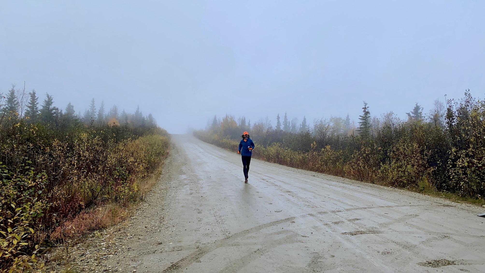
Conditions on Ester Dome during the 2020 marathon
Methods
Methods and data are the same as in my previous post, except the daily data has been updated to include years through 2020. The R code is available at the end of the previous post.
Results
Race day weather
Temperatures at the airport on race day ranged from 19.9 °F in 1972 to 68 °F in 1969, but the average range is between 34.5 and 53.0 °F. Using our model of Ester Dome temperatures, we get an average range of 29.8 and 47.3 °F and an overall min / max of 16.1 / 61.3 °F up on the Dome. Generally speaking, it will be below freezing on Ester Dome, but usually before most of the runners get up there.
Precipitation (rain, sleet or snow) has fallen on 18 out of 58 race days, or 31% of the time, and measurable snowfall has been recorded on four of those eighteen. The highest amount fell in 2014 with 0.36 inches of liquid precipitation (no snow was recorded and the temperatures were between 45 and 51 °F so it was almost certainly all rain, even on Ester Dome). More than a quarter of an inch of precipitation fell in three of the eighteen years when it rained or snowed (1990, 1993, and 2014), but most rainfall totals are much smaller.
Measurable snow fell at the airport in four years, or seven percent of the time: 4.1 inches in 1993, 2.1 inches in 1985, 1.2 inches in 1996, and 0.4 inches in 1992. But that’s at the airport station. Five of the 14 years where measurable precipitation fell at the airport and no snow fell, had possible minimum temperatures on Ester Dome that were below freezing. It’s likely that some of the precipitation recorded at the airport in those years was coming down as snow up on Ester Dome. If so, that means snow may have fallen on nine race days, bringing the percentage up to sixteen percent.
Wind data from the airport has only been recorded since 1984, but from those years the average wind speed at the airport on race day is 4.8 miles per hour. The highest 2-minute wind speed during Equinox race day was 21 miles per hour in 2003. Unfortunately, no wind data is available for Ester Dome, but it’s likely to be higher than what is recorded at the airport.
Weather from the week prior
It’s also useful to look at the weather from the week before the race, since excessive pre-race rain or snow can make conditions on race day very different, even if the race day weather is pleasant. The first year I ran the full marathon (2013), it snowed the week before and much of the trail in the woods before the water stop near Henderson and all of the out and back were covered in snow.
The most dramatic example of this was 1992 where 23 inches (!) of snow fell at the airport in the week prior to the race, with much higher totals up on the summit of Ester Dome. Measurable snow has been recorded at the airport in the week prior to six races, but all the weekly totals are under an inch except for the snow year of 1992.
Precipitation has fallen in 46 of 58 pre-race weeks (79% of the time). Three years have had more than an inch of precipitation prior to the race: 1.49 inches in 2015, 1.26 inches in 1992 (most of which fell as snow), and 1.05 inches in 2007. On average, just over two tenths of an inch of precipitation falls in the week before the race.
Summary
The following stacked plots shows the weather for all 58 runnings of the Equinox marathon. The top panel shows the range of temperatures on race day from the airport station (wide bars) and estimated on Ester Dome (thin lines below bars). The shaded area at the bottom shows where temperatures are below freezing. The orange horizonal lines represent average high and low temperature in the valley (dashed lines) and on Ester Dome (solid orange lines).
The middle panel shows race day liquid precipitation (rain, melted snow). Bars marked with an asterisk indicate years where snow was also recorded at the airport, but remember that five of the other years with liquid precipitation probably experienced snow on Ester Dome (1977, 1986, 1991, 1994, and 2016) because the temperatures were likely to be below freezing at elevation.
The bottom panel shows precipitation totals from the week prior to the race. Bars marked with an asterisk indicate weeks where snow was also recorded at the airport.

Here’s a table with most of the data from the analysis.
| Date | min t | max t | ED min t | ED max t | awnd | prcp | snow | p prcp | p snow |
|---|---|---|---|---|---|---|---|---|---|
| 1963-09-21 | 32.0 | 54.0 | 27.5 | 48.2 | 0.00 | 0.0 | 0.01 | 0.0 | |
| 1964-09-19 | 34.0 | 57.9 | 29.4 | 51.8 | 0.00 | 0.0 | 0.03 | 0.0 | |
| 1965-09-25 | 37.9 | 60.1 | 33.1 | 53.9 | 0.00 | 0.0 | 0.80 | 0.0 | |
| 1966-09-24 | 36.0 | 62.1 | 31.3 | 55.8 | 0.00 | 0.0 | 0.01 | 0.0 | |
| 1967-09-23 | 35.1 | 57.9 | 30.4 | 51.8 | 0.00 | 0.0 | 0.00 | 0.0 | |
| 1968-09-21 | 23.0 | 44.1 | 19.1 | 38.9 | 0.00 | 0.0 | 0.04 | 0.0 | |
| 1969-09-20 | 35.1 | 68.0 | 30.4 | 61.3 | 0.00 | 0.0 | 0.00 | 0.0 | |
| 1970-09-19 | 24.1 | 39.9 | 20.1 | 34.9 | 0.00 | 0.0 | 0.42 | 0.0 | |
| 1971-09-18 | 35.1 | 55.9 | 30.4 | 50.0 | 0.00 | 0.0 | 0.14 | 0.0 | |
| 1972-09-23 | 19.9 | 42.1 | 16.1 | 37.0 | 0.00 | 0.0 | 0.01 | 0.2 | |
| 1973-09-22 | 30.0 | 44.1 | 25.6 | 38.9 | 0.00 | 0.0 | 0.05 | 0.0 | |
| 1974-09-21 | 48.0 | 60.1 | 42.5 | 53.9 | 0.08 | 0.0 | 0.00 | 0.0 | |
| 1975-09-20 | 37.9 | 55.9 | 33.1 | 50.0 | 0.02 | 0.0 | 0.02 | 0.0 | |
| 1976-09-18 | 34.0 | 59.0 | 29.4 | 52.9 | 0.00 | 0.0 | 0.54 | 0.0 | |
| 1977-09-24 | 36.0 | 48.9 | 31.3 | 43.4 | 0.06 | 0.0 | 0.20 | 0.0 | |
| 1978-09-23 | 30.0 | 42.1 | 25.6 | 37.0 | 0.00 | 0.0 | 0.10 | 0.3 | |
| 1979-09-22 | 35.1 | 62.1 | 30.4 | 55.8 | 0.00 | 0.0 | 0.17 | 0.0 | |
| 1980-09-20 | 30.9 | 43.0 | 26.5 | 37.8 | 0.00 | 0.0 | 0.35 | 0.0 | |
| 1981-09-19 | 37.0 | 43.0 | 32.2 | 37.8 | 0.15 | 0.0 | 0.04 | 0.0 | |
| 1982-09-18 | 42.1 | 61.0 | 37.0 | 54.8 | 0.02 | 0.0 | 0.22 | 0.0 | |
| 1983-09-17 | 39.9 | 46.9 | 34.9 | 41.5 | 0.00 | 0.0 | 0.05 | 0.0 | |
| 1984-09-22 | 28.9 | 60.1 | 24.6 | 53.9 | 5.8 | 0.00 | 0.0 | 0.08 | 0.0 |
| 1985-09-21 | 30.9 | 42.1 | 26.5 | 37.0 | 6.5 | 0.14 | 2.1 | 0.57 | 0.0 |
| 1986-09-20 | 36.0 | 52.0 | 31.3 | 46.3 | 8.3 | 0.07 | 0.0 | 0.21 | 0.0 |
| 1987-09-19 | 37.9 | 61.0 | 33.1 | 54.8 | 6.3 | 0.00 | 0.0 | 0.00 | 0.0 |
| 1988-09-24 | 37.0 | 45.0 | 32.2 | 39.7 | 4.0 | 0.00 | 0.0 | 0.11 | 0.0 |
| 1989-09-23 | 36.0 | 61.0 | 31.3 | 54.8 | 8.5 | 0.00 | 0.0 | 0.07 | 0.5 |
| 1990-09-22 | 37.9 | 50.0 | 33.1 | 44.4 | 7.8 | 0.26 | 0.0 | 0.00 | 0.0 |
| 1991-09-21 | 36.0 | 57.0 | 31.3 | 51.0 | 4.5 | 0.04 | 0.0 | 0.03 | 0.0 |
| 1992-09-19 | 24.1 | 33.1 | 20.1 | 28.5 | 6.7 | 0.01 | 0.4 | 1.26 | 23.0 |
| 1993-09-18 | 28.0 | 37.0 | 23.8 | 32.2 | 4.9 | 0.29 | 4.1 | 0.37 | 0.3 |
| 1994-09-24 | 27.0 | 51.1 | 22.8 | 45.5 | 6.0 | 0.02 | 0.0 | 0.08 | 0.0 |
| 1995-09-23 | 43.0 | 66.9 | 37.8 | 60.3 | 4.0 | 0.00 | 0.0 | 0.00 | 0.0 |
| 1996-09-21 | 28.9 | 37.9 | 24.6 | 33.1 | 6.9 | 0.06 | 1.2 | 0.26 | 0.0 |
| 1997-09-20 | 27.0 | 55.0 | 22.8 | 49.1 | 3.8 | 0.00 | 0.0 | 0.03 | 0.0 |
| 1998-09-19 | 42.1 | 60.1 | 37.0 | 53.9 | 4.9 | 0.00 | 0.0 | 0.37 | 0.0 |
| 1999-09-18 | 39.0 | 64.9 | 34.1 | 58.4 | 3.8 | 0.00 | 0.0 | 0.26 | 0.0 |
| 2000-09-16 | 28.9 | 50.0 | 24.6 | 44.4 | 5.6 | 0.00 | 0.0 | 0.30 | 0.0 |
| 2001-09-22 | 33.1 | 57.0 | 28.5 | 51.0 | 1.6 | 0.00 | 0.0 | 0.00 | 0.0 |
| 2002-09-21 | 33.1 | 48.9 | 28.5 | 43.4 | 3.8 | 0.00 | 0.0 | 0.03 | 0.0 |
| 2003-09-20 | 26.1 | 46.0 | 22.0 | 40.7 | 9.6 | 0.00 | 0.0 | 0.00 | 0.0 |
| 2004-09-18 | 26.1 | 48.0 | 22.0 | 42.5 | 4.3 | 0.00 | 0.0 | 0.25 | 0.0 |
| 2005-09-17 | 37.0 | 63.0 | 32.2 | 56.6 | 0.9 | 0.00 | 0.0 | 0.09 | 0.0 |
| 2006-09-16 | 46.0 | 64.0 | 40.7 | 57.6 | 4.3 | 0.00 | 0.0 | 0.00 | 0.0 |
| 2007-09-22 | 25.0 | 45.0 | 20.9 | 39.7 | 4.7 | 0.00 | 0.0 | 1.05 | 0.0 |
| 2008-09-20 | 34.0 | 51.1 | 29.4 | 45.5 | 4.5 | 0.00 | 0.0 | 0.08 | 0.0 |
| 2009-09-19 | 39.0 | 50.0 | 34.1 | 44.4 | 5.8 | 0.00 | 0.0 | 0.25 | 0.0 |
| 2010-09-18 | 35.1 | 64.9 | 30.4 | 58.4 | 2.5 | 0.00 | 0.0 | 0.00 | 0.0 |
| 2011-09-17 | 39.9 | 57.9 | 34.9 | 51.8 | 1.3 | 0.00 | 0.0 | 0.44 | 0.0 |
| 2012-09-22 | 46.9 | 66.9 | 41.5 | 60.3 | 6.0 | 0.00 | 0.0 | 0.33 | 0.0 |
| 2013-09-21 | 24.3 | 44.1 | 20.3 | 38.9 | 5.1 | 0.00 | 0.0 | 0.13 | 0.6 |
| 2014-09-20 | 45.0 | 51.1 | 39.7 | 45.5 | 1.6 | 0.36 | 0.0 | 0.00 | 0.0 |
| 2015-09-19 | 37.9 | 44.1 | 33.1 | 38.9 | 2.9 | 0.01 | 0.0 | 1.49 | 0.0 |
| 2016-09-17 | 34.0 | 57.9 | 29.4 | 51.8 | 2.2 | 0.01 | 0.0 | 0.61 | 0.0 |
| 2017-09-16 | 33.1 | 66.0 | 28.5 | 59.5 | 3.1 | 0.00 | 0.0 | 0.02 | 0.0 |
| 2018-09-15 | 44.1 | 60.1 | 38.9 | 53.9 | 3.8 | 0.00 | 0.0 | 0.00 | 0.0 |
| 2019-09-21 | 37.0 | 45.0 | 32.2 | 39.7 | 7.6 | 0.13 | 0.0 | 0.40 | 0.0 |
| 2020-09-19 | 39.9 | 53.1 | 34.9 | 47.3 | 2.2 | 0.12 | 0.0 | 0.10 | 0.0 |
Introduction
Several years ago I wrote a post about past Equinox Marathon weather. Since that post Andrea and I have run the relay twice, and I’ve run the full marathon twice. This post updates the statistics and plots to include last year’s weather data.
The official race this year was cancelled due to covid-19, but I will run it anyway, and I have no doubt many others will too. Last year’s race featured rain down in the valley, and high winds and a mixture of snow, sleet, and rain up on Ester Dome.

Conditions on Ester Dome during the 2019 Equinox Marathon
Methods
Methods and data are the same as in my previous post, except the daily data has been updated to include years through 2019. The R code is available at the end of the previous post.
Results
Race day weather
Temperatures at the airport on race day ranged from 19.9 °F in 1972 to 68 °F in 1969, but the average range is between 34.4 and 53.0 °F. Using our model of Ester Dome temperatures, we get an average range of 29.7 and 47.3 °F and an overall min / max of 16.1 / 61.3 °F up on the Dome. Generally speaking, it is below freezing on Ester Dome, but usually before most of the runners get up there.
Precipitation (rain, sleet or snow) has fallen on 17 out of 57 race days, or 30% of the time, and measurable snowfall has been recorded on four of those seventeen. The highest amount fell in 2014 with 0.36 inches of liquid precipitation (no snow was recorded and the temperatures were between 45 and 51 °F so it was almost certainly all rain, even on Ester Dome). More than a quarter of an inch of precipitation fell in three of the seventeen years when it rained or snowed (1990, 1993, and 2014), but most rainfall totals are much smaller.
Measurable snow fell at the airport in four years, or seven percent of the time: 4.1 inches in 1993, 2.1 inches in 1985, 1.2 inches in 1996, and 0.4 inches in 1992. But that’s at the airport station. Five of the 13 years where measurable precipitation fell at the airport and no snow fell, had possible minimum temperatures on Ester Dome that were below freezing. It’s likely that some of the precipitation recorded at the airport in those years was coming down as snow up on Ester Dome. If so, that means snow may have fallen on nine race days, bringing the percentage up to sixteen percent.
Wind data from the airport has only been recorded since 1984, but from those years the average wind speed at the airport on race day is 4.8 miles per hour. The highest 2-minute wind speed during Equinox race day was 21 miles per hour in 2003. Unfortunately, no wind data is available for Ester Dome, but it’s likely to be higher than what is recorded at the airport.
Weather from the week prior
It’s also useful to look at the weather from the week before the race, since excessive pre-race rain or snow can make conditions on race day very different, even if the race day weather is pleasant. The first year I ran the full marathon (2013), it snowed the week before and much of the trail in the woods before the water stop near Henderson and all of the out and back were covered in snow.
The most dramatic example of this was 1992 where 23 inches (!) of snow fell at the airport in the week prior to the race, with much higher totals up on the summit of Ester Dome. Measurable snow has been recorded at the airport in the week prior to six races, but all the weekly totals are under an inch except for the snow year of 1992.
Precipitation has fallen in 45 of 57 pre-race weeks (79% of the time). Three years have had more than an inch of precipitation prior to the race: 1.49 inches in 2015, 1.26 inches in 1992 (most of which fell as snow), and 1.05 inches in 2007. On average, just over two tenths of an inch of precipitation falls in the week before the race.
Summary
The following stacked plots shows the weather for all 57 runnings of the Equinox marathon. The top panel shows the range of temperatures on race day from the airport station (wide bars) and estimated on Ester Dome (thin lines below bars). The shaded area at the bottom shows where temperatures are below freezing. The orange horizonal lines represent average high and low temperature in the valley (dashed lines) and on Ester Dome (solid orange lines).
The middle panel shows race day liquid precipitation (rain, melted snow). Bars marked with an asterisk indicate years where snow was also recorded at the airport, but remember that five of the other years with liquid precipitation probably experienced snow on Ester Dome (1977, 1986, 1991, 1994, and 2016) because the temperatures were likely to be below freezing at elevation.
The bottom panel shows precipitation totals from the week prior to the race. Bars marked with an asterisk indicate weeks where snow was also recorded at the airport.

Here’s a table with most of the data from the analysis.
| Date | min t | max t | ED min t | ED max t | awnd | prcp | snow | p prcp | p snow |
|---|---|---|---|---|---|---|---|---|---|
| 1963-09-21 | 32.0 | 54.0 | 27.5 | 48.2 | 0.00 | 0.0 | 0.01 | 0.0 | |
| 1964-09-19 | 34.0 | 57.9 | 29.4 | 51.8 | 0.00 | 0.0 | 0.03 | 0.0 | |
| 1965-09-25 | 37.9 | 60.1 | 33.1 | 53.9 | 0.00 | 0.0 | 0.80 | 0.0 | |
| 1966-09-24 | 36.0 | 62.1 | 31.3 | 55.8 | 0.00 | 0.0 | 0.01 | 0.0 | |
| 1967-09-23 | 35.1 | 57.9 | 30.4 | 51.8 | 0.00 | 0.0 | 0.00 | 0.0 | |
| 1968-09-21 | 23.0 | 44.1 | 19.1 | 38.9 | 0.00 | 0.0 | 0.04 | 0.0 | |
| 1969-09-20 | 35.1 | 68.0 | 30.4 | 61.3 | 0.00 | 0.0 | 0.00 | 0.0 | |
| 1970-09-19 | 24.1 | 39.9 | 20.1 | 34.9 | 0.00 | 0.0 | 0.42 | 0.0 | |
| 1971-09-18 | 35.1 | 55.9 | 30.4 | 50.0 | 0.00 | 0.0 | 0.14 | 0.0 | |
| 1972-09-23 | 19.9 | 42.1 | 16.1 | 37.0 | 0.00 | 0.0 | 0.01 | 0.2 | |
| 1973-09-22 | 30.0 | 44.1 | 25.6 | 38.9 | 0.00 | 0.0 | 0.05 | 0.0 | |
| 1974-09-21 | 48.0 | 60.1 | 42.5 | 53.9 | 0.08 | 0.0 | 0.00 | 0.0 | |
| 1975-09-20 | 37.9 | 55.9 | 33.1 | 50.0 | 0.02 | 0.0 | 0.02 | 0.0 | |
| 1976-09-18 | 34.0 | 59.0 | 29.4 | 52.9 | 0.00 | 0.0 | 0.54 | 0.0 | |
| 1977-09-24 | 36.0 | 48.9 | 31.3 | 43.4 | 0.06 | 0.0 | 0.20 | 0.0 | |
| 1978-09-23 | 30.0 | 42.1 | 25.6 | 37.0 | 0.00 | 0.0 | 0.10 | 0.3 | |
| 1979-09-22 | 35.1 | 62.1 | 30.4 | 55.8 | 0.00 | 0.0 | 0.17 | 0.0 | |
| 1980-09-20 | 30.9 | 43.0 | 26.5 | 37.8 | 0.00 | 0.0 | 0.35 | 0.0 | |
| 1981-09-19 | 37.0 | 43.0 | 32.2 | 37.8 | 0.15 | 0.0 | 0.04 | 0.0 | |
| 1982-09-18 | 42.1 | 61.0 | 37.0 | 54.8 | 0.02 | 0.0 | 0.22 | 0.0 | |
| 1983-09-17 | 39.9 | 46.9 | 34.9 | 41.5 | 0.00 | 0.0 | 0.05 | 0.0 | |
| 1984-09-22 | 28.9 | 60.1 | 24.6 | 53.9 | 5.8 | 0.00 | 0.0 | 0.08 | 0.0 |
| 1985-09-21 | 30.9 | 42.1 | 26.5 | 37.0 | 6.5 | 0.14 | 2.1 | 0.57 | 0.0 |
| 1986-09-20 | 36.0 | 52.0 | 31.3 | 46.3 | 8.3 | 0.07 | 0.0 | 0.21 | 0.0 |
| 1987-09-19 | 37.9 | 61.0 | 33.1 | 54.8 | 6.3 | 0.00 | 0.0 | 0.00 | 0.0 |
| 1988-09-24 | 37.0 | 45.0 | 32.2 | 39.7 | 4.0 | 0.00 | 0.0 | 0.11 | 0.0 |
| 1989-09-23 | 36.0 | 61.0 | 31.3 | 54.8 | 8.5 | 0.00 | 0.0 | 0.07 | 0.5 |
| 1990-09-22 | 37.9 | 50.0 | 33.1 | 44.4 | 7.8 | 0.26 | 0.0 | 0.00 | 0.0 |
| 1991-09-21 | 36.0 | 57.0 | 31.3 | 51.0 | 4.5 | 0.04 | 0.0 | 0.03 | 0.0 |
| 1992-09-19 | 24.1 | 33.1 | 20.1 | 28.5 | 6.7 | 0.01 | 0.4 | 1.26 | 23.0 |
| 1993-09-18 | 28.0 | 37.0 | 23.8 | 32.2 | 4.9 | 0.29 | 4.1 | 0.37 | 0.3 |
| 1994-09-24 | 27.0 | 51.1 | 22.8 | 45.5 | 6.0 | 0.02 | 0.0 | 0.08 | 0.0 |
| 1995-09-23 | 43.0 | 66.9 | 37.8 | 60.3 | 4.0 | 0.00 | 0.0 | 0.00 | 0.0 |
| 1996-09-21 | 28.9 | 37.9 | 24.6 | 33.1 | 6.9 | 0.06 | 1.2 | 0.26 | 0.0 |
| 1997-09-20 | 27.0 | 55.0 | 22.8 | 49.1 | 3.8 | 0.00 | 0.0 | 0.03 | 0.0 |
| 1998-09-19 | 42.1 | 60.1 | 37.0 | 53.9 | 4.9 | 0.00 | 0.0 | 0.37 | 0.0 |
| 1999-09-18 | 39.0 | 64.9 | 34.1 | 58.4 | 3.8 | 0.00 | 0.0 | 0.26 | 0.0 |
| 2000-09-16 | 28.9 | 50.0 | 24.6 | 44.4 | 5.6 | 0.00 | 0.0 | 0.30 | 0.0 |
| 2001-09-22 | 33.1 | 57.0 | 28.5 | 51.0 | 1.6 | 0.00 | 0.0 | 0.00 | 0.0 |
| 2002-09-21 | 33.1 | 48.9 | 28.5 | 43.4 | 3.8 | 0.00 | 0.0 | 0.03 | 0.0 |
| 2003-09-20 | 26.1 | 46.0 | 22.0 | 40.7 | 9.6 | 0.00 | 0.0 | 0.00 | 0.0 |
| 2004-09-18 | 26.1 | 48.0 | 22.0 | 42.5 | 4.3 | 0.00 | 0.0 | 0.25 | 0.0 |
| 2005-09-17 | 37.0 | 63.0 | 32.2 | 56.6 | 0.9 | 0.00 | 0.0 | 0.09 | 0.0 |
| 2006-09-16 | 46.0 | 64.0 | 40.7 | 57.6 | 4.3 | 0.00 | 0.0 | 0.00 | 0.0 |
| 2007-09-22 | 25.0 | 45.0 | 20.9 | 39.7 | 4.7 | 0.00 | 0.0 | 1.05 | 0.0 |
| 2008-09-20 | 34.0 | 51.1 | 29.4 | 45.5 | 4.5 | 0.00 | 0.0 | 0.08 | 0.0 |
| 2009-09-19 | 39.0 | 50.0 | 34.1 | 44.4 | 5.8 | 0.00 | 0.0 | 0.25 | 0.0 |
| 2010-09-18 | 35.1 | 64.9 | 30.4 | 58.4 | 2.5 | 0.00 | 0.0 | 0.00 | 0.0 |
| 2011-09-17 | 39.9 | 57.9 | 34.9 | 51.8 | 1.3 | 0.00 | 0.0 | 0.44 | 0.0 |
| 2012-09-22 | 46.9 | 66.9 | 41.5 | 60.3 | 6.0 | 0.00 | 0.0 | 0.33 | 0.0 |
| 2013-09-21 | 24.3 | 44.1 | 20.3 | 38.9 | 5.1 | 0.00 | 0.0 | 0.13 | 0.6 |
| 2014-09-20 | 45.0 | 51.1 | 39.7 | 45.5 | 1.6 | 0.36 | 0.0 | 0.00 | 0.0 |
| 2015-09-19 | 37.9 | 44.1 | 33.1 | 38.9 | 2.9 | 0.01 | 0.0 | 1.49 | 0.0 |
| 2016-09-17 | 34.0 | 57.9 | 29.4 | 51.8 | 2.2 | 0.01 | 0.0 | 0.61 | 0.0 |
| 2017-09-16 | 33.1 | 66.0 | 28.5 | 59.5 | 3.1 | 0.00 | 0.0 | 0.02 | 0.0 |
| 2018-09-15 | 44.1 | 60.1 | 38.9 | 53.9 | 3.8 | 0.00 | 0.0 | 0.00 | 0.0 |
| 2019-09-21 | 37.0 | 45.0 | 32.2 | 39.7 | 7.6 | 0.13 | 0.0 | 0.40 | 0.0 |
Introduction
At the 57th running of the Equinox Marathon last weekend Aaron Fletcher broke Stan Justice’s 1985 course record, one of the oldest running records in Alaska sports. On the Equinox Marathon Facebook page Stan and Matias Saari were discussing whether more favorable weather might have meant an even faster record-breaking effort. Stan writes:
Where is a statistician when you need one. Would be interesting to compare times of all 2018 runners with their 2019 times.
I’m not a statistician, but let’s take a look.
Results
We’ve got Equinox Marathon finish time data going back to 1997, so we’ll compare the finish times for all runners who competed in consecutive years, subtracting their current year finish times (in hours) from the previous year. By this metric, negative values indicate individuals who ran faster in the current year than the previous. For example, I completed the race in 4:40:05 in 2018, and finished in 4:33:42 this year. My “hours_delta” for 2019 is -0.106 hours, or 6 minutes, 23 seconds faster.
Here’s the distribution of this statistic for 2019:

There are several people who were dramatically faster (on the left side of the graph), but the overall picture shows that times in 2019 were slower than 2018. The dark cyan line is the median value, which is at 0.18 hours or 10 minutes, 35 seconds slower. There were 53 runners that ran the race faster in 2019 than 2018 (including me), and 115 who were slower. That’s a pretty dramatic difference.
Here’s that relationship for all the years where we have data:

The orange bars are runners who ran that year’s Equinox faster than the previous year and the dark cyan bars are those who were slower. 2019 is dramatically different than most other years for how much slower most people ran. 2013 is another particularly slow year. Fast years include 2007, 2009, and last year.
Here’s another way to look at the data. It shows the median number of minutes runners ran Equinox faster (negative numbers) or slower (positive) in consecutive years.

You can see that finish times were dramatically slower in 2019, and much faster in 2018. Since this comparison is using paired comparisons between years, at least part of the reason 2019 seemed like such a slow race is that 2018 was a fast one.
Two-year lag
Let’s see what happens if we use a two-year lag to calculate the differences. Instead of comparing the current year’s results with the previous year for individual runners that raced in both years, we’ll compare the current year with two years prior. For example runners that ran the race this year and in 2017.
Here’s what the distribution looks like comparing 2019 and 2017 results from the same runner.

It’s a similar pattern, with the median values at 0.18 hours, indicating that runners were almost 10 minutes slower in 2019 when compared against their 2017 times. This strengthens the evidence that 2019 was a particularly difficult year to run the race.
Median difference by year for all years of the two-year lag data:

Remember that the dark cyan bars are years with slower finish times and orange are faster. 2019 still comes out as an outlier, along with 2013. 2007 is the clear winner for fast times.
All pairwise race results
If we can do one and two year lags, how about combining all the pairwise race results? At some point the comparison is no longer a good one because of the large time interval between races, so we will restrict the comparisons to six or fewer years between results. We’ll also remove the earliest years from the results because those years are likely biased by having fewer long lag results.
Here’s the same plot showing difference times in minutes for all pairwise race results, six years and fewer.

You can see that there’s a pretty strong bias toward slower times, which is likely due to people aging and their times getting slower. The conditions were good enough in 2007 that this aging effect was offset and people running in that race tended to do it faster than their earlier performances despite being older. Even so, 2019 still stands out as one of the most difficult races.
Here’s the aging effect:
##
## Call:
## lm(formula = hours_delta ~ years_delta, data = all_through_six)
##
## Residuals:
##     Min      1Q  Median      3Q     Max
## -6.3242 -0.3639 -0.0415  0.3115  6.4441
##
## Coefficients:
##             Estimate Std. Error t value            Pr(>|t|)
## (Intercept) -0.03390    0.01934  -1.752              0.0797 .
## years_delta  0.05152    0.00558   9.234 <0.0000000000000002 ***
## ---
## Signif. codes:  0 '***' 0.001 '**' 0.01 '*' 0.05 '.' 0.1 ' ' 1
##
## Residual standard error: 0.8845 on 8664 degrees of freedom
## Multiple R-squared:  0.009745,   Adjusted R-squared:  0.00963
## F-statistic: 85.26 on 1 and 8664 DF,  p-value: < 0.00000000000000022
There’s a very significant positive relationship between the difference in years and the difference in marathon times for those runners (years_delta in the coefficient results above). The longer the gap between races, the slower a runner is by just over 3 minutes each year. Notice, however, that the noise in the data is so great that this model, no matter how significant the coefficients, explains almost none of the variation in the difference in marathon times (dismally small R-squared values).
Weather
The conditions in this year’s race were particularly harsh with a fairly constant 40 °F temperature and light rain falling at valley level; and below freezing temperatures, high winds, and snow falling up on Ester Dome. The trail was muddy, soft, and slippery in places, especially the single track and the on the unpaved section of Henderson Road. Compare this with last year when the weather was gorgeous: dry, sunny, and temperatures ranging from 39—60 °F.
We took a look at the differences in weather between years to see if there is a relationship between weather differences and finish time differences, but none of the models we tried were any good at predicting differences in finish times, probably because of the huge variation in finish times that had nothing to do with the weather. There are too many other factors contributing to an individual’s performance from one year to the next to be able to pull out just the effects of weather on the results.
Conclusion
2019 was a very slow year when we compared runners who completed Equinox in 2019 and earlier years. In fact, there’s some evidence that it’s the slowest year of all the years considered here (1997—2019). We could find no statistical evidence to show that weather was the cause of this, but anyone who was out there on race day this year knows it played a part in their finish times. I ran the race this year and last and managed to improve on my time despite the conditions, but I don’t think there’s any question that I would have improved my time even more had it been warm and sunny instead of cold, windy, and wet. Congratulations to all the competitors in this year’s race. It was a fun, but challenging year for Equinox.