I've decided to migrate this blog to a quarto-based blog format. All future posts will be found here: https://swingley.dev/blog2.

Ruffed Grouse, April 2023
We’ve been keeping a yard list of all the animals we see since we moved to the Goldstream Valley in 2008. At the end of the year it’s fun to look at the data and compare this year against previous years.
We saw 39 different species of bird, 8 mammal species, and one amphibian (the full list). In an average year we see 36 bird species, 7 mammals, and the one amphibian we have in the Interior, so we saw a few more than usual in 2023.
Here’s a list of species we either saw for the first time this year, or are uncommonly seen on our property:
| Common Name | Years seen (including 2023) |
|---|---|
| Coyote | 1 |
| Northern Waterthrush | 1 |
| Townsend’s Solitaire | 1 |
| Ruffed Grouse | 2 |
| Black-billed Magpie | 3 |
| Alder Flycatcher | 4 |
| Lynx | 4 |
And we only missed one species we commonly see, Northern Shrike, which we’ve seen in 11 out of 16 years.
Introduction
For the past two years I’ve played Yahoo fantasy baseball with a group of friends. It’s a fun addition to watching games because it requires you to pay attention to more than just the players on the teams you root for (especially important if your favorite “team” is the Athletics).
Last year we had a draft party and it was interesting to see how different people approached the draft. Some of us chose players for emotional reasons like whether they played for the team they rooted for or what country the player was from, and some used a very analytical approach. The last two years I’ve tended to be more on the emotional side, choosing preferrentialy for former Oakland Athletcs players in the first year, and current Phillies last year. Some brought computers to track choices and rankings, and some didn’t bring anything at all except their phones and minds.
I’ve been working on my draft strategy for next year, and plan to use a more analytical approach to the draft. I’m working on an app that will have all the players in draft ranked, and allow me to easily mark off who has been selected, and who I’ve added to my team in real time as the draft is underway.
One of the important considerations for choosing any player is what positions they can play. Not only do you need to field a complete team with pitchers, catchers, infielders, and outfielders, but some players are capable of playing multiple positions, and those players can be more valuable to a fantasy manager than their pure numbers would suggest because you can plug them into different positions on any given day. Last year I had Alec Bohm on my team, which allowed me to fill either first base (typically manned by Vladimir Gurerro Jr) or third, depending on what teams were playing or who might be injured or getting a day off. I used Brandon Drury to great effect two years ago because he was eligible for three infield positions.
Positional eligibility for Yahoo fantasy follows these rules:
- Position eligibility – 5 starts or 10 total appearances in a position.
- Pitcher eligibility – 3 starts to be a starter, or 5 relief appearances to qualify as a reliever.
In this post I will use Retrosheet event data to determine the positional eligibility for all the players who played in the majors last year. In cases where a player in the draft hasn’t played in the majors but is likely to reach Major League Baseball in 2024, I’ll just use whatever position the projections have him in.
Methods
I’m going to use the retrosheet R package to load the event files for 2023, then determine how many games each player started and substituted at each position, and apply Yahoo’s rules to determine eligibility.
We’ll load some libraries, get the team IDs, and map Retrosheet position IDs to the usual position abbreviations.
library(tidyr)
library(dplyr)
library(purrr)
library(retrosheet)
library(glue)

YEAR <- 2023

team_ids <- getTeamIDs(YEAR)

positions <- tribble(
   ~fieldPos, ~pos,
   "1", "P",
   "2", "C",
   "3", "1B",
   "4", "2B",
   "5", "3B",
   "6", "SS",
   "7", "LF",
   "8", "CF",
   "9", "RF",
   "10", "DH",
   "11", "PH",
   "12", "PR"
)
Next, we write a function to retrieve the data for a single team’s home games, and extract the starting and subtitution information, which are stored as $start and $sub matrices in the Retrosheet event files. Then loop over this function for every team, and convert position ID to the position abbreviations.
get_pbp <- function(team_id) {
   print(glue("loading {team_id}"))

   pbp <- getRetrosheet("play", YEAR, team_id)

   starters <- map(
      seq(1, length(pbp)),
      function(game) {
      pbp[[game]]$start |>
         as_tibble()
      }
   ) |>
      list_rbind() |>
      mutate(start_sub = "start")

   subs <- map(
      seq(1, length(pbp)),
      function(game) {
      pbp[[game]]$sub |>
         as_tibble()
      }
   ) |>
      list_rbind() |>
      mutate(start_sub = "sub")

   bind_rows(starters, subs)
}

pbp_start_sub <- map(
   team_ids,
   get_pbp
) |>
   list_rbind() |>
   inner_join(positions, by = "fieldPos")
That data frame looks like this, with one row for every player that played in any game during the 2023 regular season:
# A tibble: 76,043 × 7
   retroID  name                  team  batPos fieldPos start_sub pos
   <chr>    <chr>                 <chr> <chr>  <chr>    <chr>     <chr>
   1 sprig001 George Springer       0     1      9        start     RF
   2 bichb001 Bo Bichette           0     2      6        start     SS
   3 guerv002 Vladimir Guerrero Jr. 0     3      3        start     1B
   4 chapm001 Matt Chapman          0     4      5        start     3B
   5 merrw001 Whit Merrifield       0     5      7        start     LF
   6 kirka001 Alejandro Kirk        0     6      2        start     C
   7 espis001 Santiago Espinal      0     7      4        start     2B
   8 luplj001 Jordan Luplow         0     8      10       start     DH
   9 kierk001 Kevin Kiermaier       0     9      8        start     CF
  10 bassc001 Chris Bassitt         0     0      1        start     P
# ℹ 76,033 more rows
Next, we convert that into appearances by grouping the data by player, whether they were a starter or substitute, and by their position. Since each row in the original data frame is per game, we can use n() to count the games each player started and subbed for each position.
appearances <- pbp_start_sub |>
   group_by(retroID, name, start_sub, pos) |>
   summarize(games = n(), .groups = "drop") |>
   pivot_wider(names_from = start_sub, values_from = games)
That looks like this:
# A tibble: 3,479 × 5
   retroID  name          pos     sub start
   <chr>    <chr>         <chr> <int> <int>
   1 abadf001 Fernando Abad P         6    NA
   2 abboa001 Andrew Abbott P        NA    21
   3 abboc001 Cory Abbott   P        22    NA
   4 abrac001 CJ Abrams     SS        3   148
   5 abrac001 CJ Abrams     PH        2    NA
   6 abrac001 CJ Abrams     PR        1    NA
   7 abrea001 Albert Abreu  P        45    NA
   8 abreb002 Bryan Abreu   P        72    NA
   9 abrej003 Jose Abreu    1B       NA   134
  10 abrej003 Jose Abreu    DH       NA     7
# ℹ 3,469 more rows
Finally, we group by the player and position, calculate eligibility, then group by player and combine all the positions they are eligible for into a single string. There’s a little funny business at the end to remove pitching eligibility from position players who are called into action as pitchers in blow out games, and player suffixes, which may or may not be necessary for matching against your projection ranks.
eligibility <- appearances |>
   filter(pos != "PH", pos != "PR") |>
   mutate(
      sub = if_else(is.na(sub), 0, sub),
      start = if_else(is.na(start), 0, start),
      total = sub + start,
      eligible = case_when(
      pos == "P" & start >= 3 & sub >= 5 ~ "SP,RP",
      pos == "P" & start >= 3 ~ "SP",
      pos == "P" & sub >= 5 ~ "RP",
      pos == "P" ~ "P",
      start >= 5 | total >= 10 ~ pos,
      TRUE ~ NA
      )
   ) |>
   filter(!is.na(eligible)) |>
   arrange(retroID, name, desc(total)) |>
   group_by(retroID, name) |>
   summarize(
      eligible = paste(eligible, collapse = ","),
      eligible = gsub(",P$", "", eligible),
      .groups = "drop"
   ) |>
   mutate(
      name = gsub(" (Jr.|II|IV)", "", name)
   )
Here’s a look at the final results. You can download the full data as a CSV file below.
# A tibble: 1,402 × 3
   retroID  name            eligible
   <chr>    <chr>           <chr>
   1 abadf001 Fernando Abad   RP
   2 abboa001 Andrew Abbott   SP
   3 abboc001 Cory Abbott     RP
   4 abrac001 CJ Abrams       SS
   5 abrea001 Albert Abreu    RP
   6 abreb002 Bryan Abreu     RP
   7 abrej003 Jose Abreu      1B,DH
   8 abrew002 Wilyer Abreu    CF,LF
   9 acevd001 Domingo Acevedo RP
  10 actog001 Garrett Acton   RP
# ℹ 1,392 more rows
Who is eligible for the most positions? Here's the top 20:
   retroID  name              eligible
   <chr>    <chr>             <chr>
 1 herne001 Enrique Hernandez SS,2B,CF,3B,LF,1B
 2 diaza003 Aledmys Diaz      3B,SS,LF,2B,1B,DH
 3 hampg001 Garrett Hampson   SS,CF,RF,2B,LF
 4 mckiz001 Zach McKinstry    3B,2B,RF,LF,SS
 5 ariag002 Gabriel Arias     SS,1B,RF,3B
 6 bertj001 Jon Berti         SS,3B,LF,2B
 7 biggc002 Cavan Biggio      2B,RF,1B,3B
 8 cabro002 Oswaldo Cabrera   LF,RF,3B,SS
 9 castw003 Willi Castro      LF,CF,3B,2B
10 dubom001 Mauricio Dubon    2B,CF,LF,SS
11 edmat001 Tommy Edman       2B,SS,CF,RF
12 gallj002 Joey Gallo        1B,LF,CF,RF
13 ibana001 Andy Ibanez       2B,3B,LF,RF
14 newmk001 Kevin Newman      3B,SS,2B,1B,DH
15 rengl001 Luis Rengifo      2B,SS,3B,RF
16 senzn001 Nick Senzel       3B,LF,CF,RF
17 shorz001 Zack Short        2B,SS,3B,RP
18 stees001 Spencer Steer     1B,3B,LF,2B,DH
19 vargi001 Ildemaro Vargas   3B,2B,SS,LF
20 vierm001 Matt Vierling     RF,LF,3B,CF
References and Acknowledgements
The information used here was obtained free of charge from and is copyrighted by Retrosheet. Interested parties may contact Retrosheet at “www.retrosheet.org”.
Friday night we got 2.4 inches of snow at home, after a storm earlier in the week dropped a total of 6.9 inches of snow (0.51 inches of liquid). I plowed the road on Wednesday afternoon after most of that first storm’s snow had fallen and got up Saturday morning debating about whether I should plow again. My normal rule is if we get more than two inches I’ll plow, but I didn’t feel like it and left it. It’s snowing again today, so I will probably wind up plowing soon.
Feeling somewhat responsible for keeping the road clear makes winter something of a mixed bag for me because I enjoy the snow in the winter, but the drudgery of plowing turns snow storms into work. I remember plowing three times in the span of a week before Thanksgiving one year, and everyone in Fairbanks remembers Christmas 2021 when we had a major storm with both rain and snow, following by extreme cold, and most people were stuck at home until they could dig out. Our four wheeler was out of commission with a burned up rear differential, so I couldn’t do anything about it.
I thought it would be interesting to look at the storm data for Fairbanks. I’m defining a “storm” as any period with one or more consecutive days with precipitation, and by “precipitation” I mean either rain, or the liquid when daily snowfall is melted. I am not including “trace” precipitation (snowfall less than a tenth of an inch or liquid less than 0.01 inches) in this calculation.
Here’s a table of the top ten storms in Fairbanks, ranked by total precipitation.
| Rank | Start | Days | Total Snow (inches) | Total Precip (inches) | Per Day Snow | Per Day Precip |
|---|---|---|---|---|---|---|
| 1 | 1967‑08‑08 | 8 | 0.00 | 6.15 | 0.00 | 0.77 |
| 2 | 2003‑07‑26 | 11 | 0.00 | 4.57 | 0.00 | 0.42 |
| 3 | 1937‑01‑18 | 12 | 38.15 | 4.17 | 3.18 | 0.35 |
| 4 | 1990‑07‑07 | 7 | 0.00 | 3.98 | 0.00 | 0.57 |
| 5 | 2021‑12‑25 | 5 | 23.39 | 3.67 | 4.68 | 0.73 |
| 6 | 2019‑07‑28 | 11 | 0.00 | 3.59 | 0.00 | 0.33 |
| 7 | 2014‑06‑30 | 3 | 0.00 | 3.37 | 0.00 | 1.12 |
| 8 | 1948‑07‑18 | 7 | 0.00 | 3.18 | 0.00 | 0.45 |
| 9 | 1932‑08‑02 | 7 | 0.00 | 3.14 | 0.00 | 0.45 |
| 10 | 1962‑08‑25 | 6 | 0.00 | 3.09 | 0.00 | 0.52 |
A couple storms stand out to me. First, the Christmas 2021 event is 5th on the list (it winds up 13th on the list of winter storms ranked by total snowfall instead of liquid precipitation). It’s so high on this list because a significant amount of the total precipitation in that storm came as rain.
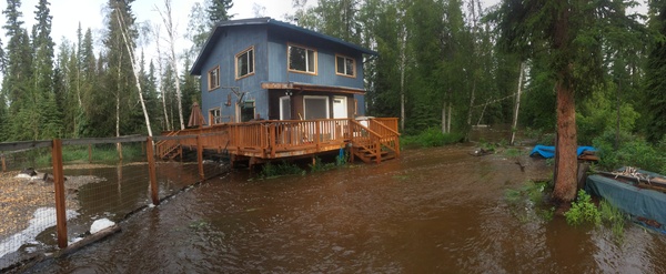
The other remarkable storm for me is the three day rainstorm that started on June 30th, 2014 and ended on July 2nd. We got a remarkable 1.12 inches of rain per day over those three days, and on July 2nd Goldstream Creek went over the banks at our house. Here’s a ranking of storms by average daily precipitation.
| Rank | Start | Days | Per Day Precip (inches) |
|---|---|---|---|
| 1 | 2014-07-07 | 1 | 1.13 |
| 2 | 2014-06-30 | 3 | 1.12 |
| 3 | 2014-09-01 | 2 | 1.12 |
| 4 | 1953-06-24 | 1 | 1.08 |
| 5 | 1992-07-06 | 1 | 0.95 |
The top three storms are all from the summer 2014.
There is evidence that one of the consequences of climate change in Alaska is an increase in the severity of storms. Here’s a ranking of the number of top 50 storms in each decade. The previous decade leads the list, and our current decade already has 2 such top 50 storms. Changing the minimum ranking from top 50 to top 100 doesn’t change the list much, and 2010‒2019 is a the top of that ranking as well.
| Decade | Number of Top 50 Storms |
|---|---|
| 2010‒2019 | 9 |
| 1920‒1929 | 7 |
| 1930‒1939 | 7 |
| 1940‒1949 | 6 |
| 1960‒1969 | 4 |
| 2000‒2009 | 4 |
| 1990‒1999 | 3 |
| 1910‒1919 | 2 |
| 1950‒1959 | 2 |
| 1970‒1979 | 2 |
| 1980‒1989 | 2 |
| 2020‒2023 | 2 |
Introduction
Yesterday Richard James posted about “hythergraphs”, which he’d seen on Toolik Field Station’s web site.
Hythergraphs show monthly weather parameters for an entire year, plotting temperature against precipitation (or other paired climate variables) against each other for each month of the year, drawing a line from month to month. When contrasting one climate record against another (historic vs. contemporary, one station against another), the differences stand out.
I was curious to see how easy it would be to produce one with R and ggplot.
Data
I’ll produce hythergraphs, one that compares Fairbanks Airport data against the data collected at our station on Goldstream Creek for the period of record for our station (2011‒2022) and one that compares the Fairbanks Airport station data from 1951‒2000 against data from 2001‒2022 (similar to what Richard did).
I’m using the following R packages:
library(tidyverse)
library(RPostgres)
library(lubridate)
library(scales)
I’ll skip the part where I pull the data from the GHCND database. What we need is a table of observations that look like this. We’ve got a categorical column (station_name), a date column, and the two climate variables we’re going to plot:
# A tibble: 30,072 × 4
   station_name     dte         PRCP   TAVG
   <chr>            <date>     <dbl>  <dbl>
   1 GOLDSTREAM CREEK 2011-04-01   0   -17.5
   2 GOLDSTREAM CREEK 2011-04-02   0   -15.6
   3 GOLDSTREAM CREEK 2011-04-03   0    -8.1
   4 GOLDSTREAM CREEK 2011-04-04   0    -5
   5 GOLDSTREAM CREEK 2011-04-05   0    -5
   6 GOLDSTREAM CREEK 2011-04-06   0.5  -3.9
   7 GOLDSTREAM CREEK 2011-04-07   0    -8.3
   8 GOLDSTREAM CREEK 2011-04-08   2    -5.85
   9 GOLDSTREAM CREEK 2011-04-09   0.5  -1.65
  10 GOLDSTREAM CREEK 2011-04-10   0    -4.45
# ℹ 30,062 more rows
From that raw data, we’ll aggregate to year and month, calculating the montly precipitation sum and mean average temperature, then aggregate to station and month, calculating the mean monthly precipitation and temperature.
The final step adds the necessary aesthetics to produce the plot using ggplot. We’ll draw the monthly scatterplot values using the first letter of the month, calculated using month_label = substring(month.name[month], 1, 1) below. To draw the lines from one month to the next we use geom_segement and calculate the ends of each segment by setting xend and yend to the next row’s value from the table.
One flaw in this approach is that there’s no line between December and January because there is no “next” value in the data frame. This could be fixed by seperately finding the January positions, then passing those to lead() as the default value (which is normally NA).
airport_goldstream <- pivot |>
   filter(dte >= "2010-04-01") |>
   # get monthly precip total, mean temp
   mutate(
      year = year(dte),
      month = month(dte)
   ) |>
   group_by(station_name, year, month) |>
   summarize(
      sum_prcp_in = sum(PRCP, na.rm = TRUE) / 25.4,
      mean_tavg_f = mean(TAVG, na.rm = TRUE) * 9 / 5.0 + 32,
      .groups = "drop"
   ) |>
   # get monthy means for each station
   group_by(station_name, month) |>
   summarize(
      mean_prcp_in = mean(sum_prcp_in),
      mean_tavg_f = mean(mean_tavg_f),
      .groups = "drop"
   ) |>
   # add month label, line segment ends
   arrange(station_name, month) |>
   group_by(station_name) |>
   mutate(
      month_label = substring(month.name[month], 1, 1),
      xend = lead(mean_prcp_in),
      yend = lead(mean_tavg_f)
   )
Here’s what that data frame looks like:
# A tibble: 24 × 7
# Groups:   station_name [2]
   station_name      month mean_prcp_in mean_tavg_f month_label  xend   yend
   <chr>             <dbl>        <dbl>       <dbl> <chr>       <dbl>  <dbl>
   1 FAIRBANKS INTL AP     1        0.635      -6.84  J           0.988 -0.213
   2 FAIRBANKS INTL AP     2        0.988      -0.213 F           0.635 11.5
   3 FAIRBANKS INTL AP     3        0.635      11.5   M           0.498 33.1
   4 FAIRBANKS INTL AP     4        0.498      33.1   A           0.670 51.2
   5 FAIRBANKS INTL AP     5        0.670      51.2   M           1.79  61.3
   6 FAIRBANKS INTL AP     6        1.79       61.3   J           2.41  63.1
   7 FAIRBANKS INTL AP     7        2.41       63.1   J           2.59  57.9
   8 FAIRBANKS INTL AP     8        2.59       57.9   A           1.66  46.5
   9 FAIRBANKS INTL AP     9        1.66       46.5   S           1.04  29.5
  10 FAIRBANKS INTL AP    10        1.04       29.5   O           1.16   5.21
# ℹ 14 more rows
Plots
Here’s the code to produce the plot. The month labels are displayed using geom_label, and the lines between months are generated from geom_segment.
airport_v_gsc <- ggplot(
   data = airport_goldstream,
   aes(x = mean_prcp_in, y = mean_tavg_f, color = station_name)
) +
   theme_bw() +
   geom_segment(aes(xend = xend, yend = yend, color = station_name)) +
   geom_label(aes(label = month_label), show.legend = FALSE) +
   scale_x_continuous(
      name = "Monthly Average Precipitation (inches liquid)",
      breaks = pretty_breaks(n = 10)
   ) +
   scale_y_continuous(
      name = "Monthly Average Tempearature (°F)",
      breaks = pretty_breaks(n = 10)
   ) +
   scale_color_manual(
      name = "Station",
      values = c("darkorange", "darkcyan")
   ) +
   theme(
      legend.position = c(0.8, 0.2),
      legend.background = element_rect(
      fill = "white", linetype = "solid", color = "grey80", size = 0.5
      )
   ) +
   labs(
      title = "Monthly temperature and precipitation",
      subtitle = "Fairbanks Airport and Goldstream Creek Stations, 2011‒2022"
   )
You can see from the plot that we are consistently colder than the airport, curiously more dramatically in the summer than winter. The airport gets slighly more precipitation in winter, but our summer precipitation is significantly higher, especially in August.
The standard plot to display this information would be two bar charts with one plot showing the monthly mean temperature for each station, and a second plot showing precipitation. The advantage of such a display is that the differences would be more clear, and the bars could include standard errors (or standard deviation) that would help provide an idea of whether the differences between stations are statistically significant or not.
For example (the lines above the bars are one standard deviation above or below the mean):
In this plot of the same data, you can tell from the standard deviation lines that the precipitation differences between stations are probably not significant, but the cooler summer temperatures at Goldstrem Creek may be.
If we calculate the standard deviations of the monthly means, we can use geom_tile to draw significance boxes around each monthly value in the hytherplot as Richard suggests in his post. Here’s the ggplot geom to do that:
geom_tile(
  aes(width = 2*sd_prcp_in, height = 2*sd_tavg_f, fill = station_name),
  show.legend = FALSE, alpha = 0.25
) +
And the updated plot:
This clearly shows the large variation in precipitation, and if you carefully compare the boxes for a particular month, you can draw concusions similar to what is made fairly clear in the bar charts. For example, if we focus on August, you can see that the Goldstream Creek precipitation box clearly overlaps that of the airport station, but the temperature ranges do not overlap, suggesting that August temperatures are cooler at Goldstream Creek but that while precipitation is much higher, it’s not statistically significant.
Airport station, different time periods
Here’s the plot for the airport station that is similar to the plot Richard created (I used different time periods).
This plot demonstrates that while temperatures have increased in the last two decades, it’s the differences in the pattern of precipitation that stands out, with July and August precipitation much larger in the last 20 years. It’s also curious that February and April precipitation is higher, but the differences are smaller in the other winter months. This is a case where some sense of the distribution of the values would be useful.