Introduction
While riding to work this morning I figured out a way to disentangle the effects of trail quality and physical conditioning (both of which improve over the season) from temperature, which also tends to increase throughout the season. As you recall in my previous post, I found that days into the season (winter day of year) and minimum temperature were both negatively related with fat bike energy consumption. But because those variables are also related to each other, we can’t make statements about them individually.
But what if we look at pairs of trips that are within two days of each other and look at the difference in temperature between those trips and the difference in energy consumption? We’ll only pair trips going the same direction (to or from work), and we’ll restrict the pairings to two days or less. That eliminates seasonality from the data because we’re always comparing two trips from the same few days.
Data
For this analysis, I’m using SQL to filter the data because I’m better at window functions and filtering in SQL than R. Here’s the code to grab the data from the database. (The CSV file and RMarkdown script is on my GitHub repo for this analysis). The trick here is to categorize trips as being to work (“north”) or from work (“south”) and then include this field in the partition statement of the window function so I’m only getting the next trip that matches direction.
library(dplyr)
library(ggplot2)
library(scales)

exercise_db <- src_postgres(host="example.com", dbname="exercise_data")

diffs <- tbl(exercise_db,
            build_sql(
   "WITH all_to_work AS (
      SELECT *,
            CASE WHEN extract(hour from start_time) < 11
                 THEN 'north' ELSE 'south' END AS direction
      FROM track_stats
      WHERE type = 'Fat Biking'
            AND miles between 4 and 4.3
   ), with_next AS (
      SELECT track_id, start_time, direction, kcal, miles, min_temp,
            lead(direction) OVER w AS next_direction,
            lead(start_time) OVER w AS next_start_time,
            lead(kcal) OVER w AS next_kcal,
            lead(miles) OVER w AS next_miles,
            lead(min_temp) OVER w AS next_min_temp
      FROM all_to_work
      WINDOW w AS (PARTITION BY direction ORDER BY start_time)
   )
   SELECT start_time, next_start_time, direction,
      min_temp, next_min_temp,
      kcal / miles AS kcal_per_mile,
      next_kcal / next_miles as next_kcal_per_mile,
      next_min_temp - min_temp AS temp_diff,
      (next_kcal / next_miles) - (kcal / miles) AS kcal_per_mile_diff
   FROM with_next
   WHERE next_start_time - start_time < '60 hours'
   ORDER BY start_time")) %>% collect()

write.csv(diffs, file="fat_biking_trip_diffs.csv", quote=TRUE,
         row.names=FALSE)
kable(head(diffs))
| start time | next start time | temp diff | kcal / mile diff |
|---|---|---|---|
| 2013-12-03 06:21:49 | 2013-12-05 06:31:54 | 3.0 | -13.843866 |
| 2013-12-03 15:41:48 | 2013-12-05 15:24:10 | 3.7 | -8.823329 |
| 2013-12-05 06:31:54 | 2013-12-06 06:39:04 | 23.4 | -22.510564 |
| 2013-12-05 15:24:10 | 2013-12-06 16:38:31 | 13.6 | -5.505662 |
| 2013-12-09 06:41:07 | 2013-12-11 06:15:32 | -27.7 | -10.227048 |
| 2013-12-09 13:44:59 | 2013-12-11 16:00:11 | -25.4 | -1.034789 |
Out of a total of 123 trips, 70 took place within 2 days of each other. We still don’t have a measure of trail quality, so pairs where the trail is smooth and hard one day and covered with fresh snow the next won’t be particularly good data points.
Let’s look at a plot of the data.
s = ggplot(data=diffs,
         aes(x=temp_diff, y=kcal_per_mile_diff)) +
   geom_point() +
   geom_smooth(method="lm", se=FALSE) +
   scale_x_continuous(name="Temperature difference between paired trips (degrees F)",
                     breaks=pretty_breaks(n=10)) +
   scale_y_continuous(name="Energy consumption difference (kcal / mile)",
                     breaks=pretty_breaks(n=10)) +
   theme_bw() +
   ggtitle("Paired fat bike trips to and from work within 2 days of each other")

print(s)
This shows that when the temperature difference between two paired trips is negative (the second trip is colder than the first), additional energy is required for the second (colder) trip. This matches the pattern we saw in my earlier post where minimum temperature and winter day of year were negatively associated with energy consumption. But because we’ve used differences to remove seasonal effects, we can actually determine how large of an effect temperature has.
There are quite a few outliers here. Those that are in the region with very little difference in temperature are likey due to snowfall changing the trail conditions from one trip to the next. I’m not sure why there is so much scatter among the points on the left side of the graph, but I don’t see any particular pattern among those points that might explain the higher than normal variation, and we don’t see the same variation in the points with a large positive difference in temperature, so I think this is just normal variation in the data not explained by temperature.
Results
Here’s the linear regression results for this data.
summary(lm(data=diffs, kcal_per_mile_diff ~ temp_diff))
##
## Call:
## lm(formula = kcal_per_mile_diff ~ temp_diff, data = diffs)
##
## Residuals:
##     Min      1Q  Median      3Q     Max
## -40.839  -4.584  -0.169   3.740  47.063
##
## Coefficients:
##             Estimate Std. Error t value Pr(>|t|)
## (Intercept)  -2.1696     1.5253  -1.422    0.159
## temp_diff    -0.7778     0.1434  -5.424 8.37e-07 ***
## ---
## Signif. codes:  0 '***' 0.001 '**' 0.01 '*' 0.05 '.' 0.1 ' ' 1
##
## Residual standard error: 12.76 on 68 degrees of freedom
## Multiple R-squared:  0.302,  Adjusted R-squared:  0.2917
## F-statistic: 29.42 on 1 and 68 DF,  p-value: 8.367e-07
The model and coefficient are both highly signficant, and as we might expect, the intercept in the model is not significantly different from zero (if there wasn’t a difference in temperature between two trips there shouldn’t be a difference in energy consumption either, on average). Temperature alone explains 30% of the variation in energy consumption, and the coefficient tells us the scale of the effect: each degree drop in temperature results in an increase in energy consumption of 0.78 kcalories per mile. So for a 4 mile commute like mine, the difference between a trip at 10°F vs −20°F is an additional 93 kilocalories (30 × 0.7778 × 4 = 93.34) on the colder trip. That might not sound like much in the context of the calories in food (93 kilocalories is about the energy in a large orange or a light beer), but my average energy consumption across all fat bike trips to and from work is 377 kilocalories so 93 represents a large portion of the total.
Introduction
I’ve had a fat bike since late November 2013, mostly using it to commute the 4.1 miles to and from work on the Goldstream Valley trail system. I used to classic ski exclusively, but that’s not particularly pleasant once the temperatures are below 0°F because I can’t keep my hands and feet warm enough, and the amount of glide you get on skis declines as the temperature goes down.
However, it’s also true that fat biking gets much harder the colder it gets. I think this is partly due to biking while wearing lots of extra layers, but also because of increased friction between the large tires and tubes in a fat bike. In this post I will look at how temperature and other variables affect the performance of a fat bike (and it’s rider).
The code and data for this post is available on GitHub.
Data
I log all my commutes (and other exercise) using the RunKeeper app, which uses the phone’s GPS to keep track of distance and speed, and connects to my heart rate monitor to track heart rate. I had been using a Polar HR chest strap, but after about a year it became flaky and I replaced it with a Scosche Rhythm+ arm band monitor. The data from RunKeeper is exported into GPX files, which I process and insert into a PostgreSQL database.
From the heart rate data, I estimate energy consumption (in kilocalories, or what appears on food labels as calories) using a formula from Keytel LR, et al. 2005, which I talk about in this blog post.
Let’s take a look at the data:
library(dplyr)
library(ggplot2)
library(scales)
library(lubridate)
library(munsell)

fat_bike <- read.csv("fat_bike.csv", stringsAsFactors=FALSE, header=TRUE) %>%
    tbl_df() %>%
    mutate(start_time=ymd_hms(start_time, tz="US/Alaska"))

kable(head(fat_bike))
| start_time | miles | time | hours | mph | hr | kcal | min_temp | max_temp |
|---|---|---|---|---|---|---|---|---|
| 2013-11-27 06:22:13 | 4.17 | 0:35:11 | 0.59 | 7.12 | 157.8 | 518.4 | -1.1 | 1.0 |
| 2013-11-27 15:27:01 | 4.11 | 0:35:49 | 0.60 | 6.89 | 156.0 | 513.6 | 1.1 | 2.2 |
| 2013-12-01 12:29:27 | 4.79 | 0:55:08 | 0.92 | 5.21 | 172.6 | 951.5 | -25.9 | -23.9 |
| 2013-12-03 06:21:49 | 4.19 | 0:39:16 | 0.65 | 6.40 | 148.4 | 526.8 | -4.6 | -2.1 |
| 2013-12-03 15:41:48 | 4.22 | 0:30:56 | 0.52 | 8.19 | 154.6 | 434.5 | 6.0 | 7.9 |
| 2013-12-05 06:31:54 | 4.14 | 0:32:14 | 0.54 | 7.71 | 155.8 | 463.2 | -1.6 | 2.9 |
There are a few things we need to do to the raw data before analyzing it. First, we want to restrict the data to just my commutes to and from work, and we want to categorize them as being one or the other. That way we can analyze trips to ABR and home separately, and we’ll reduce the variation within each analysis. If we were to analyze all fat biking trips together, we’d be lumping short and long trips, as well as those with a different proportion of hills or more challenging conditions. To get just trips to and from work, I’m restricting the distance to trips between 4.0 and 4.3 miles, and only those activities where there were two of them in a single day (to work and home from work). To categorize them into commutes to work and home, I filter based on the time of day.
I’m also calculating energy per mile, and adding a “winter day of year” variable (wdoy), which is a measure of how far into the winter season the trip took place. We can’t just use day of year because that starts over on January 1st, so we subtract the number of days between January and May from the date and get day of year from that. Finally, we split the data into trips to work and home.
I’m also excluding the really early season data from 2015 because the trail was in really poor condition.
fat_bike_commute <- fat_bike %>%
    filter(miles>4, miles<4.3) %>%
    mutate(direction=ifelse(hour(start_time)<10, 'north', 'south'),
           date=as.Date(start_time, tz='US/Alaska'),
           wdoy=yday(date-days(120)),
           kcal_per_mile=kcal/miles) %>%
    group_by(date) %>%
    mutate(n=n()) %>%
    ungroup() %>%
    filter(n>1)

to_abr <- fat_bike_commute %>% filter(direction=='north',
                                      wdoy>210)
to_home <- fat_bike_commute %>% filter(direction=='south',
                                       wdoy>210)
kable(head(to_home %>% select(-date, -kcal, -n)))
| start_time | miles | time | hours | mph | hr | min_temp | max_temp | direction | wdoy | kcal_per_mile |
|---|---|---|---|---|---|---|---|---|---|---|
| 2013-11-27 15:27:01 | 4.11 | 0:35:49 | 0.60 | 6.89 | 156.0 | 1.1 | 2.2 | south | 211 | 124.96350 |
| 2013-12-03 15:41:48 | 4.22 | 0:30:56 | 0.52 | 8.19 | 154.6 | 6.0 | 7.9 | south | 217 | 102.96209 |
| 2013-12-05 15:24:10 | 4.18 | 0:29:07 | 0.49 | 8.60 | 150.7 | 9.7 | 12.0 | south | 219 | 94.13876 |
| 2013-12-06 16:38:31 | 4.17 | 0:26:04 | 0.43 | 9.60 | 154.3 | 23.3 | 24.7 | south | 220 | 88.63309 |
| 2013-12-09 13:44:59 | 4.11 | 0:32:06 | 0.54 | 7.69 | 161.3 | 27.5 | 28.5 | south | 223 | 119.19708 |
| 2013-12-11 16:00:11 | 4.19 | 0:33:48 | 0.56 | 7.44 | 157.6 | 2.1 | 4.5 | south | 225 | 118.16229 |
Analysis
Here a plot of the data. We’re plotting all trips with winter day of year on the x-axis and energy per mile on the y-axis. The color of the points indicates the minimum temperature and the straight line shows the trend of the relationship.
s <- ggplot(data=fat_bike_commute %>% filter(wdoy>210), aes(x=wdoy, y=kcal_per_mile, colour=min_temp)) +
    geom_smooth(method="lm", se=FALSE, colour=mnsl("10B 7/10", fix=TRUE)) +
    geom_point(size=3) +
    scale_x_continuous(name=NULL,
                       breaks=c(215, 246, 277, 305, 336),
                       labels=c('1-Dec', '1-Jan', '1-Feb', '1-Mar', '1-Apr')) +
    scale_y_continuous(name="Energy (kcal)", breaks=pretty_breaks(n=10)) +
    scale_colour_continuous(low=mnsl("7.5B 5/12", fix=TRUE), high=mnsl("7.5R 5/12", fix=TRUE),
                            breaks=pretty_breaks(n=5),
                            guide=guide_colourbar(title="Min temp (°F)", reverse=FALSE, barheight=8)) +
    ggtitle("All fat bike trips") +
    theme_bw()
print(s)
Across all trips, we can see that as the winter progresses, I consume less energy per mile. This is hopefully because my physical condition improves the more I ride, and also because the trail conditions also improve as the snow pack develops and the trail gets harder with use. You can also see a pattern in the color of the dots, with the bluer (and colder) points near the top and the warmer temperature trips near the bottom.
Let’s look at the temperature relationship:
s <- ggplot(data=fat_bike_commute %>% filter(wdoy>210), aes(x=min_temp, y=kcal_per_mile, colour=wdoy)) +
    geom_smooth(method="lm", se=FALSE, colour=mnsl("10B 7/10", fix=TRUE)) +
    geom_point(size=3) +
    scale_x_continuous(name="Minimum temperature (degrees F)", breaks=pretty_breaks(n=10)) +
    scale_y_continuous(name="Energy (kcal)", breaks=pretty_breaks(n=10)) +
    scale_colour_continuous(low=mnsl("7.5PB 2/12", fix=TRUE), high=mnsl("7.5PB 8/12", fix=TRUE),
                            breaks=c(215, 246, 277, 305, 336),
                            labels=c('1-Dec', '1-Jan', '1-Feb', '1-Mar', '1-Apr'),
                            guide=guide_colourbar(title=NULL, reverse=TRUE, barheight=8)) +
    ggtitle("All fat bike trips") +
    theme_bw()
print(s)
A similar pattern. As the temperature drops, it takes more energy to go the same distance. And the color of the points also shows the relationship from the earlier plot where trips taken later in the season require less energy.
There is also be a correlation between winter day of year and temperature. Since the winter fat biking season essentially begins in December, it tends to warm up throughout.
Results
The relationship between winter day of year and temperature means that we’ve got multicollinearity in any model that includes both of them. This doesn’t mean we shouldn’t include them, nor that the significance or predictive power of the model is reduced. All it means is that we can’t use the individual regression coefficients to make predictions.
Here are the linear models for trips to work, and home:
to_abr_lm <- lm(data=to_abr, kcal_per_mile ~ min_temp + wdoy)
print(summary(to_abr_lm))
##
## Call:
## lm(formula = kcal_per_mile ~ min_temp + wdoy, data = to_abr)
##
## Residuals:
##     Min      1Q  Median      3Q     Max
## -27.845  -6.964  -3.186   3.609  53.697
##
## Coefficients:
##              Estimate Std. Error t value Pr(>|t|)
## (Intercept) 170.81359   15.54834  10.986 1.07e-14 ***
## min_temp     -0.45694    0.18368  -2.488   0.0164 *
## wdoy         -0.29974    0.05913  -5.069 6.36e-06 ***
## ---
## Signif. codes:  0 '***' 0.001 '**' 0.01 '*' 0.05 '.' 0.1 ' ' 1
##
## Residual standard error: 15.9 on 48 degrees of freedom
## Multiple R-squared:  0.4069, Adjusted R-squared:  0.3822
## F-statistic: 16.46 on 2 and 48 DF,  p-value: 3.595e-06
to_home_lm <- lm(data=to_home, kcal_per_mile ~ min_temp + wdoy)
print(summary(to_home_lm))
##
## Call:
## lm(formula = kcal_per_mile ~ min_temp + wdoy, data = to_home)
##
## Residuals:
##     Min      1Q  Median      3Q     Max
## -21.615 -10.200  -1.068   3.741  39.005
##
## Coefficients:
##              Estimate Std. Error t value Pr(>|t|)
## (Intercept) 144.16615   18.55826   7.768 4.94e-10 ***
## min_temp     -0.47659    0.16466  -2.894  0.00570 **
## wdoy         -0.20581    0.07502  -2.743  0.00852 **
## ---
## Signif. codes:  0 '***' 0.001 '**' 0.01 '*' 0.05 '.' 0.1 ' ' 1
##
## Residual standard error: 13.49 on 48 degrees of freedom
## Multiple R-squared:  0.5637, Adjusted R-squared:  0.5455
## F-statistic: 31.01 on 2 and 48 DF,  p-value: 2.261e-09
The models confirm what we saw in the plots. Both regression coefficients are negative, which means that as the temperature rises (and as the winter goes on) I consume less energy per mile. The models themselves are significant as are the coefficients, although less so in the trips to work. The amount of variation in kcal/mile explained by minimum temperature and winter day of year is 41% for trips to work and 56% for trips home.
What accounts for the rest of the variation? My guess is that trail conditions are the missing factor here; specifically fresh snow, or a trail churned up by snowmachiners. I think that’s also why the results are better on trips home than to work. On days when we get snow overnight, I am almost certainly riding on an pristine snow-covered trail, but by the time I leave work, the trail will be smoother and harder due to all the traffic it’s seen over the course of the day.
Conclusions
We didn’t really find anything surprising here: it is significantly harder to ride a fat bike when it’s colder. Because of conditioning, improved trail conditions, as well as the tendency for warmer weather later in the season, it also gets easier to ride as the winter goes on.
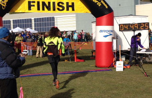
Equinox Marathon finish
It’s the beginning of a new year and time for me to look back at what I learned last year. Rather than a long narrative, let’s focus on the data. The local newspaper did a “community profile” of me this year and it was focused on my curiosity about the world around us and how we can measure and analyze it to better understand our lives. This post is a brief summary of that sort of analysis for my small corner of the world in the year that was 2013.
Exercise
2013 was the year I decided to, and did, run the Equinox Marathon, so I spent a lot of time running this year and a lot less time bicycling. Since the race, I’ve been having hip problems that have kept me from skiing or running much at all. The roads aren’t cleared well enough to bicycle on them in the winter so I got a fat bike to commute on the trails I’d normally ski.
Here are my totals in tabular form:
| type | miles | hours | calories |
|---|---|---|---|
| Running | 529 | 89 | 61,831 |
| Bicycling | 1,018 | 82 | 54,677 |
| Skiing | 475 | 81 | 49,815 |
| Hiking | 90 | 43 | 18,208 |
| TOTAL | 2,113 | 296 | 184,531 |
I spent just about the same amount of time running, bicycling and skiing this year, and much less time hiking around on the trails than in the past. Because of all the running, and my hip injury, I didn’t manage to commute to work with non-motorized transport quite as much this year (55% of work days instead of 63% in 2012), but the exercise totals are all higher.
One new addition this year is a heart rate monitor, which allows me to much more accurately estimate energy consumption than formulas based on the type of activity, speed, and time. Riding my fat bike, it’s pretty clear that this form of travel is so much less efficient than a road bike with smooth tires that it can barely be called “bicycling,” at least in terms of how much energy it takes to travel over a certain distance.
Here’s the equations from Keytel LR, Goedecke JH, Noakes TD, Hiiloskorpi H, Laukkanen R, van der Merwe L, Lambert EV. 2005. Prediction of energy expenditure from heart rate monitoring during submaximal exercise. J Sports Sci. 23(3):289-97.
where
- hr = Heart rate (in beats/minute)
- w = Weight (in pounds)
- a = Age (in years)
- t = Exercise duration time (in hours)
And a SQL function that implements the version for men (to use it, you’d replace
the nnn and yyyy-mm-dd with the appropriate values for you):
--- Kcalories burned based on average heart rate and number
--- of hours at that rate.
CREATE OR REPLACE FUNCTION kcal_from_hr(hr numeric, hours numeric)
RETURNS numeric
LANGUAGE plpgsql
AS $$
DECLARE
    weight_lb numeric := nnn;
    resting_hr numeric := nn;
    birthday date := 'yyyy-mm-dd';
    resting_kcal numeric;
    exercise_kcal numeric;
BEGIN
    resting_kcal := ((-55.0969+(0.6309*(resting_hr))+
                    (0.0901*weight_lb)+
                    (0.2017*(extract(epoch from now()-birthday)/
                    (365.242*24*60*60))))/4.184)*60*hours;
    exercise_kcal := ((-55.0969+(0.6309*(hr))+
                     (0.0901*weight_lb)+
                     (0.2017*(extract(epoch from now()-birthday)/
                     (365.242*24*60*60))))/4.184)*60*hours;
    RETURN exercise_kcal - resting_kcal;
END;
$$;
Here’s a graphical comparison of my exercise data over the past four years:
It was a pretty remarkable year, although the drop in exercise this fall is disappointing.
Another way to visualize the 2013 data is in the form of a heatmap, where each block represents a day on the calendar, and the color is how many calories I burned on that day. During the summer you can see my long runs on the weekends showing up in red. Equinox was on September 21st, the last deep red day of the year.
Weather
2013 was quite remarkable for the number of days where the daily temperature was dramatically different from the 30-year average. The heatmap below shows each day in 2013, and the color indicates how many standard deviations that day’s temperature was from the 30-year average. To put the numbers in perspective, approximately 95.5% of all observations will fall within two standard deviations from the mean, and 99.7% will be within three standard deviations. So the very dark red or dark blue squares on the plot below indicate temperature anomalies that happen less than 1% of the time. Of course, in a full year, you’d expect to see a few of these remarkable differences, but 2013 had a lot of remarkable differences.
2013 saw 45 days where the temperature was more than 2 standard deviations from the mean (19 that were colder than normal and 26 that were warmer), something that should only happen 16 days out of a normal year [ 365.25(1 − 0.9545) ]. There were four days ouside of 3 standard deviations from the mean anomaly. Normally there’d only be a single day [ 365.25(1 − 0.9973) ] with such a remarkably cold or warm temperature.
April and most of May were remarkably cold, resulting in many people skiing long past what is normal in Fairbanks. On May first, Fairbanks still had 17 inches of snow on the ground. Late May, almost all of June and the month of October were abnormally warm, including what may be the warmest week on record in Alaska from June 23rd to the 29th. Although it wasn’t exceptional, you can see the brief cold snap preceding and including the Equinox Marathon on September 21st this year. The result was bitter cold temperatures on race day (my hands and feet didn’t get warm until I was climbing Ester Dome Road an hour into the race), as well as an inch or two of snow on most of the trail sections of the course above 1,000 feet.
Most memorable was the ice and wind storm on November 13th and 14th that dumped several inches of snow and instantly freezing rain, followed by record high winds that knocked power out for 14,000 residents of the area, and then a drop in temperatures to colder than ‒20°F. My office didn’t get power restored for four days.
git
I’m moving more and more of my work into git, which is a distributed revision control system (or put another way, it’s a system that stores stuff and keeps track of all the changes). Because it’s distributed, anything I have on my computer at home can be easily replicated to my computer at work or anywhere else, and any changes that I make to these files on any system, are easy to recover anywhere else. And it’s all backed up on the master repository, and all changes are recorded. If I decide I’ve made a mistake, it’s easy to go back to an earlier version.
Using this sort of system for software code is pretty common, but I’m also using
this for normal text files (the docs repository below), and have
starting moving other things into git such as all my eBooks.
The following figure shows the number of file changes made in three of my
repositories over the course of the year. I don’t know why April was such an
active month for Python, but I clearly did a lot of programming that month. The
large number of file changes during the summer in the docs repository is
because I was keeping my running (and physical therapy) logs in that repository.
Dog Barn
The dog barn was the big summer project. It’s a seven by eleven foot building with large dog boxes inside that we keep warm. When the temperatures are too cold for the dogs to stay outside, we put them into their boxes in the dog barn and turn the heat up to 40°F. I have a real-time visualization of the conditions inside and outside the barn, and because the whole thing is run with a small Linux computer and Arduino board, I’m able to collect a lot of data about how the barn is performing.
One such analysis will be to see how much heat the dogs produce when they are in the barn. To estimate that, we need a baseline of how much heat we’re adding at various temperatures in order to keep it at temperature. I haven’t collected enough cold temperature data to really see what the relationship looks like, but here’s the pattern so far.
The graph shows the relationship between the temperature differential between the outside and inside of the barn plotted against the percentage of time the heater is on in order to maintain that differential, for all 12-hour periods where the dogs weren’t in the barn and there’s less than four missing observations. I’ve also run a linear and quadratic regression in order to predict how much heat will be required at various temperature differentials.
The two r2 values shows how much of the variation in heating is explained by the temperature differential for the linear and the quadratic regressions. I know that this isn’t a linear relationship, but that model still fits the data better than the quadratic model does. It may be that it’s some other form of non-linear relationship that’s not well expressed by a second order polynomial.
Once we can predict how much heat it should take to keep the barn warm at a particular temperature differential, we can see how much less heat we’re using when the dogs are in the barn. One complication is that the dogs produce enough moisture when they are in the barn that we need to ventilate it when they are in there. So in addition to the additive heating from the dogs themselves, there will be increased heat losses because we have to keep it better ventilated.
It’ll be an interesting data set.
Power
Power consumption is a concern now that we’ve set up the dog barn and are keeping it heated with an electric heater. It’s an oil-filled radiator-style heater, and uses around 1,100 Watts when it’s on.
This table shows our overall usage by year for the period we have data.
| year | average watts | total KWH |
|---|---|---|
| 2010 | 551 | 4822 |
| 2011 | 493 | 4318 |
| 2012 | 433 | 3792 |
| 2013 | 418 | 3661 |
Our overall energy use continues to go down, which is a little surprising to me, actually, since we eliminated most of the devices known to use a lot electricity (incandescent light bulbs, halogen floodlights) years ago. Despite that, and bringing the dog barn on line in late November, we used less electricity in 2013 than in the prior three years.
Here’s the pattern by month, and year.
The spike in usage in November is a bit concerning, since it’s the highest overall monthly consumption for the past four years. Hopefully this was primarily due to the heavy use of the heater during the final phases of the dog barn construction. December wasn’t a particularly cold month relative to years past, but it’s good to see that our consumption was actually quite low even with the barn heater being on the entire month.
That wraps it up. Have a happy and productive 2014!