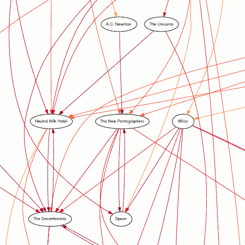
A couple posts ago I showed a hand-made similarity diagram for The Magnetic Fields, where I started at the last.fm similarity page and followed the top two most similar artists until I'd made a diagram. At the time I wondered how hard it would be to generate these things automatically.
Not too hard, it turns out, but it took me several months to get it all working properly. I wrote a Python script that queries the last.fm database, loading and saving the similarity pages for the artists related to the original query. Because it saves the similarities locally, after a few runs there's not much traffic to the last.fm web site.
Once all the data is collected, it generates a text file of links in the DOT language. These files are processed by the graphviz suite of programs (unflatten and dot, in this case) to produce similarity diagrams like the one below (click on the image to download a full-size PDF, 17 KB).
The diagram was produced by:
./build_and_graph.py -a "The Olivia Tremor Control" -c 60 -r 1      \
  | unflatten | dot -Tps > /tmp/graph.ps
Click on the image for a PDF version of the entire graph. The darker and redder the lines, the more similar the two artists are. The options passed to my script control what the initial similarity cutoff is, and what the r-value is for the logistic function that controls how similarity changes as you get farther from the initial artist. For these values, the cutoff starts at 60 for the artists directly connected to The Olivia Tremor Control, rises to 80, then 92, 97, 99 and finally 100. That's why the links all get darker as you move down the diagram, moving farther from the original artist at the top.
