Introduction
There are now 777 photos in my photolog, organized in reverse chronological order (or chronologically if you append /asc/ to the url). With that much data, it occurred to me that there ought to be a way to organize these photos by color, similar to the way some people organize their books. I didn’t find a way of doing that, unfortunately, but I did spend some time experimenting with image similarity analysis using color.
The basic idea is to generate histograms (counts of the pixels in the image that fit into pre-defined bins) for red, green and blue color combinations in the image. Once we have these values for each image, we use the chi square distance between the values as a distance metric that is a measure of color similarty between photos.
Code
I followed this tutorial Building your first image search engine in Python which uses code like this to generate 3D RGB histograms (all the code from this post is on GitHub):
import cv2

def get_histogram(image, bins):
   """ calculate a 3d RGB histogram from an image """
   if os.path.exists(image):
      imgarray = cv2.imread(image)

      hist = cv2.calcHist([imgarray], [0, 1, 2], None,
                           [bins, bins, bins],
                           [0, 256, 0, 256, 0, 256])
      hist = cv2.normalize(hist, hist)

      return hist.flatten()
   else:
      return None
Once you have them, you need to calculate all the pair-wise distances using a function like this:
def chi2_distance(a, b, eps=1e-10):
   """ distance between two histograms (a, b) """
   d = 0.5 * np.sum([((x - y) ** 2) / (x + y + eps)
                     for (x, y) in zip(a, b)])

   return d
Getting histogram data using OpenCV in Python is pretty fast. Even with 32 bins, it only took about 45 minutes for all 777 images. Computing the distances between histograms was a lot slower, depending on how the code was written.
With 8 bin histograms, a Python script using the function listed above, took just under 15 minutes to calculate each pairwise comparison (see the rgb_histogram.py script).
Since the photos are all in a database so they can be displayed on the Internet, I figured a SQL function to calculate the distances would make the most sense. I could use the OpenCV Python code to generate histograms and add them to the database when the photo was inserted, and a SQL function to get the distances.
Here’s the function:
CREATE OR REPLACE FUNCTION chi_square_distance(a numeric[], b numeric[])
RETURNS numeric AS $_$
   DECLARE
      sum numeric := 0.0;
      i integer;
   BEGIN
      FOR i IN 1 .. array_upper(a, 1)
      LOOP
            IF a[i]+b[i] > 0 THEN
               sum = sum + (a[i]-b[i])^2 / (a[i]+b[i]);
            END IF;
      END LOOP;

      RETURN sum/2.0;
   END;
$_$
LANGUAGE plpgsql;
Unfortunately, this is incredibly slow. Instead of the 15 minutes the Python script took, it took just under two hours to compute the pairwise distances on the 8 bin histograms.
When your interpreted code is slow, the solution is often to re-write compiled code and use that. I found some C code on Stack Overflow for writing array functions. The PostgreSQL interface isn’t exactly intuitive, but here’s the gist of the code (full code):
#include <postgres.h>
#include <fmgr.h>
#include <utils/array.h>
#include <utils/lsyscache.h>

/* From intarray contrib header */
#define ARRPTR(x) ( (float8 *) ARR_DATA_PTR(x) )

PG_MODULE_MAGIC;

PG_FUNCTION_INFO_V1(chi_square_distance);
Datum chi_square_distance(PG_FUNCTION_ARGS);

Datum chi_square_distance(PG_FUNCTION_ARGS) {
   ArrayType *a, *b;
   float8 *da, *db;

   float8 sum = 0.0;
   int i, n;

   da = ARRPTR(a);
   db = ARRPTR(b);

   // Generate the sums.
   for (i = 0; i < n; i++) {
      if (*da - *db) {
            sum = sum + ((*da - *db) * (*da - *db) / (*da + *db));
      }
      da++;
      db++;
   }

   sum = sum / 2.0;

   PG_RETURN_FLOAT8(sum);
}
This takes 79 seconds to do all the distance calculates on 8 bin histograms. That kind of improvement is well worth the effort.
Results
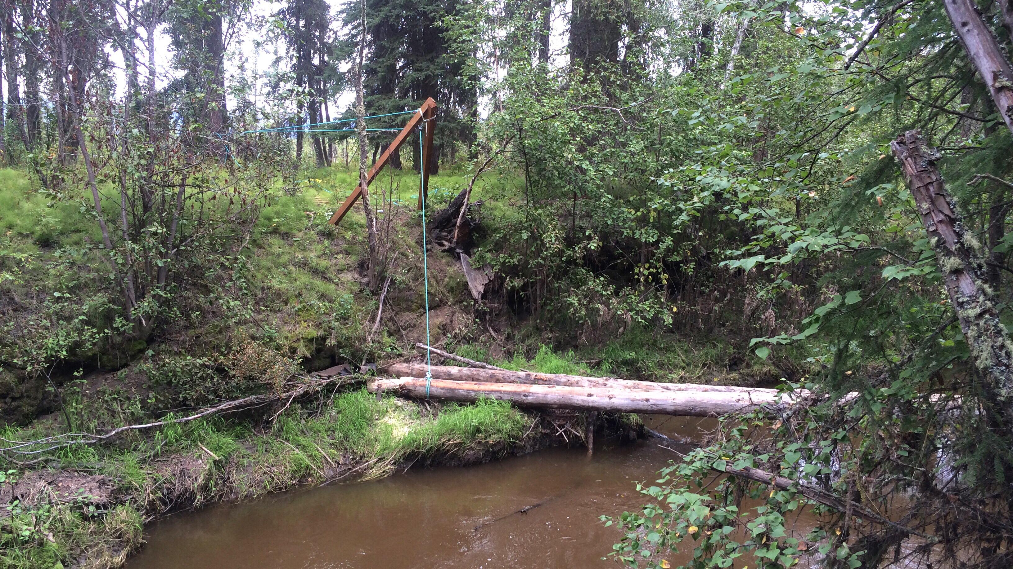
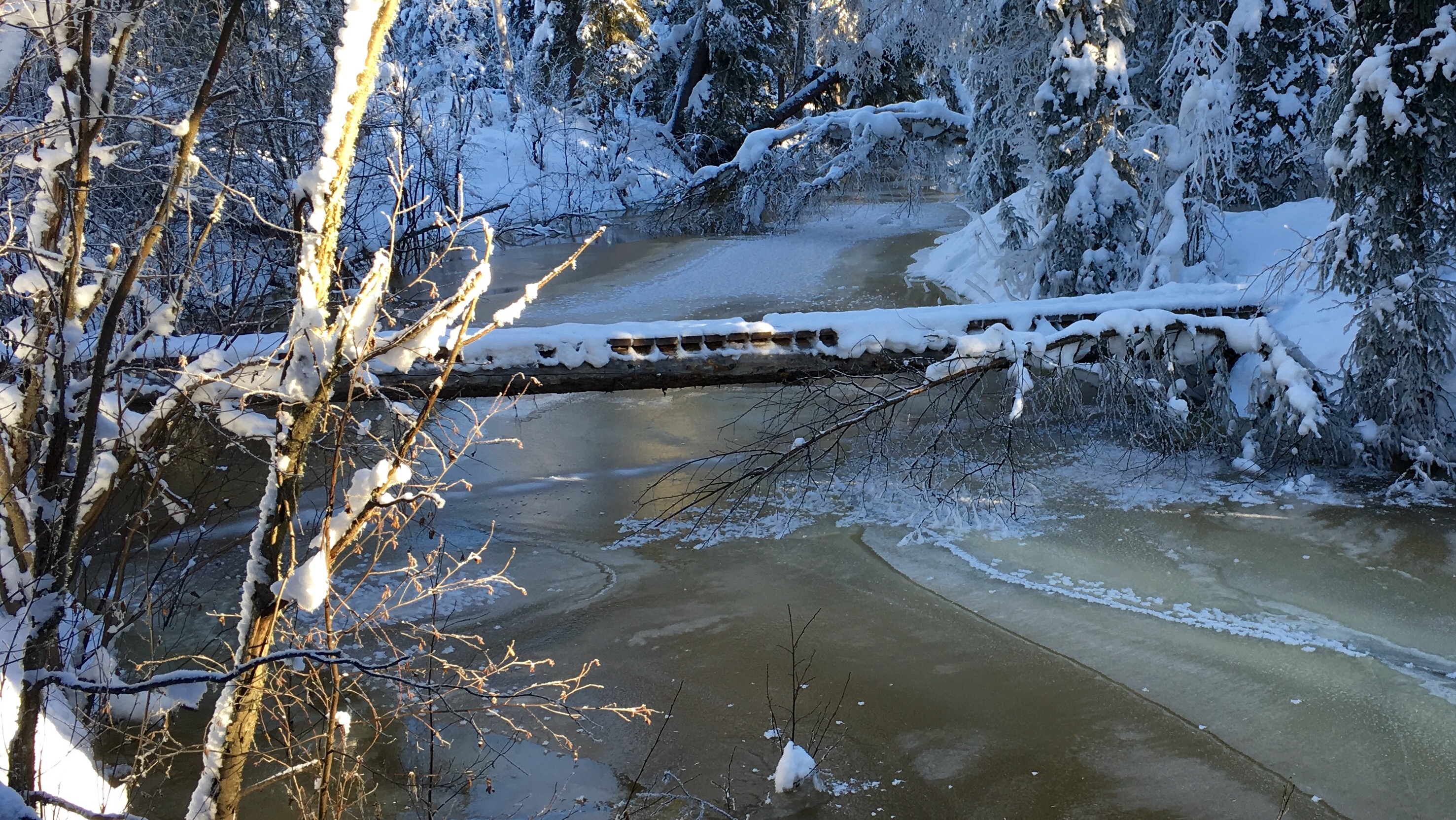
After all that, the results aren’t as good as I was hoping. For some photos, such as the photos I took while re-raising the bridge across the creek, sorting by the histogram distances does actually identify other photos taken of the same process. For example, these two photos are the closest to each other by 32 bin histogram distance:

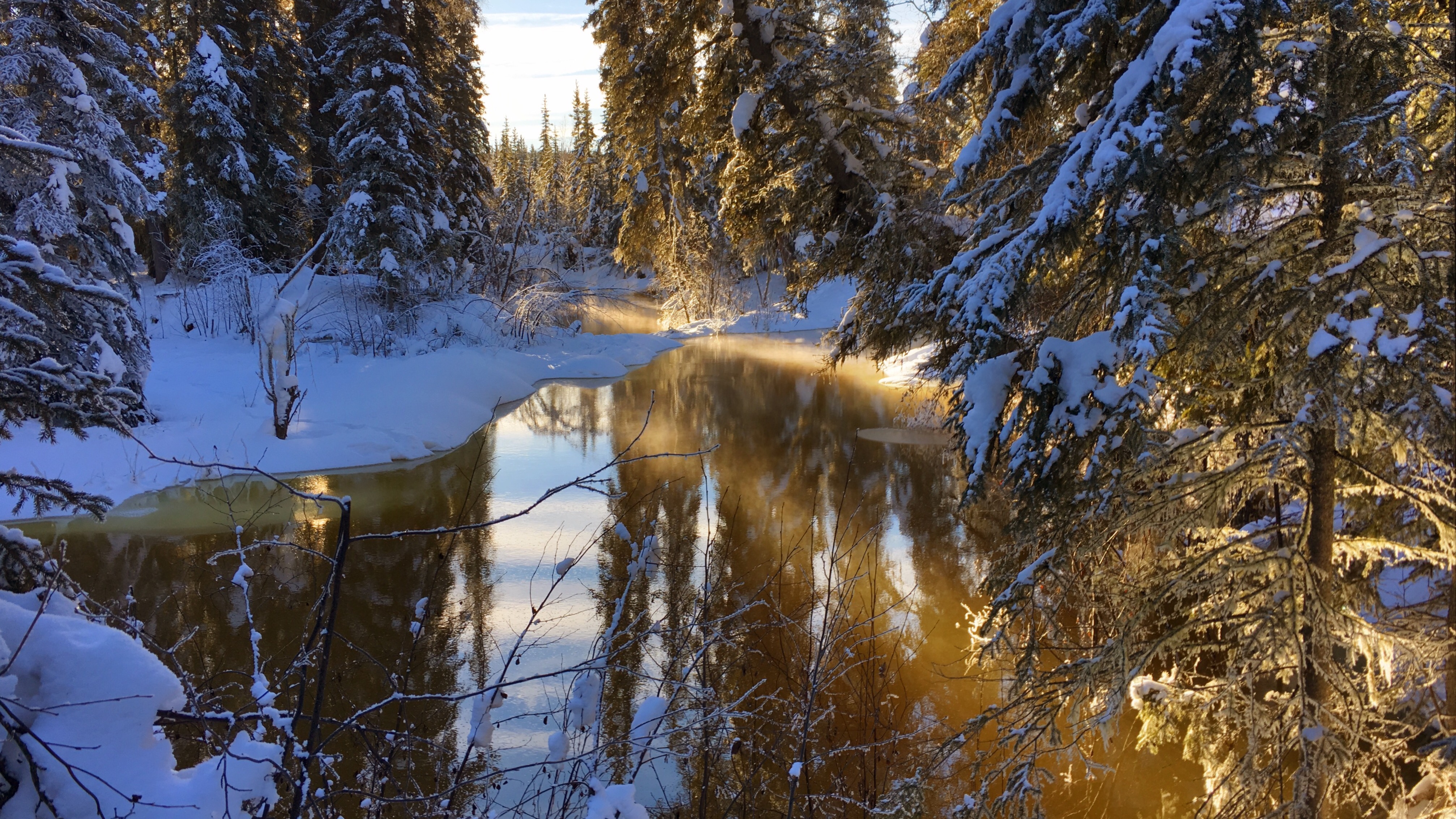
But there are certain images, such as the middle image in the three below that are very close to many of the photos in the database, even though they’re really not all that similar. I think this is because images with a lot of black in them (or white) wind up being similar to each other because of the large areas without color. It may be that performing the same sort of analysis using the HSV color space, but restricting the histogram to regions with high saturation and high value, would yield results that make more sense.
Introduction
I’ve been brewing beer since the early 90s, and since those days the number of hops available to homebrewers has gone from a handfull of varieties (Northern Brewer, Goldings, Fuggle, Willamette, Cluster) to well over a hundred. Whenever I go to my local brewing store I’m bewildered by the large variety of hops, most of which I’ve never heard of. I’m also not all that fond of super-citrusy hops like Cascade or it’s variants, so it is a challenge to find flavor and aroma hops that aren’t citrusy among the several dozen new varieties on display.
Most of the hops at the store are Yakima Chief – Hop Union branded, and they’ve got a great web site that lists all their varieties and has information about each hop. As convenient as a website can be, I’d rather have the data in a database where I can search and organize it myself. Since the data is all on the website, we can use a web scraping library to grab it and format it however we like.
One note: websites change all the time, so whenever the structure of a site changes, the code to grab the data will need to be updated. I originally wrote the code for this post a couple weeks ago, scraping data from the Hop Union web site. This morning, that site had been replaced with an entirely different Yakima Chief – Hop Union site and I had to completely rewrite the code.
rvest
I’m using the rvest package from Hadley Wickham and RStudio to do the work of pulling the data from each page. In the Python world, Beautiful Soup would be the library I’d use, but there’s a fair amount of data manipulation needed here and I felt like dplyr would be easier.
Process
First, load all the libraries we need.
library(rvest)       # scraping data from the web
library(dplyr)       # manipulation, filtering, grouping into tables
library(stringr)     # string functions
library(tidyr)       # creating columns from rows
library(RPostgreSQL) # dump final result to a PostgreSQL database
Next, we retrieve the data from the main page that has all the varieties listed on it, and extract the list of links to each hop. In the code below, we read the entire document into a variable, hop_varieties using the read_html function.
Once we’ve got the web page, we need to find the HTML nodes that contain links to the page for each individual hop. To do that, we use html_nodes(), passing a CSS selector to the function. In this case, we’re looking for a tags that have a class of card__name. I figured this out by looking at the raw source code from the page using my web browser’s inspection tools. If you right-click on what looks like a link on the page, one of the options in the pop-up menu is “inspect”, and when you choose that, it will show you the HTML for the element you clicked on. It can take a few tries to find the proper combination of tag, class, attribute or id to uniquely identify the things you want.
The YCH site is pretty well organized, so this isn’t too difficult. Once we’ve got the nodes, we extract the links by retrieving the href attribute from each one with html_attr().
hop_varieties <- read_html("http://ychhops.com/varieties")

hop_page_links <- hop_varieties %>%
    html_nodes("a.card__name") %>%
    html_attr("href")
Now we have a list of links to all the varieties on the page. It turns out that they made a mistake when they transitioned to the new site and the links all have the wrong host (ych.craft.dev). We can fix that by applying replacing the host in all the links.
fixed_links <- sapply(hop_page_links,
                     FUN=function(x) sub('ych.craft.dev',
                                         'ychhops.com', x)) %>%
    as.vector()
Each page will need to be loaded, the relevant information extracted, and the data formatted into a suitable data structure. I think a data frame is the best format for this, where each row in the data frame represents the data for a single hop and each column is a piece of information from the web page.
First we write a function the retrieves the data for a single hop and returns a one-row data frame with that data. Most of the data is pretty simple, with a single value for each hop. Name, description, type of hop, etc. Where it gets more complicated is the each hop can have more than one aroma category, and the statistics for each hop vary from one to the next. What we’ve done here is combine the aromas together into a single string, using the at symbol (@) to separate the parts. Since it’s unlikely that symbol will appear in the data, we can split it back apart later. We do the same thing for the other parameters, creating an @-delimited string for the items, and their values.
get_hop_stats <- function(p) {
    hop_page <- read_html(p)

    hop_name <- hop_page %>%
        html_nodes('h1[itemprop="name"]') %>%
        html_text()

    type <- hop_page %>%
        html_nodes('div.hop-profile__data div[itemprop="additionalProperty"]') %>%
        html_text()
    type <- (str_split(type, ' '))[[1]][2]

    region <- hop_page %>%
        html_nodes('div.hop-profile__data h5') %>%
        html_text()

    description <- hop_page %>%
        html_nodes('div.hop-profile__profile p[itemprop="description"]') %>%
        html_text()

    aroma_profiles <- hop_page %>%
        html_nodes('div.hop-profile__profile h3.headline a[itemprop="category"]') %>%
        html_text()

    aroma_profiles <- sapply(aroma_profiles,
                             FUN=function(x) sub(',$', '', x)) %>%
        as.vector() %>%
        paste(collapse="@")

    composition_keys <- hop_page %>%
        html_nodes('div.hop-composition__item') %>%
        html_text()

    composition_keys <- sapply(composition_keys,
                               FUN=function(x)
                                   tolower(gsub('[ -]', '_', x))) %>%
        as.vector() %>%
        paste(collapse="@")

    composition_values <- hop_page %>%
        html_nodes('div.hop-composition__value') %>%
        html_text() %>%
        paste(collapse="@")

    hop <- data.frame('hop'=hop_name, 'type'=type, 'region'=region,
                      'description'=description,
                      'aroma_profiles'=aroma_profiles,
                      'composition_keys'=composition_keys,
                      'composition_values'=composition_values)

}
With a function that takes a URL as input, and returns a single-row data frame, we use a common idiom in R to combine everything together. The inner-most lapply function will run the function on each of the fixed variety links, and each single-row data frame will then be combined together using rbind within do.call.
all_hops <- do.call(rbind,
                    lapply(fixed_links, get_hop_stats)) %>% tbl_df() %>%
    arrange(hop) %>%
    mutate(id=row_number())
At this stage we’ve retrieved all the data from the website, but some of it has been encoded in a less that useful format.
Data tidying
To tidy the data, we want to extract only a few of the item / value pairs of data from the data frame, alpha acid, beta acid, co-humulone and total oil. We also need to remove carriage returns from the description and remove the aroma column.
We split the keys and values back apart again using the @ symbol used earlier to combine them, then use unnest to create duplicate columns with each of the key / value pairs in them. spread pivots these up into columns such that the end result has one row per hop with the relevant composition values as columns in the tidy data set.
hops <- all_hops %>%
    arrange(hop) %>%
    mutate(description=gsub('\\r', '', description),
           keys=str_split(composition_keys, "@"),
           values=str_split(composition_values, "@")) %>%
    unnest(keys, values) %>%
    spread(keys, values) %>%
    select(id, hop, type, region, alpha_acid, beta_acid, co_humulone, total_oil, description)

kable(hops %>% select(id, hop, type, region, alpha_acid) %>% head())
| id | hop | type | region | alpha_acid |
|---|---|---|---|---|
| 1 | Admiral | Bittering | United Kingdom | 13 - 16% |
| 2 | Ahtanum™ | Aroma | Pacific Northwest | 3.5 - 6.5% |
| 3 | Amarillo® | Aroma | Pacific Northwest | 7 - 11% |
| 4 | Aramis | Aroma | France | 7.9 - 8.3% |
| 5 | Aurora | Dual | Slovenia | 7 - 9.5% |
| 6 | Bitter Gold | Dual | Pacific Northwest | 12 - 14.5% |
For the aromas we have a one to many relationship where each hop has one or more aroma categories associated. We could fully normalize this by created an aroma table and a join table that connects hop and aroma, but this data is simple enough that I just created the join table itself. We’re using the same str_split / unnest method we used before, except that in this case we don't want to turn those into columns, we want a separate row for each hop × aroma combination.
hops_aromas <- all_hops %>%
    select(id, hop, aroma_profiles) %>%
    mutate(aroma=str_split(aroma_profiles, "@")) %>%
    unnest(aroma) %>%
    select(id, hop, aroma)
Saving and exporting
Finally, we save the data and export it into a PostgreSQL database.
save(list=c("hops", "hops_aromas"),
     file="ych_hops.rdata")

beer <- src_postgres(host="dryas.swingleydev.com", dbname="beer",
                     port=5434, user="cswingle")

dbWriteTable(beer$con, "ych_hops", hops %>% data.frame(), row.names=FALSE)
dbWriteTable(beer$con, "ych_hops_aromas", hops_aromas %>% data.frame(), row.names=FALSE)
Usage
I created a view in the database that combines all the aroma categories into a Postgres array type using this query. I also use a pair of regular expressions to convert the alpha acid string into a Postgres numrange.
CREATE VIEW ych_basic_hop_data AS
SELECT ych_hops.id, ych_hops.hop, array_agg(aroma) AS aromas, type,
    numrange(
        regexp_replace(alpha_acid, '([0-9.]+).*', E'\\1')::numeric,
        regexp_replace(alpha_acid, '.*- ([0-9.]+)%', E'\\1')::numeric,
        '[]') AS alpha_acid_percent, description
FROM ych_hops
    INNER JOIN ych_hops_aromas USING(id)
GROUP BY ych_hops.id, ych_hops.hop, type, alpha_acid, description
ORDER BY hop;
With this, we can, for example, find US aroma hops that are spicy, but without citrus using the ANY() and ALL() array functions.
SELECT hop, region, type, aromas, alpha_acid_percent
FROM ych_basic_hop_data
WHERE type = 'Aroma' AND region = 'Pacific Northwest' AND 'Spicy' = ANY(aromas)
AND 'Citrus' != ALL(aromas) ORDER BY alpha_acid_percent;

     hop    |      region       | type  |            aromas            | alpha_acid_percent
 -----------+-------------------+-------+------------------------------+--------------------
  Crystal   | Pacific Northwest | Aroma | {Floral,Spicy}               | [3,6]
  Hallertau | Pacific Northwest | Aroma | {Floral,Spicy,Herbal}        | [3.5,6.5]
  Tettnang  | Pacific Northwest | Aroma | {Earthy,Floral,Spicy,Herbal} | [4,6]
  Mt. Hood  | Pacific Northwest | Aroma | {Spicy,Herbal}               | [4,6.5]
  Santiam   | Pacific Northwest | Aroma | {Floral,Spicy,Herbal}        | [6,8.5]
  Ultra     | Pacific Northwest | Aroma | {Floral,Spicy}               | [9.2,9.7]
Code
The RMarkdown version of this post, including the code can be downloaded from GitHub:
Since the middle of 2010 we’ve been monitoring the level of Goldstream Creek for the National Weather Service by measuring the distance from the top of our bridge to the surface of the water or ice. In 2012 the Creek flooded and washed the bridge downstream. We eventually raised the bridge logs back up onto the banks and resumed our measurements.
This winter the Creek had been relatively quiet, with the level hovering around eight feet below the bridge. But last Friday, we awoke to more than four feet of water over the ice, and since then it's continued to rise. This morning’s reading had the ice only 3.17 feet below the surface of the bridge.
Overflow within a few feet of the bridge
Water also entered the far side of the slough, and is making it’s way around the loop, melting the snow covering the old surface. Even as the main channel stops rising and freezes, water moves closer to the dog yard from the slough.
Water entering the slough
One of my longer commutes to work involves riding east on the Goldstream Valley trails, crossing the Creek by Ballaine Road, then riding back toward the house on the north side of the Creek. From there, I can cross Goldstream Creek again where the trail at the end of Miller Hill Road and the Miller Hill Extension trail meet, and ride the trails the rest of the way to work. That crossing is also covered with several feet of water and ice.
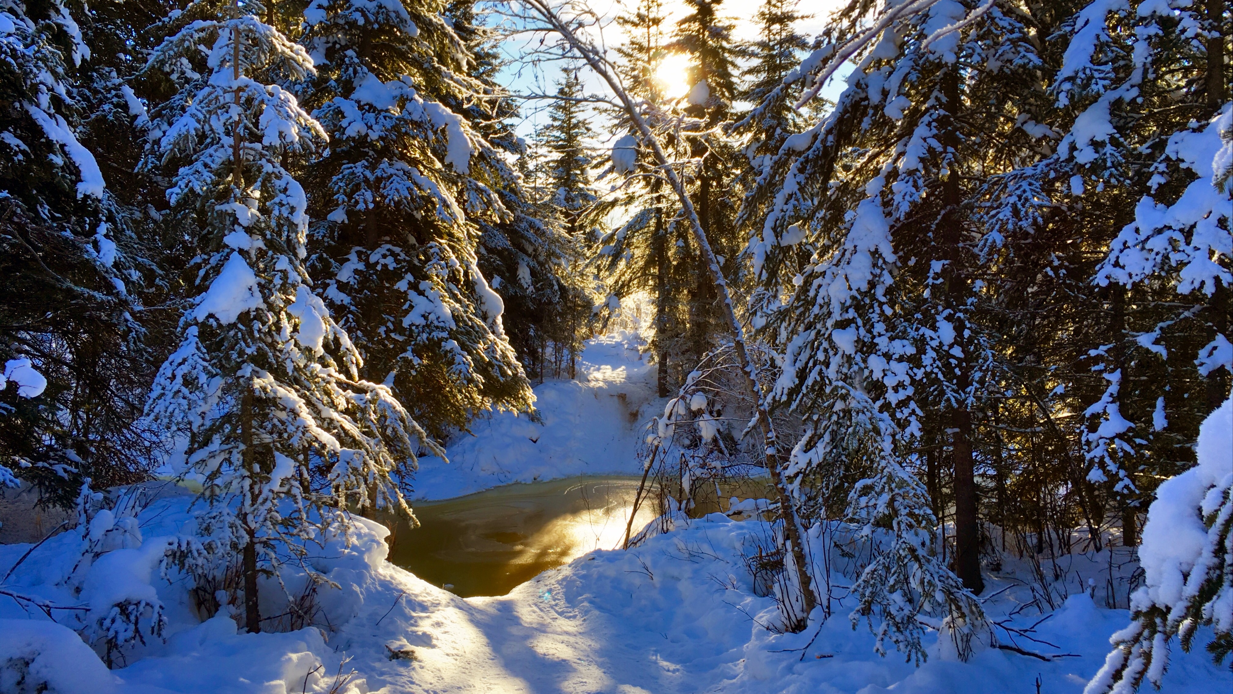
Trail crossing at the end of Miller Hill
Yesterday one of my neighbors sent email with the subject line, “Are we doomed?,” so I took a look at the heigh data from past years. The plot below shows the height of the Creek, as measured from the surface of the bridge (click on the plot to view or download a PDF, R code used to generate the plot appears at the bottom of this post).
The orange region is the region where the Creek is flowing; between my reporting of 0% ice in spring and 100% ice-covered in fall. The data gap in July 2014 was due to the flood washing the bridge downstream. Because the bridge isn’t in the same location, the height measurements before and after the flood aren’t completely comparable, but I don’t have the data for the difference in elevation between the old and new bridge locations, so this is the best we’ve got.

Creek heights by year
The light blue line across all the plots shows the current height of the Creek (3.17 feet) for all years of data. 2012 is probably the closest year to our current situation where the Creek rose to around five feet below the bridge in early January. But really nothing is completely comparable to the situation we’re in right now. Breakup won’t come for another two or three months, and in most years, the Creek rises several feet between February and breakup.
Time will tell, of course, but here’s why I’m not too worried about it. There’s another bridge crossing several miles downstream, and last Friday there was no water on the surface, and the Creek was easily ten feet below the banks. That means that there is a lot of space within the banks of the Creek downstream that can absorb the melting water as breakup happens. I also think that there is a lot of liquid water trapped beneath the ice on the surface in our neighborhood and that water is likely to slowly drain out downstream, leaving a lot of empty space below the surface ice that can accommodate further overflow as the winter progresses. In past years of walking on the Creek I’ve come across huge areas where the top layer of ice dropped as much as six feet when the water underneath drained away. I’m hoping that this happens here, with a lot of the subsurface water draining downstream.
The Creek is always reminding us of how little we really understand what’s going on and how even a small amount of flowing water can become a huge force when that water accumulates more rapidly than the Creek can handle it. Never a dull moment!
Code
library(readr)
library(dplyr)
library(tidyr)
library(lubridate)
library(ggplot2)
library(scales)

wxcoder <- read_csv("data/wxcoder.csv", na=c("-9999"))
feb_2016_incomplete <- read_csv("data/2016_02_incomplete.csv",
                                na=c("-9999"))

wxcoder <- rbind(wxcoder, feb_2016_incomplete)

wxcoder <- wxcoder %>%
   transmute(dte=as.Date(ymd(DATE)), tmin_f=TN, tmax_f=TX, tobs_f=TA,
             tavg_f=(tmin_f+tmax_f)/2.0,
             prcp_in=ifelse(PP=='T', 0.005, as.numeric(PP)),
             snow_in=ifelse(SF=='T', 0.05, as.numeric(SF)),
             snwd_in=SD, below_bridge_ft=HG,
             ice_cover_pct=IC)

creek <- wxcoder %>% filter(dte>as.Date(ymd("2010-05-27")))

creek_w_year <- creek %>%
   mutate(year=year(dte),
         doy=yday(dte))

ice_free_date <- creek_w_year %>%
   group_by(year) %>%
   filter(ice_cover_pct==0) %>%
   summarize(ice_free_dte=min(dte), ice_free_doy=min(doy))

ice_covered_date <- creek_w_year %>%
   group_by(year) %>%
   filter(ice_cover_pct==100, doy>182) %>%
   summarize(ice_covered_dte=min(dte), ice_covered_doy=min(doy))

flowing_creek_dates <- ice_free_date %>%
   inner_join(ice_covered_date, by="year") %>%
   mutate(ymin=Inf, ymax=-Inf)

latest_obs <- creek_w_year %>%
   mutate(rank=rank(desc(dte))) %>%
   filter(rank==1)

current_height_df <- data.frame(
      year=c(2011, 2012, 2013, 2014, 2015, 2016),
      below_bridge_ft=latest_obs$below_bridge_ft)

q <- ggplot(data=creek_w_year %>% filter(year>2010),
            aes(x=doy, y=below_bridge_ft)) +
   theme_bw() +
   geom_rect(data=flowing_creek_dates %>% filter(year>2010),
             aes(xmin=ice_free_doy, xmax=ice_covered_doy, ymin=ymin, ymax=ymax),
             fill="darkorange", alpha=0.4,
             inherit.aes=FALSE) +
   # geom_point(size=0.5) +
   geom_line() +
   geom_hline(data=current_height_df,
              aes(yintercept=below_bridge_ft),
              colour="darkcyan", alpha=0.4) +
   scale_x_continuous(name="",
                      breaks=c(1,32,60,91,
                               121,152,182,213,
                               244,274,305,335,
                               365),
                      labels=c("Jan", "Feb", "Mar", "Apr",
                               "May", "Jun", "Jul", "Aug",
                               "Sep", "Oct", "Nov", "Dec",
                               "Jan")) +
   scale_y_reverse(name="Creek height, feet below bridge",
                   breaks=pretty_breaks(n=5)) +
   facet_wrap(~ year, ncol=1)

width <- 16
height <- 16
rescale <- 0.75
pdf("creek_heights_2010-2016_by_year.pdf",
    width=width*rescale, height=height*rescale)
print(q)
dev.off()
svg("creek_heights_2010-2016_by_year.svg",
    width=width*rescale, height=height*rescale)
print(q)
dev.off()
Introduction
This week a class action lawsuit was filed against FitBit, claiming that their heart rate fitness trackers don’t perform as advertised, specifically during exercise. I’ve been wearing a FitBit Charge HR since October, and also wear a Scosche Rhythm+ heart rate monitor whenever I exercise, so I have a lot of data that I can use to assess the legitimacy of the lawsuit. The data and RMarkdown file used to produce this post is available from GitHub.
The Data
Heart rate data from the Rhythm+ is collected by the RunKeeper app on my phone, and after transferring the data to RunKeeper’s website, I can download GPX files containing all the GPS and heart rate data for each exercise. Data from the Charge HR is a little harder to get, but with the proper tools and permission from FitBit, you can get what they call “intraday” data. I use the fitbit Python library and a set of routines I wrote (also available from GitHub) to pull this data.
The data includes 116 activities, mostly from commuting to and from work by bicycle, fat bike, or on skis. The first step in the process is to pair the two data sets, but since the exact moment when each sensor recorded data won’t match, I grouped both sets of data into 15-second intervals, and calculated the mean heart rate for each sensor withing that 15-second window. The result looks like this:
load("matched_hr_data.rdata")
kable(head(matched_hr_data))
| dt_rounded | track_id | type | min_temp | max_temp | rhythm_hr | fitbit_hr |
|---|---|---|---|---|---|---|
| 2015-10-06 06:18:00 | 3399 | Bicycling | 17.8 | 35 | 103.00000 | 100.6 |
| 2015-10-06 06:19:00 | 3399 | Bicycling | 17.8 | 35 | 101.50000 | 94.1 |
| 2015-10-06 06:20:00 | 3399 | Bicycling | 17.8 | 35 | 88.57143 | 97.1 |
| 2015-10-06 06:21:00 | 3399 | Bicycling | 17.8 | 35 | 115.14286 | 104.2 |
| 2015-10-06 06:22:00 | 3399 | Bicycling | 17.8 | 35 | 133.62500 | 107.4 |
| 2015-10-06 06:23:00 | 3399 | Bicycling | 17.8 | 35 | 137.00000 | 113.3 |
| ... | ... | ... | ... | ... | ... | ... |
Let’s take a quick look at a few of these activities. The squiggly lines show the heart rate data from the two sensors, and the horizontal lines show the average heart rate for the activity. In both cases, the FitBit Charge HR is shown in red and the Scosche Rhythm+ is blue.
library(dplyr)
library(tidyr)
library(ggplot2)
library(lubridate)
library(scales)

heart_rate <- matched_hr_data %>%
    transmute(dt=dt_rounded, track_id=track_id,
              title=paste(strftime(as.Date(dt_rounded,
                                           tz="US/Alaska"), "%b-%d"),
                          type),
              fitbit=fitbit_hr, rhythm=rhythm_hr) %>%
    gather(key=sensor, value=hr, fitbit:rhythm) %>%
    filter(track_id %in% c(3587, 3459, 3437, 3503))

activity_means <- heart_rate %>%
    group_by(track_id, sensor) %>%
    summarize(hr=mean(hr))

facet_labels <- heart_rate %>% select(track_id, title) %>% distinct()
hr_labeller <- function(values) {
     lapply(values, FUN=function(x) (facet_labels %>% filter(track_id==x))$title)
}
r <- ggplot(data=heart_rate,
            aes(x=dt, y=hr, colour=sensor)) +
    geom_hline(data=activity_means, aes(yintercept=hr, colour=sensor), alpha=0.5) +
    geom_line() +
    theme_bw() +
    scale_color_brewer(name="Sensor",
                       breaks=c("fitbit", "rhythm"),
                       labels=c("FitBit Charge HR", "Scosche Rhythm+"),
                       palette="Set1") +
    scale_x_datetime(name="Time") +
    theme(axis.text.x=element_blank(), axis.ticks.x=element_blank()) +
    scale_y_continuous(name="Heart rate (bpm)") +
    facet_wrap(~track_id, scales="free", labeller=hr_labeller, ncol=1) +
    ggtitle("Comparison between heart rate monitors during a single activity")

print(r)
You can see that for each activity type, one of the plots shows data where the two heart rate monitors track well, and one where they don’t. And when they don’t agree the FitBit is wildly inaccurate. When I initially got my FitBit I experimented with different positions on my arm for the device but it didn’t seem to matter, so I settled on the advice from FitBit, which is to place the band slightly higher on the wrist (two to three fingers from the wrist bone) than in normal use.
One other pattern is evident from the two plots where the FitBit does poorly: the heart rate readings are always much lower than reality.
A scatterplot of all the data, plotting the FitBit heart rate against the Rhythm+ shows the overall pattern.
q <- ggplot(data=matched_hr_data,
            aes(x=rhythm_hr, y=fitbit_hr, colour=type)) +
    geom_abline(intercept=0, slope=1) +
    geom_point(alpha=0.25, size=1) +
    geom_smooth(method="lm", inherit.aes=FALSE, aes(x=rhythm_hr, y=fitbit_hr)) +
    theme_bw() +
    scale_x_continuous(name="Scosche Rhythm+ heart rate (bpm)") +
    scale_y_continuous(name="FitBit Charge HR heart rate (bpm)") +
    scale_colour_brewer(name="Activity type", palette="Set1") +
    ggtitle("Comparison between heart rate monitors during exercise")

print(q)
If the FitBit device were always accurate, the points would all be distributed along the 1:1 line, which is the diagonal black line under the point cloud. The blue diagonal line shows the actual linear relationship between the FitBit and Rhythm+ data. What’s curious is that the two lines cross near 100 bpm, which means that the FitBit is underestimating heart rate when my heart is beating fast, but overestimates it when it’s not.
The color of the points indicate the type of activity for each point, and you can see that most of the lower heart rate points (and overestimation by the FitBit) come from hiking activities. Is it the type of activity that triggers over- or underestimation of heart rate from the FitBit, or is is just that all the lower heart rate activities tend to be hiking?
Another way to look at the same data is to calculate the difference between the Rhythm+ and FitBit and plot those anomalies against the actual (Rhythm+) heart rate.
anomaly_by_hr <- matched_hr_data %>%
    mutate(anomaly=fitbit_hr-rhythm_hr) %>%
    select(rhythm_hr, anomaly, type)

q <- ggplot(data=anomaly_by_hr,
            aes(x=rhythm_hr, y=anomaly, colour=type)) +
    geom_abline(intercept=0, slope=0, alpha=0.5) +
    geom_point(alpha=0.25, size=1) +
    theme_bw() +
    scale_x_continuous(name="Scosche Rhythm+ heart rate (bpm)",
                       breaks=pretty_breaks(n=10)) +
    scale_y_continuous(name="Difference between FitBit Charge HR and Rhythm+ (bpm)",
                       breaks=pretty_breaks(n=10)) +
    scale_colour_brewer(palette="Set1")

print(q)
In this case, all the points should be distributed along the zero line (no difference between FitBit and Rhythm+). We can see a large bluish (fat biking) cloud around the line between 130 and 165 bpm (indicating good results from the FitBit), but the rest of the points appear to be well distributed along a diagonal line which crosses the zero line around 90 bpm. It’s another way of saying the same thing: at lower heart rates the FitBit tends to overestimate heart rate, and as my heart rate rises above 90 beats per minute, the FitBit underestimates heart rate to a greater and greater extent.
Student’s t-test and results
A Student’s t-test can be used effectively with paired data like this to judge whether the two data sets are statistically different from one another. This routine runs a paired t-test on the data from each activity, testing the null hypothesis that the FitBit heart rate values are the same as the Rhythm+ values. I’m tacking on significance labels typical in analyses like these where one asterisk indicates the results would only happen by chance 5% of the time, two asterisks mean random data would only show this pattern 1% of the time, and three asterisks mean there’s less than a 0.1% chance of this happening by chance.
One note: There are 116 activities, so at the 0.05 significance level, we would expect five or six of them to be different just by chance. That doesn’t mean our overall conclusions are suspect, but you do have to keep the number of tests in mind when looking at the results.
t_tests <- matched_hr_data %>%
    group_by(track_id, type, min_temp, max_temp) %>%
    summarize_each(funs(p_value=t.test(., rhythm_hr, paired=TRUE)$p.value,
                        anomaly=t.test(., rhythm_hr, paired=TRUE)$estimate[1]),
                   vars=fitbit_hr) %>%
    ungroup() %>%
    mutate(sig=ifelse(p_value<0.001, '***',
                      ifelse(p_value<0.01, '**',
                             ifelse(p_value<0.05, '*', '')))) %>%
    select(track_id, type, min_temp, max_temp, anomaly, p_value, sig)
kable(head(t_tests))
| track_id | type | min_temp | max_temp | anomaly | p_value | sig |
|---|---|---|---|---|---|---|
| 3399 | Bicycling | 17.8 | 35.0 | -27.766016 | 0.0000000 | *** |
| 3401 | Bicycling | 37.0 | 46.6 | -12.464228 | 0.0010650 | ** |
| 3403 | Bicycling | 15.8 | 38.0 | -4.714672 | 0.0000120 | *** |
| 3405 | Bicycling | 42.4 | 44.3 | -1.652476 | 0.1059867 | |
| 3407 | Bicycling | 23.3 | 40.0 | -7.142151 | 0.0000377 | *** |
| 3409 | Bicycling | 44.6 | 45.5 | -3.441501 | 0.0439596 | * |
| ... | ... | ... | ... | ... | ... | ... |
It’s easier to interpret the results summarized by activity type:
t_test_summary <- t_tests %>%
    mutate(different=grepl('\\*', sig)) %>%
    select(type, anomaly, different) %>%
    group_by(type, different) %>%
    summarize(n=n(),
              mean_anomaly=mean(anomaly))
kable(t_test_summary)
| type | different | n | mean_anomaly |
|---|---|---|---|
| Bicycling | FALSE | 2 | -1.169444 |
| Bicycling | TRUE | 26 | -20.847136 |
| Fat Biking | FALSE | 15 | -1.128833 |
| Fat Biking | TRUE | 58 | -14.958953 |
| Hiking | FALSE | 2 | -0.691730 |
| Hiking | TRUE | 8 | 10.947165 |
| Skiing | TRUE | 5 | -28.710941 |
What this shows is that the FitBit underestimated heart rate by an average of 21 beats per minute in 26 of 28 (93%) bicycling trips, underestimated heart rate by an average of 15 bpm in 58 of 73 (79%) fat biking trips, overestimate heart rate by an average of 11 bpm in 80% of hiking trips, and always drastically underestimated my heart rate while skiing.
For all the data:
t.test(matched_hr_data$fitbit_hr, matched_hr_data$rhythm_hr, paired=TRUE)
##
##  Paired t-test
##
## data:  matched_hr_data$fitbit_hr and matched_hr_data$rhythm_hr
## t = -38.6232, df = 4461, p-value < 2.2e-16
## alternative hypothesis: true difference in means is not equal to 0
## 95 percent confidence interval:
##  -13.02931 -11.77048
## sample estimates:
## mean of the differences
##                -12.3999
Indeed, in aggregate, the FitBit does a poor job at estimating heart rate during exercise.
Conclusion
Based on my data of more than 100 activities, I’d say the lawsuit has some merit. I only get accurate heart rate readings during exercise from my FitBit Charge HR about 16% of the time, and the error in the heart rate estimates appears to get worse as my actual heart rate increases. The advertising for these devices gives you the impression that they’re designed for high intensity exercise (showing people being very active, running, bicycling, etc.), but their performance during these activities is pretty poor.
All that said, I knew this going in when I bought my FitBit, so I’m not hugely disappointed. There are plenty of other benefits to monitoring the data from these devices (including non-exercise heart rate), and it isn’t a major inconvenience for me to strap on a more accurate heart rate monitor for those times when it actually matters.