This morning’s weather forecast includes this section:
.WEDNESDAY...CLOUDY. A CHANCE OF SNOW IN THE MORNING...THEN SNOW LIKELY IN THE AFTERNOON. SNOW ACCUMULATION OF 1 TO 2 INCHES. HIGHS AROUND 40. WEST WINDS INCREASING TO 15 TO 20 MPH.
.WEDNESDAY NIGHT...CLOUDY. SNOW LIKELY IN THE EVENING...THEN A CHANCE OF SNOW AFTER MIDNIGHT. LOWS IN THE 20S. WEST WINDS TO 20 MPH DIMINISHING.
Here’s a look at how often Fairbanks gets two or more inches of snow later than April 23rd:
| Date | Snow (in) | Date | Snow (in) |
|---|---|---|---|
| 1915‑04‑27 | 2.0 | 1964‑05‑13 | 4.5 |
| 1916‑05‑03 | 2.0 | 1968‑05‑11 | 2.7 |
| 1918‑04‑26 | 4.1 | 1982‑04‑30 | 2.8 |
| 1918‑05‑15 | 2.0 | 1992‑05‑12 | 9.4 |
| 1923‑05‑03 | 3.0 | 2001‑05‑04 | 3.2 |
| 1931‑05‑06 | 2.0 | 2001‑05‑05 | 2.9 |
| 1948‑04‑26 | 4.0 | 2002‑04‑25 | 2.0 |
| 1952‑05‑05 | 2.8 | 2002‑04‑26 | 4.4 |
| 1962‑05‑07 | 2.0 | 2008‑04‑30 | 3.4 |
It’s not all that frequent, with only 18 occurrences in the last 98 years, and two of those 18 coming two days in a row. The pattern is also curious, with several in the early 1900s, one or two in each decade until the 2000s when there were several events.
In any case, I’m not looking forward to it. We’ve still got a lot of hardpack on the road from the 5+ inches we got a couple weeks ago and I’ve just started riding my bicycle to work every day. If we do get 2 inches of snow, that’ll slow breakup even more, and mess up the shoulders of the road for a few days.
Next month I’ll be attending a game at Wrigley Field and my brother and I had some discussion about the best strategy for us to meet up somewhere in Chicago after the game. Knowing how long a game could be, and how many people are likely to be crowding the train platforms is useful information that can be inferred from the game data that http://www.retrosheet.org/ collects and distributes.
It’s also a good excuse to fiddle around the the IPython Notebook, pandas and the rest of the Python scientific computing stack.
I downloaded the game log data from http://www.retrosheet.org/gamelogs/index.html using this bash one-liner:
for i in `seq 1871 2012`; \
do  wget http://www.retrosheet.org/gamelogs/gl${i}.zip ; \
    unzip gl${i}.zip; \
    rm gl${i}.zip; \
done
Game Length
Game length in minutes is in column 19. Let’s read it and analyze it with Pandas.
import pandas as pd
import matplotlib.pyplot as plt
import datetime

def fix_df(input_df, cols):
    """ Pulls out the columns from cols, labels them and returns
        a new DataFrame """
    df = pd.DataFrame(index=range(len(input_df)))
    for k, v in cols.items():
        df[v] = input_df[k]

    return df

cols = {0:'dt_str', 2:'day_of_week', 3:'visiting_team',
        6:'home_team', 9:'visitor_score', 10:'home_score',
       11:'game_outs', 12:'day_night', 13:'complete',
       16:'park_id', 17:'attendance', 18:'game_time_min'}
raw_gamelogs = []
for i in range(1871, 2013):
    fn = "GL{0}.TXT".format(i)
    raw_gamelogs.append(pd.read_csv(fn, header=None, index_col=None))
raw_gamelog = pd.concat(raw_gamelogs, ignore_index=True)
gamelog = fix_df(raw_gamelog, cols)
gamelog['dte'] = gamelog.apply(
    lambda x: datetime.datetime.strptime(str(x['dt_str']), '%Y%m%d').date(),
    axis=1)
gamelog.ix[0:5, 1:] # .head() but without the dt_str col
| dow | vis | hme | vis | hme | outs | day | park | att | time | dte | |
|---|---|---|---|---|---|---|---|---|---|---|---|
| 0 | Thu | CL1 | FW1 | 0 | 2 | 54 | D | FOR01 | 200 | 120 | 1871-05-04 |
| 1 | Fri | BS1 | WS3 | 20 | 18 | 54 | D | WAS01 | 5000 | 145 | 1871-05-05 |
| 2 | Sat | CL1 | RC1 | 12 | 4 | 54 | D | RCK01 | 1000 | 140 | 1871-05-06 |
| 3 | Mon | CL1 | CH1 | 12 | 14 | 54 | D | CHI01 | 5000 | 150 | 1871-05-08 |
| 4 | Tue | BS1 | TRO | 9 | 5 | 54 | D | TRO01 | 3250 | 145 | 1871-05-09 |
| 5 | Thu | CH1 | CL1 | 18 | 10 | 48 | D | CLE01 | 2500 | 120 | 1871-05-11 |
(Note that I’ve abbreviated the column names so they fit)
The data looks reasonable, although I don’t know quite what to make of the team names from back in 1871. Now I’ll take a look at the game time data for the whole data set:
times = gamelog['game_time_min']
times.describe()
count    162259.000000
mean        153.886145
std          74.850459
min          21.000000
25%         131.000000
50%         152.000000
75%         173.000000
max       16000.000000
The statistics look reasonable, except that it’s unlikley that there was a completed game in 21 minutes, or that a game took 11 days, so we have some outliers in the data. Let’s see if something else in the data might help us filter out these records.
First the games longer than 24 hours:
print(gamelog[gamelog.game_time_min > 60 * 24][['visiting_team',
                    'home_team', 'game_outs', 'game_time_min']])
print("Removing all NaN game_outs: {0}".format(
        len(gamelog[np.isnan(gamelog.game_outs)])))
print("Max date removed: {0}".format(
        max(gamelog[np.isnan(gamelog.game_outs)].dte)))
      visiting_team home_team  game_outs  game_time_min
26664           PHA       WS1        NaN          12963
26679           PHA       WS1        NaN           4137
26685           WS1       PHA        NaN          16000
26707           NYA       PHA        NaN          15115
26716           CLE       CHA        NaN           3478
26717           DET       SLA        NaN           1800
26787           PHA       NYA        NaN           3000
26801           PHA       NYA        NaN           6000
26880           CHA       WS1        NaN           2528
26914           SLA       WS1        NaN           2245
26921           SLA       WS1        NaN           1845
26929           CLE       WS1        NaN           3215
Removing all NaN game_outs: 37890
Max date removed: 1915-10-03
There’s no value for game_outs, so there isn’t data for how long the game actually was. We remove 37,890 records by eliminating this data, but these are all games from prior to the 1916 season, so it seems reasonable:
gamelog = gamelog[pd.notnull(gamelog.game_outs)]
gamelog.game_time_min.describe()
count    156639.000000
mean        154.808975
std          32.534916
min          21.000000
25%         133.000000
50%         154.000000
75%         174.000000
max        1150.000000
What about the really short games?
gamelog[gamelog.game_time_min < 60][[
        'dte', 'game_time_min', 'game_outs']].tail()
               dte  game_time_min  game_outs
79976   1948-07-02             24         54
80138   1948-07-22             59         30
80982   1949-05-29             21         42
113455  1971-07-30             48         27
123502  1976-09-10             57         30
Many of these aren’t nine inning games because there are less than 51 outs (8 innings for a home team, 9 for the visitor in a home team win ✕ 3 innings = 51). At the moment, I’m interested in looking at how long a game is likely to be, rather than the pattern of game length over time, so we can leave these records in the data.
Now we filter the data to just the games played since 2000.
twenty_first = gamelog[gamelog['dte'] > datetime.date(1999, 12, 31)]
times_21 = twenty_first['game_time_min']
times_21.describe()
count    31580.000000
mean       175.084421
std         26.621124
min         79.000000
25%        157.000000
50%        172.000000
75%        189.000000
max        413.000000
The average game length between 2000 and 2012 is 175 minutes, or just under three hours. And three quarters of all the games played are under three hours and ten minutes.
Here’s the code to look at the distribution of these times. The top plot shows a histogram (the count of the games in each bin) and a density estimation of the same data.
The second plot is a cumulative density plot, which makes it easier to see what percentage of games are played within a certain time.
from scipy import stats
# Calculate a kernel density function
density = stats.kde.gaussian_kde(times_21)
x = range(90, 300)
rc('grid', linestyle='-', alpha=0.25)
fig, axes = plt.subplots(ncols=1, nrows=2, figsize=(8, 6))

# First plot (histogram / density)
ax = axes[0]
ax2 = ax.twinx()
h = ax.hist(times_21, bins=50, facecolor="lightgrey", histtype="stepfilled")
d = ax2.plot(x, density(x))
ax2.set_ylabel("Density")
ax.set_ylabel("Count")
plt.title("Distribution of MLB game times, 2000-2012")
ax.grid(True)
ax.set_xlim(90, 300)
ax.set_xticks(range(90, 301, 15))

# Second plot (cumulative histogram)
ax1 = axes[1]
n, bins, patches = ax1.hist(times_21, bins=50, normed=True, cumulative=True,
        facecolor="lightgrey", histtype="stepfilled")
y = n / float(n[-1]) # Convert counts to percentage of total
y = np.concatenate(([0], y))
bins = bins - ((bins[1] - bins[0]) / 2.0) # Center curve on bars
ax1.plot(bins, y, color="blue")
ax1.set_ylabel("Cumulative percentage")
ax1.set_xlabel("Game time (minutes)")
ax1.grid(True)
ax1.set_xlim(90, 300)
ax1.set_xticks(range(90, 301, 15))
ax1.set_yticks(np.array(range(0, 101, 10)) / 100.0)
plt.savefig('game_time.png', dpi=87.5)
plt.savefig('game_time.svg')
plt.savefig('game_time.pdf')
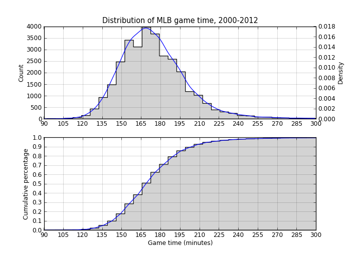
The two plots show what the descriptive statistics did: 70% of games are under three hours but it’s not uncommon for games to last three hours and fifteen minutes. Beyond that, it’s pretty uncommon.
Change in game times in the last 100 years
Now let’s look at how game times have changed over the years. First we eliminate all the games that weren’t complete in 51 or 54 innings to standardize the “game” were’re evaluating.
nine_innings = gamelog[gamelog.game_outs.isin([51, 54])]
nine_innings['year'] = nine_innings.apply(lambda x: x['dte'].year, axis=1)
nine_groupby_year = nine_innings.groupby('year')
mean_time_by_year = nine_groupby_year['game_time_min'].aggregate(np.mean)
fig = plt.figure()
p = mean_time_by_year.plot(figsize=(8, 4))
p.set_xlim(1915, 2015)
p.set_xlabel('Year')
p.set_ylabel('Game Time (minutes)')
p.set_title('Average MLB nine-inning game time since 1915')
p.set_xticks(range(1915, 2016, 10))
plt.savefig('game_time_by_year.png', dpi=87.5)
plt.savefig('game_time_by_year.svg')
plt.savefig('game_time_by_year.pdf')
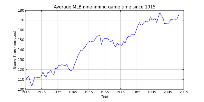
That shows a pretty clear upward trend interrupted by a slight decline between 1960 and 1975 (when offense was down across baseball). Since the mid-90s, game times have hovered around 2:50, so maybe MLB’s efforts at increasing the pace of the game have at least stopped what had been an almost continual rise in game times.
Attendance
I’ll be seeing a game at Wrigley Field, so let’s examine attendance at Wrigley.
Attendance is field 17, “Park ID” is field 16, but we can probably use Home team (field 6) = “CHN” for seasons after 1914 when it opened.
twenty_first[twenty_first['home_team'] == 'CHN']['attendance'].describe()
count     1053.000000
mean     37326.561254
std       5544.121773
min          0.000000
25%      36797.000000
50%      38938.000000
75%      40163.000000
max      55000.000000
We see the minimum is zero, which may indicate bad or missing data. Let’s look at all the games at Wrigley with less than 10,000 fans:
twenty_first[(twenty_first.home_team == 'CHN') &
             (twenty_first.attendance < 10000)][[
            'dte', 'visiting_team', 'home_team', 'visitor_score',
            'home_score', 'game_outs', 'day_night', 'attendance',
            'game_time_min']]
| dte | vis | hme | vis | hme | outs | day | att | game_time | |
|---|---|---|---|---|---|---|---|---|---|
| 172776 | 2000-06-01 | ATL | CHN | 3 | 5 | 51 | D | 5267 | 160 |
| 173897 | 2000-08-25 | LAN | CHN | 5 | 3 | 54 | D | 0 | 189 |
| 174645 | 2001-04-18 | PHI | CHN | 3 | 4 | 51 | D | 0 | 159 |
| 176290 | 2001-08-20 | MIL | CHN | 4 | 7 | 51 | D | 0 | 180 |
| 177218 | 2002-04-28 | LAN | CHN | 5 | 4 | 54 | D | 0 | 196 |
| 177521 | 2002-05-21 | PIT | CHN | 12 | 1 | 54 | N | 0 | 158 |
| 178910 | 2002-09-02 | MIL | CHN | 4 | 2 | 54 | D | 0 | 193 |
| 181695 | 2003-09-27 | PIT | CHN | 2 | 4 | 51 | D | 0 | 169 |
| 183806 | 2004-09-10 | FLO | CHN | 7 | 0 | 54 | D | 0 | 146 |
| 184265 | 2005-04-13 | SDN | CHN | 8 | 3 | 54 | D | 0 | 148 |
| 188186 | 2006-08-03 | ARI | CHN | 10 | 2 | 54 | D | 0 | 197 |
Looks like the zeros are just missing data because these games have relevant data for the other fields and it’s impossible to believe that not a single person was in the stands. We’ll get rid of them for the attendance analysis.
Now we’ll filter the games so we’re only looking at day games played at Wrigley where the attendance value is above zero, and group the data by day of the week.
groupby_dow = twenty_first[(twenty_first['home_team'] == 'CHN') &
           (twenty_first['day_night'] == 'D') &
           (twenty_first['attendance'] > 0)].groupby('day_of_week')
groupby_dow['attendance'].aggregate(np.mean).order()
day_of_week
Tue            34492.428571
Wed            35312.265957
Thu            35684.737864
Mon            37938.757576
Fri            38066.060976
Sun            38583.833333
Sat            39737.428571
Name: attendance
And plot it:
filtered = twenty_first[(twenty_first['home_team'] == 'CHN') &
                           (twenty_first['day_night'] == 'D') &
                           (twenty_first['attendance'] > 0)]
dows = {'Sun':0, 'Mon':1, 'Tue':2, 'Wed':3, 'Thu':4, 'Fri':5, 'Sat':6}
filtered['dow'] = filtered.apply(lambda x: dows[x['day_of_week']], axis=1)
filtered['attendance'] = filtered['attendance'] / 1000.0
fig = plt.figure()
d = filtered.boxplot(column='attendance', by='dow', figsize=(8, 4))
plt.suptitle('')
d.set_xlabel('Day of the week')
d.set_ylabel('Attendance (thousands)')
d.set_title('Wrigley Field attendance by day of the week, 2000-2012')
labels = ['Sun', 'Mon', 'Tue', 'Wed', 'Thu', 'Fri', 'Sat']
l = d.set_xticklabels(labels)
d.set_ylim(15, 45)
plt.savefig('attendance.png', dpi=87.5)
plt.savefig('attendance.svg') # lines don't show up?
plt.savefig('attendance.pdf')
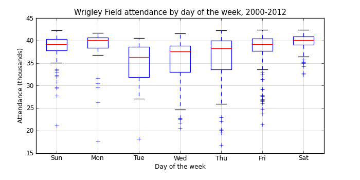
There’s a pretty clear pattern here, with increasing attendance from Tuesday through Monday, and larger variances in attendance during the week.
It’s a bit surprising that Monday games are as popular as Saturday games, especially since we’re only looking at day games. On any given Monday when the Cubs are at home, there’s a good chance that there will be fourty thousand people not showing up to work!
Cold November
Several years ago I showed some R code to make a heatmap showing the rank of the Oakland A’s players for various hitting and pitching statistics.
Last week I used this same style of plot to make a new weather visualization on my web site: a calendar heatmap of the difference between daily average temperature and the “climate normal” daily temperature for all dates in the last ten years. “Climate normals” are generated every ten years and are the averages for a variety of statistics for the previous 30-year period, currently 1981—2010.
A calendar heatmap looks like a normal calendar, except that each date box is colored according to the statistic of interest, in this case the difference in temperature between the temperature on that date and the climate normal temperature for that date. I also created a normalized version based on the standard deviations of temperature on each date.
Here’s the temperature anomaly plot showing all the temperature differences for the last ten years:
It’s a pretty incredible way to look at a lot of data at the same time, and it makes it really easy to pick out anomalous events such as the cold November and December of 2012. One thing you can see in this plot is that the more dramatic temperature differences are always in the winter; summer anomalies are generally smaller. This is because the range of likely temperatures is much larger in winter, and in order to equalize that difference, we need to normalize the anomalies by this range.
One way to do that is to divide the actual temperature difference by the standard deviation of the 30-year climate normal mean temperature. Because of the nature of the distribution standard deviations are based on, approximately 66% of the variation occurrs within -1 and 1 standard deviation, 95% between -2 and 2, and 99% between -3 and 3 standard deviations. That means that deep red or blue dates, those outside of -3 and 3, in the normalized calendar plot are fairly rare occurrances.
Here’s the normalized anomalies for the last twelve months:
The tricky part in generating either of these plots is getting the temperature data into the right format. The plots are faceted by month and year (or YYYYY-MM in the twelve month plot), so each record needs to have month and year. That part is easy. Each individual plot is a single calendar month, and is organized by day of the week along the x-axis, and the inverse of week number along the y-axis (the first week in a month is at the top of the plot, the last at the bottom).
Here’s how to get the data formatted properly:
library(lubridate)
cal <- function(dt) {
    # Reads a date object and returns a tuple (weekrow, daycol)
    # where weekrow starts at 1 and daycol starts at 1 for Sunday
    year <- year(dt)
    month <- month(dt)
    day <- day(dt)
    wday_first <- wday(ymd(paste(year, month, 1, sep = '-'), quiet = TRUE))
    offset <- 7 + (wday_first - 2)
    weekrow <- ((day + offset) %/% 7) - 1
    daycol <- (day + offset) %% 7

    c(weekrow, daycol)
}
weekrow <- function(dt) {
    cal(dt)[1]
}
daycol <- function(dt) {
    cal(dt)[2]
}
vweekrow <- function(dts) {
    sapply(dts, weekrow)
}
vdaycol <- function(dts) {
    sapply(dts, daycol)
}
pafg$temp_anomaly <- pafg$mean_temp - pafg$average_mean_temp
pafg$month <- month(pafg$dt, label = TRUE, abbr = TRUE)
pafg$year <- year(pafg$dt)
pafg$weekrow <- factor(vweekrow(pafg$dt),
   levels = c(5, 4, 3, 2, 1, 0),
   labels = c('6', '5', '4', '3', '2', '1'))
pafg$daycol <- factor(vdaycol(pafg$dt),
   labels = c('u', 'm', 't', 'w', 'r', 'f', 's'))
And the plotting code:
library(ggplot2)
library(scales)
library(grid)
svg('temp_anomaly_heatmap.svg', width = 11, height = 10)
q <- ggplot(data = subset(pafg, year > max(pafg$year) - 11),
            aes(x = daycol, y = weekrow, fill = temp_anomaly)) +
    theme_bw() +
    theme(axis.text.x = element_blank(),
          axis.text.y = element_blank(),
          panel.grid.major = element_blank(),
          panel.grid.minor = element_blank(),
          axis.ticks.x = element_blank(),
          axis.ticks.y = element_blank(),
          axis.title.x = element_blank(),
          axis.title.y = element_blank(),
          legend.position = "bottom",
          legend.key.width = unit(1, "in"),
          legend.margin = unit(0, "in")) +
    geom_tile(colour = "white") +
    facet_grid(year ~ month) +
    scale_fill_gradient2(name = "Temperature anomaly (°F)",
          low = 'blue', mid = 'lightyellow', high = 'red',
          breaks = pretty_breaks(n = 10)) +
    ggtitle("Difference between daily mean temperature\
             and 30-year average mean temperature")
print(q)
dev.off()
You can find the current versions of the temperature and normalized anomaly plots at:

Yesterday I attempted to watch the A’s Opening Day game against the Mariners in the Oakland Coliseum. Unfortunately, it turns out the entire state of Alaska is within the blackout region for all Seattle Mariners games, regardless of where the Mariners are playing.
The A’s lost the game, so maybe I’m not too disappointed I didn’t see it, but for curiousity, let’s extend Major League Baseball’s Alaska blackout “logic” to the rest of the country and see what that looks like.
First, load in the locations of all Major League stadiums into a PostGIS database. There are a variety of sources for this on the Internet, but many are missing the more recent stadiums. I downloaded one and updated those that weren’t correct using information on Wikipedia.
CREATE TABLE stadiums (
   division text, opened integer, longitude numeric,
   latitude numeric, class text, team text,
   stadium text, league text, capacity integer
);
COPY stadiums FROM 'stadium_data.csv' CSV HEADER;
Turn the latitude and longitudes into geographic objects:
SELECT addgeometrycolumn('stadiums', 'geom_wgs84', 4326, 'POINT', 2);
CREATE SEQUENCE stadium_id_seq;
ALTER TABLE stadiums
   ADD COLUMN id integer default (nextval('stadium_id_seq'));
UPDATE stadiums
   SET geom_wgs84 = ST_SetSRID(
      ST_MakePoint(longitude, latitude), 4326
   );
Now load in a states polygon layer (which came from: http://www.arcgis.com/home/item.html?id=f7f805eb65eb4ab787a0a3e1116ca7e5):
$ shp2pgsql -s 4269 states.shp | psql -d stadiums
Calculate how far the farthest location in Alaska is to Safeco Field:
SELECT ST_MaxDistance(safeco, alaska) / 1609.344 AS miles
FROM (
   SELECT ST_Transform(geom_wgs84, 3338) AS safeco
   FROM stadiums WHERE stadium ~* 'safeco'
) AS foo, (
   SELECT ST_Transform(geom, 3338) AS alaska
   FROM states
   WHERE state_name ~* 'alaska'
) AS bar;

miles
------------------
 2467.67499410842
Yep. Folks in Alaska are supposed to travel 2,468 miles (3,971,338 meters, to be exact) in order to attend a game at Safeco Field (or farther if they’re playing elsewhere because the blackout rules aren’t just for home games anymore).
Now we add a 2,468 mile buffer around each of the 30 Major League stadiums to see what the blackout rules would look like if the rule for Alaska was applied everywhere:
SELECT addgeometrycolumn(
   'stadiums', 'ak_rules_buffer', 3338, 'POLYGON', 2);
UPDATE stadiums
SET ak_rules_buffer =
   ST_Buffer(ST_Transform(geom_wgs84, 3338), 3971338);
Here's a map showing what these buffers look like:
Or, shown another way, here’s the number of teams that would be blacked out for everyone in each state. Keep in mind that there are 30 teams in Major League Baseball so the states on the top of the list shouldn’t be able to watch any team if Alaska rules were applied evenly to the country:
| Blacked out teams | States |
|---|---|
| 30 | Alabama, Arkansas, Colorado, Illinois, Indiana, Iowa, Kansas, Kentucky, Louisiana, Michigan, Minnesota, Mississippi, Missouri, Nebraska, New Mexico, North Dakota, Ohio, Oklahoma, South Dakota, Tennessee, Texas, Utah, Wisconsin, Wyoming |
| 29 | Idaho, Montana, Arizona |
| 28 | District of Columbia, West Virginia |
| 27 | Georgia, South Carolina |
| 26 | Nevada |
| 25 | Pennsylvania, Florida, Vermont |
| 24 | Rhode Island, New Hampshire, Connecticut, Delaware, New Jersey, New York, North Carolina, Virginia, Maryland, Massachusetts |
| 23 | Maine |
| 22 | Oregon, Washington, California |
| 1 | Alaska |
| 0 | Hawaii |
Based on this, Hawaii would be the place to live as they can actually watch all 30 teams! Except the blackout rules for Hawaii are even stupider than Alaska: they can’t watch any of the teams on the West Coast. Ouch!
This is stupid-crazy. It seems to me that a more appropriate rule might be buffers that represent a two hour drive, or whatever distance is considered “reasonable” for traveling to attend a game. When I lived in Davis California we drove to the Bay Area several times a season to watch the A’s or Giants play, and that’s about the farthest I’d expect someone to go in order to see a three hour baseball game.
This makes a much more reasonable map:
I’m sure there are other issues going on here, such as cable television deals and other sources of revenue that MLB is trying to protect. But for the fans, those who ultimately pay for this game, the current situation is idiotic. I don’t have access to cable television (and even if I did, I won’t buy it until it’s possible to pick and choose which stations I want to pay for), and I’m more than 2,000 miles from the nearest ballpark. My only avenue for enjoying the game is to pay MLB $130 for a MLB.TV subscription. Which I happily do. Unfortunately, this year I can’t watch my teams whenever they happen to play the Mariners.